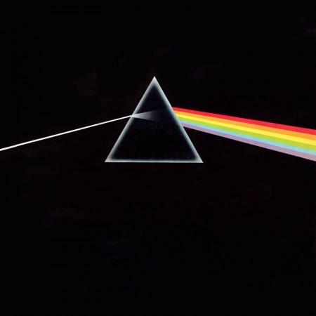
Pink Floyd - "Dark Side Of The Moon" (1973)
As a kid, a lot of my time was spent either drawing or rummaging through my parents vast music collection. The latter becoming more of bed time ritual, as every night I would listen to an album(s) until I fell asleep, literally, until I fell asleep, which meant that the next morning my Dad gave me his usual: “Jonathan, you’re going to go deaf if you continue to fall asleep with those headphones on…” speech. This ritual turned to obsession when in 4th grade I received my first Sony Walkman. Night to night I would pick out a new tape to listen to. At first, I started listening to albums that I had heard my parents play on one of many weekend camping trips or long drives to our lake house, but when I started running out of familiar names, I would choose solely on a what the album’s cover looked like (unbeknownst to me at the time, this would be one of the main reasons I would become a Graphic Designer). As I got older and became more familiar with certain artists, photographers and designers, I came to realize that 90% of the album covers I had fallen in love with as a kid, were designed by a group by the name of Hipgnosis.
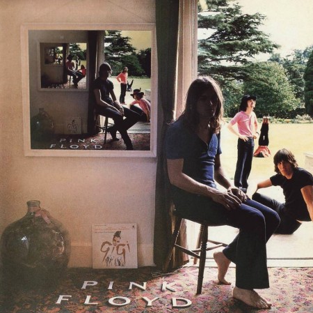
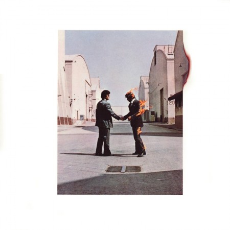
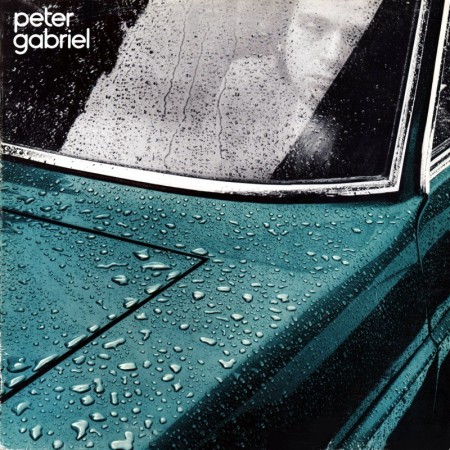
Hipgnosis was a British design group responsible for creating some of the most iconic and recognizable album covers of all times. Most notably for bands and artists such as Pink Floyd, T-Rex, Led Zeppelin, AC/DC, Scorpions, Yes, The Alan Parsons Project, Genesis, Peter Gabriel, ELO, just to name a few. The group consisted primarily of Storm Thorgerson and Aubrey Powell, and later, Peter Christopherson. The group would dissolve in 1983, though Thorgerson still works on album designs, and Powell works in video.

Pink Floyd - "Ummagumma" (1969)

Pink Floyd - "Wish You Were Here" (1975)

Pink Floyd - "Animals" (1977)

Peter Gabriel - "I" (1977)

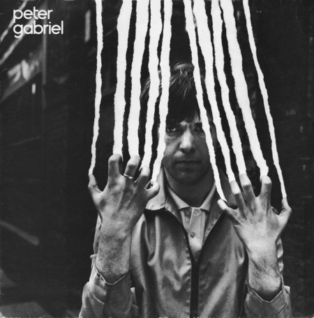
Peter Gabriel - "II" (1978)

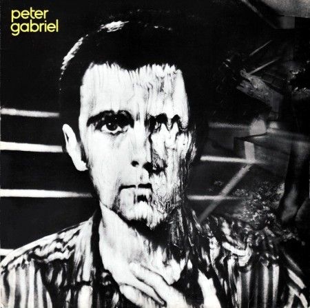
Peter Gabriel - "III" (1980)
The groups approach to album design was strongly photography-oriented, and they pioneered the use of many innovative visual and packaging techniques. In particular, Thorgerson & Powell’s surreal, elaborately manipulated photos (utilizing darkroom tricks, multiple exposures, airbrush retouching, and mechanical cut-and-paste techniques) were a film-based forerunner of what, much later, can be called “Photoshopping”. Hipgnosis used primarily Hasselblad medium format cameras for their work, the square film format being especially suited to album cover imagery.

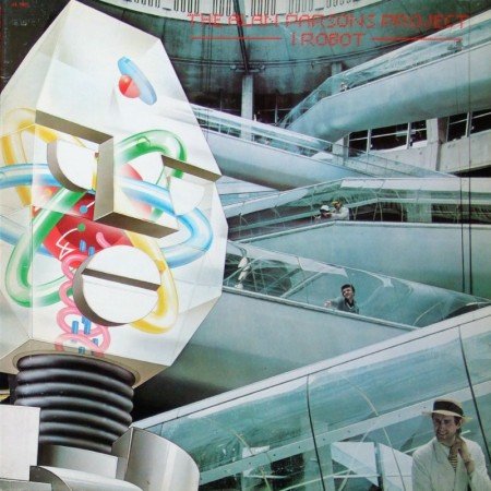
The Alan Parsons Project - " I Robot" (1977)

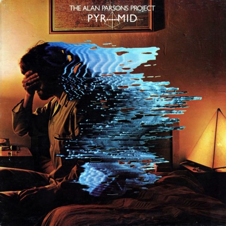
The Alan Parsons Project - "Pyramid" (1978)

Led Zeppelin - "Houses Of The Holly" (1973)

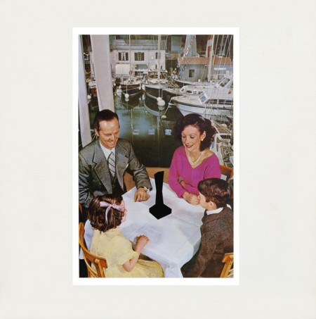
Led Zeppelin - "Presence" (1976)

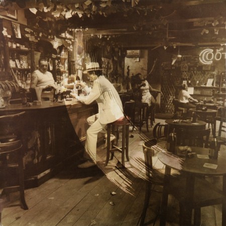
Led Zeppelin - "In Through The Out Door" (1979)

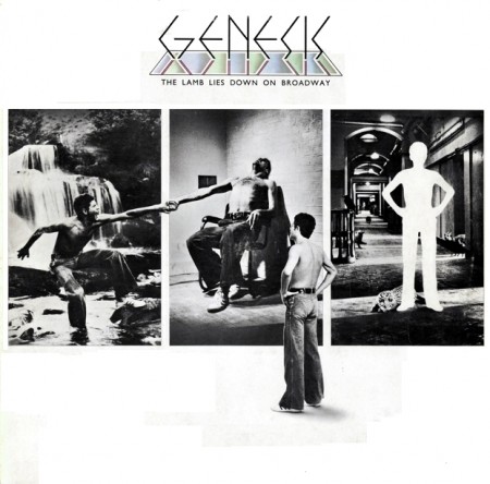
Genesis - "The Lamb Lies Down On Broadway" (1974)

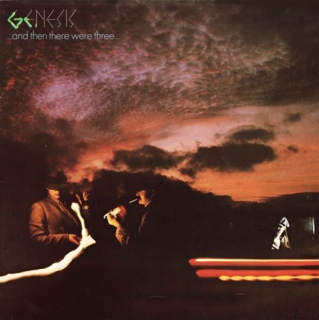
Genesis - "And Then There Were Three" (1978)

Black Sabbath - "Technical Ecstasy" (1976)

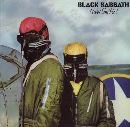
Black Sabbath - "Never Say Die" (1978)
Another trademark was that many of their cover photos told “stories” directly related to the album’s lyrics, often based on puns or double meanings of words in the album title. Since both Powell and Thorgerson were film students, they often used models as “actors” and staged the photos in a highly theatrical manner. Many of Hipgnosis’ covers also featured distinctively “high tech” pen and ink logos and illustrations (often by graphic designer George Hardie), stickers, fancy inner sleeves, and other packaging bonuses. One of the unique extras created by Hipgnosis was the specially printed inner sleeve for Led Zeppelin’s “In Through the Out Door LP”, a “black and white” affair that magically turned to color when dampened with water (tying in with the main cover’s photographic theme).
The groups contribution to album cover designs and packaging can best be described as more of a legacy than anything. A legacy that definitely shaped a generation and set the bar for future album design for years to come.


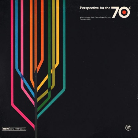
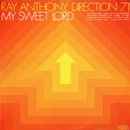
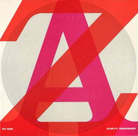
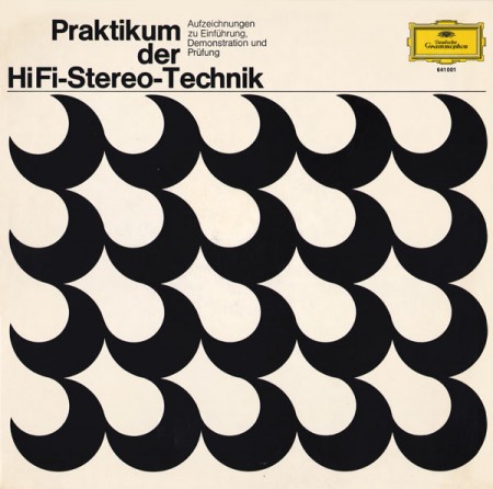
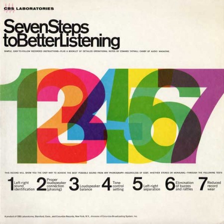
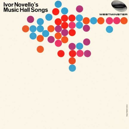
Project Thirty-Three has a great collection of vintage record sleeves up. This kind of minimalist approach to record jacket design is about as close as it gets to perfection for me. I’ve always loved the Blue Note style stuff but this is just a little more what I’m looking for. The simplicity is what really gets me, so much with so little. Wish I had prints of all these, but as a consolation, they make great iPhone backgrounds after a little editing.
Source Project Thirty-Three Via Wanken Blog


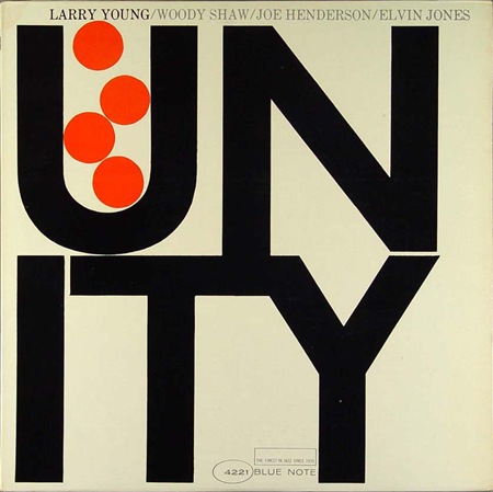
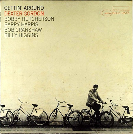
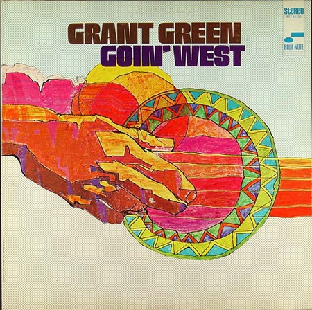
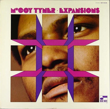
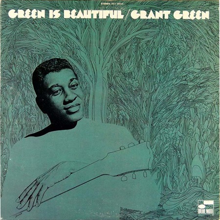
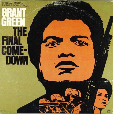
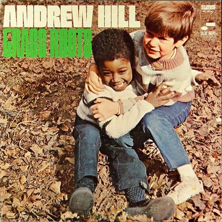
In the last Blue Note post I went with the more duo-tone offerings but with these 4 covers we see a bit more color injected into the compositions. That Dexter Gordon one is choice, this sort of stuff really needs to be offered in poster form. I always wonder who actually owns the rights to these images, I assume EMI does (they now own Blue Note), so that doesn’t bode well for future large format prints.
Massive bonus round: Name all the fonts used on these covers.
By the way, if you missed it last time, there was quite a nice debate running in the comments after the original Blue Note post. Worth a read, some good opinions from people in there. But no matter how good your opinion is, you can’t sway me from my original position: Cream > White!


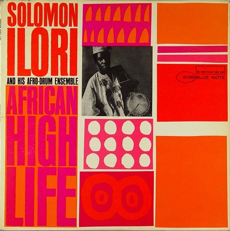
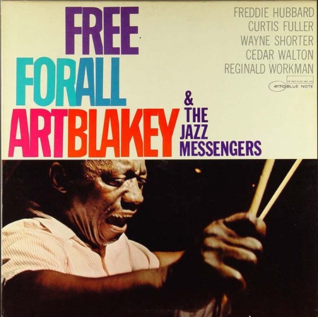
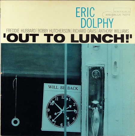
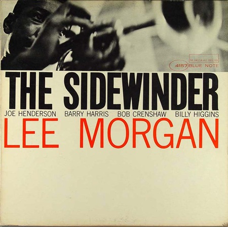
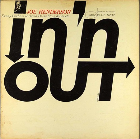
Here are some more covers from that great Blue Note Cover Archive that Amy Stoddard sent in a while back. Scanning through the archive you’ll find some periods of absolute greatness; these four were culled from the mid-60’s period when modernism was in full swing and someone over at the Blue Note design dept. seriously knew what they were doing. I selected these particular covers to illustrate the sort of continuity that seemed to pervade this period of releases. I really appreciate that from record labels, it’s not always the best policy, but there are times when I would sacrifice variety for a continuous visual message that flows through a series of records.
The other thing that really stands out to me about these is something that the original designer(s) probably didn’t intend: the lack of true white. Something about the off-white / cream in the place of white always makes an image feel more human to me, more tangible. That’s why white hasn’t been included in any of my design work since some of my earliest stuff from around 2001. I am not saying it doesn’t have it’s place in design or that it can’t be used effectively, I just don’t prefer it.
The minimalist color ethic in these pieces is employed successfully to such a degree that only a maximalist could truly appreciate. These images are literally exploding off the page, it almost hurts to look at them, yet they’re only two colors and relatively empty, full of negative space. True, a couple of them have leveraged photography to provide some depth, but try to imagine them without the photos; they would still stand on their own and that’s a testament to not only the designer but the power of typography itself. Note that aside from the oval and rectangle of the Blue Note logo the only shapes and lines are formed solely by type. To me that’s the ultimate expression of design, the information is the image, or, as a sort of anagram of Marshall McLuhan’s famous quote; the message is the medium.
What also strikes me about these is how timeless they are. This is not nostalgia, this is graphic design at its apex. If you compare these to the visually entertaining, yet decidedly dated, selections in my last Blue Note post, you might see how comparatively well these designs have stood up compared to say, this. The later Blue Note covers scream "late 60’s-70’s", the Carson stuff screams "1990’s", while these simply scream "DESIGN". Just as many have proclaimed Helvetica to be the purest expression of modernism through typography (which is an interesting concept in and of itself), I sometimes think that design as a whole reached some sort of zenith somewhere around the middle of the 20th century. That’s not to say there isn’t more to be done, new paths to be forged; but I feel like perhaps the perfect balance was struck during that era and all we can do now is explore all of the not-so-perfect alternatives. I know many will disagree with me, they’ll invoke Sagmeister and his ilk, but I’ve never been a fan of post-modernism, I think it is flawed. It is sometimes beautiful, thought provoking, and can be used to great effect, but at the end of the day it doesn’t go as far to accomplish the goals of communication and graphic design. True, graphic design is an ever-evolving form that mirrors the society it is employed to convey it’s message to, but the basic set of requirements that govern the neccessary function of that conveyance do not change…..That is, until we all mutate and read with thought waves and our eyes remain only as vestigial lumps mounted on the front of some sort of hyper-evolved super-brain. But that’s besides the point.
So that’s the long and the very long of it, my opinion only. As I’ve betrayed many times before, I am a lowly uneducated philistine so please set me straight, I would love to hear your opinions and the masochist in me eagerly anticipates the verbal thrashing I am sure to receive from the collective rebuttal superpower that is: The Innernette.


Amy Stoddard sent in this amazing archive of vintage Blue Note album covers. Lot’s of great inspiration all over this page, be sure to hit the "Next" button, it just keeps going and going, almost too many to take in at once. Visit the archive here.
