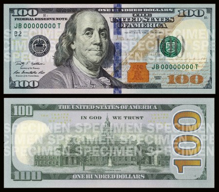
For Better or For Worse: $100 Bill design

In case you haven’t heard, a new $100 bill was recently unveiled and will be rolling out in early 2011. The good news is that the new bill will be flashy. It has been updated to include some new “3D” anti-counterfeiting features. The bad news is that the design suffered in doing so.
Maybe I’m expecting too much, but the new features that this bill has brought to the table aren’t doing it for me. The few techie “3D” color-shift features are cool but clearly look to be crammed alongside and over other elements in the design. If you look at an old $100 bill, you can see that the design has more of a structured layout from element to element. As hard as it is to say, the new design actually has a couple positive things going for it, but they still don’t outweigh the negatives.
The new design adds vibrant color which something that the old bill lacked. It seems to me that if such a vibrant color is added, it should only be in one location: either in the actual numbers or as the background of the entire bill. I do believe that the spot of color on the back of the bill (second image) is a nice accent when used with the larger ‘100’ type but I can’t say the same for the color accent on the front.
With that said, it’s pretty clear that I’m skeptical about this design, but what do you think. Were these design changes for better or for worse?
