Matthias Heiderich
Posted by Scott
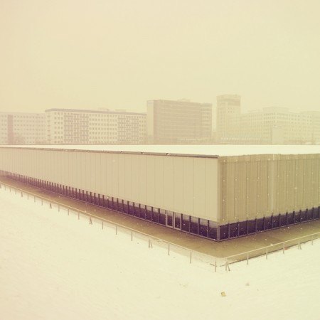
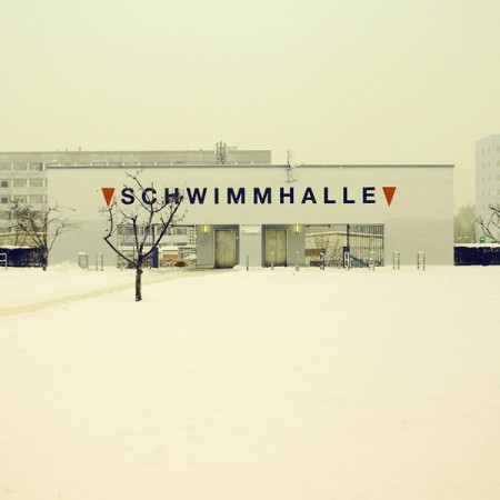
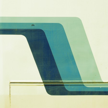
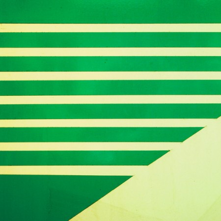
Just checked in on Matthias Heiderich (who we covered a while back) and he’s got some beautiful new work up. I love how he blurs the lines between photography and design.


Just checked in on Matthias Heiderich (who we covered a while back) and he’s got some beautiful new work up. I love how he blurs the lines between photography and design.

9 Comments Leave A Comment
Natasha says:
October 20, 2010 at 5:20 pmStunning!! These should be posters!
Shelby says:
October 20, 2010 at 6:42 pmI’m particularly fond of the second and third images.
80tech says:
October 20, 2010 at 8:47 pmWow! just wow!
treatment of color…his site is pretty “fantastical”
thank you for the show Scott
~
网上兼职赚钱 says:
October 21, 2010 at 12:34 am学习了,很喜欢来这里看看!
mike cottone / the green kingdom says:
October 21, 2010 at 6:20 amAwesome stuff- some inspirational color schemes!
Salemid says:
October 21, 2010 at 7:42 amI’ve got to be honest, This doesn’t impress me. His color palette is way over the top and over saturated. His winter series is the better of the lot. But the color just doesn’t sit well with me. If your shooting such a neutral subject, why would you add color into the image. Seems awfully kitschy. Don’t get me wrong, I generally admire the photographs you guys post here but there comes a point where it can get a bit repetitive. There are works out there that comply to your aesthetic without having an additive wash of color. Just some constructive criticism.
Lauren says:
October 21, 2010 at 8:40 amOh wow ~ love these! He has a great eye – I love the composition and the mood of the photos. Definitely inspirational!
Tyler says:
March 18, 2011 at 8:19 amWin a 20×20 print by Matthias on our website zeitgeistudios.com: http://bit.ly/fYU1de until March 26th
Tyler says:
March 18, 2011 at 8:19 amWin a 20×20 print by Matthias on our website zeitgeistudios.com: http://bit.ly/fYU1de until March 26th