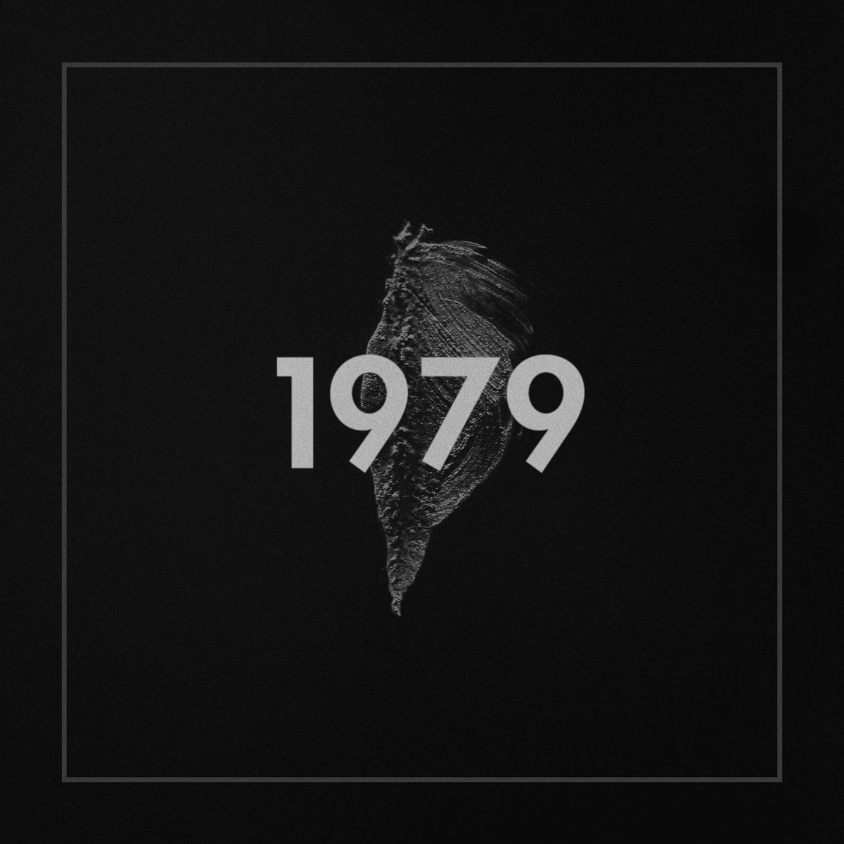
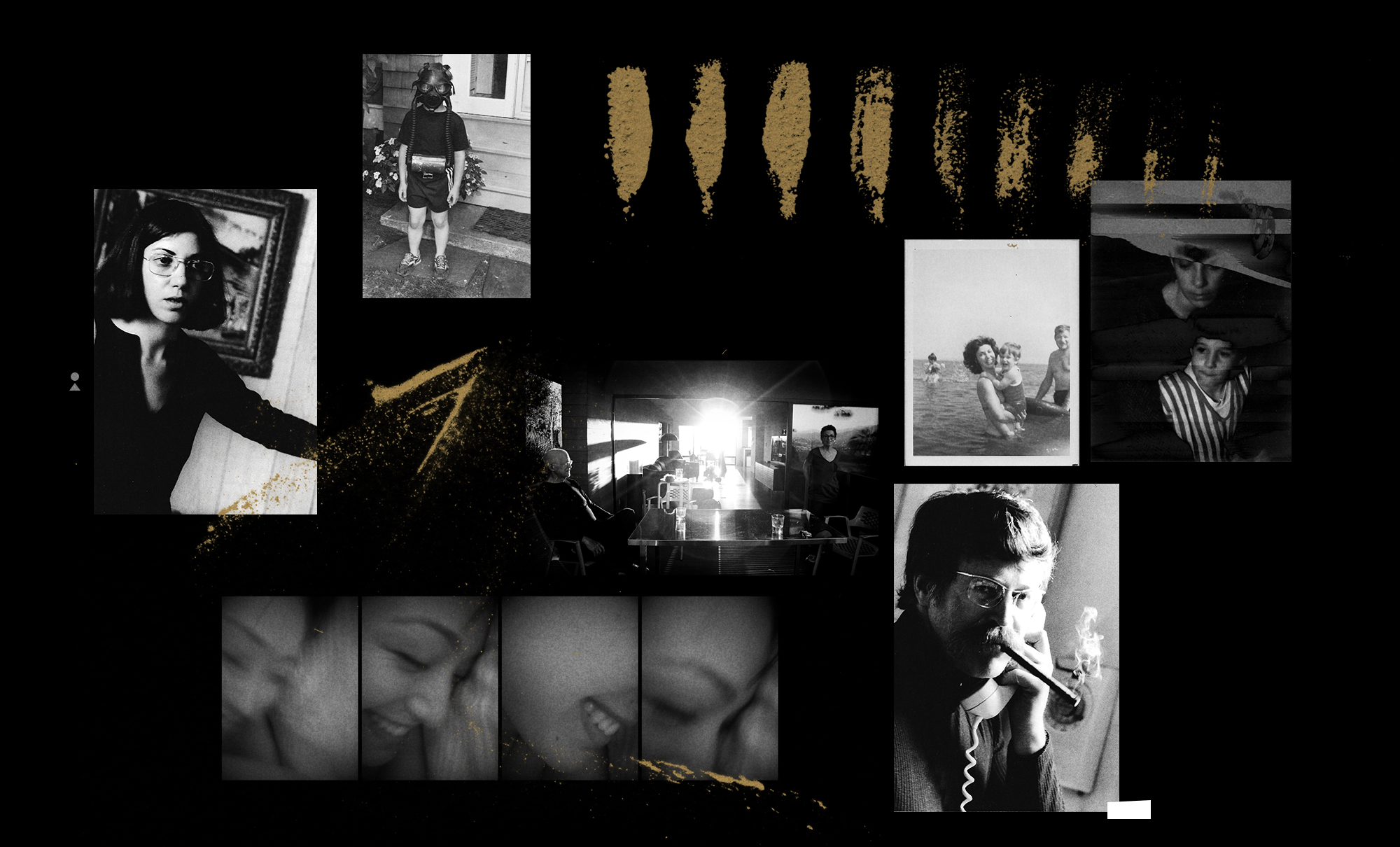
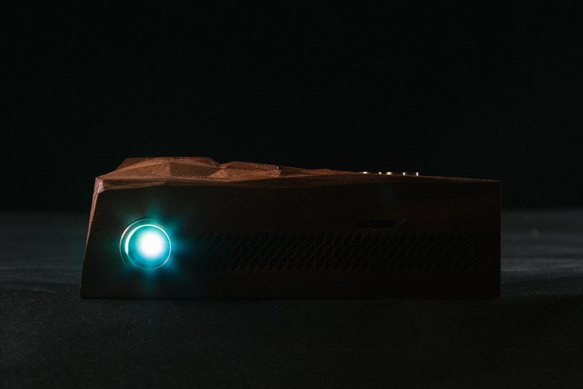
In a time where the devaluation of music seems to be at it’s peak, fans and audiences expect every release to be either for free or donation based, which forces musicians to tour extensively or resort to day jobs in order to support themselves. Deru, an electronic artist who questions this establishment, explores an innovative release of his latest album, 1979. His approach influences listeners to place themselves in an appropriate listening environment, delivering an entirely new experience.
To help him with his vision, Deru enlisted a team of people including the visual artist, Effixx, who collaborated previously on the Outliers, Iceland: Vol. 1 project.
I sat with Deru & Effixx to discuss the themes and concept behind 1979:
My old buddy Nick Felton spends a lot of time tracking his every move. After years of hanging with him knowing at the end of the year my stats would also in some way be immortalized in that years annual report, I decided to make use of one of the tools he created to track all that data: Daytum. It might be old news now, considering he’s moved on from Daytum, but it’s taken a while for the type of data I’ve been tracking to reveal something, hence the late-to-the party post.
I started obsessively keeping track of all of my music purchases via Daytum mostly just to keep tabs on myself – to make sure I was in fact supporting artists like I claimed I was.
But most telling to me is how the formats break down. Having moved a few times recently with a pretty hefty record collection – and a slow shift to “digital djing” (cue the purists), my buying habits have have clearly shifted towards downloads.
It may be a hold over from the vinyl and cd days, but no matter how hard I try, I can’t commit to the Rdio’s and the Spotify’s out there. I need to have the thing, be it physical or digital. I need to know it’s with me here, preferably in lossless format, taking up space somewhere – even if it’s just bits on an external hard drive. Loads of them.
I’m excited to see the label roster over at Drip.fm grow – it’s the perfect subscription based, lossless downloads model in my opinion.
**log in denied** Does anyone even remember their myspace password? I don’t. I mean look the new Myspace, yeah its visually appealing, it will probably run smoother than any social site out there, and it does everything I need it to if I want music. My first 2 issues that come to mind: sifting thru the content/mass spam from the past to prep it to make my site look as good as Justin Timberlake’s. Second, being a musician and having to care for another site, at this point maybe if they paid me $5 a week i’d consider it.
Honestly, good for them but I see this being kind of a Zune thing, it just came too late in the game, most of us that have a life on the internet are just to settled in with our Rdios, Facebooks, Tumblrs, and Twitters.
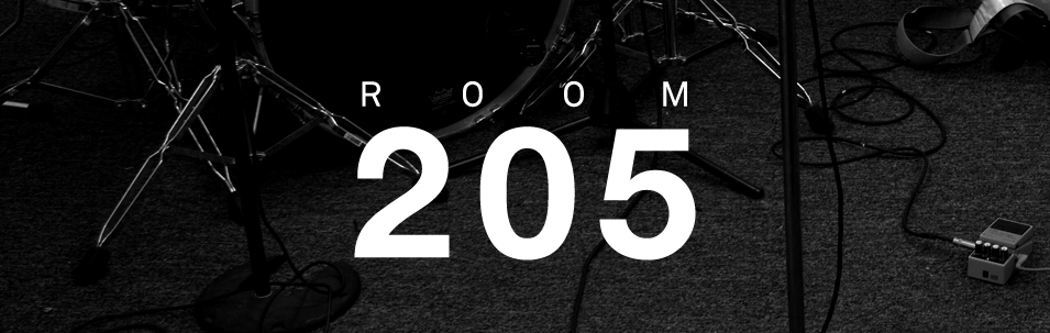
Incase isn’t just the brand that you know for their backpacks, headphones, casings, and other attractive accessories, they offer some of the most interactive and cared for ways to collab with other creatives. Room 205 is on the top of my list of going above and beyond in their efforts:
Working in collaboration with visiting musicians and a revolving cast of filmmakers, set designers, audio engineers and friends, Room 205 exists to share our collective passion for art and music and showcase the people that inspire us.
I mean to take the time and rebuild a space for each musician to perform in a space that is imagined up then documenting it is a dream for any musician with a vision, for me its like telling an 8 year old that Disney World is coming to your room, be ready. Take a second and check out their site and all the musicians that have came thru, its one of the most ideal ways to experience music in my opinion.
Mr. Div is Tumblr I find myself (and apparently 30,000 other followers) visiting quite often, due to the amazing world of Animated GIF’s and Motion Graphics that inhabit within, designed by Matthew DiVito.
I intend to one day hire this man for my show visuals. Above are a few of my personal favorites.
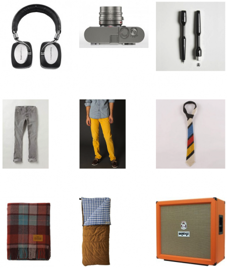
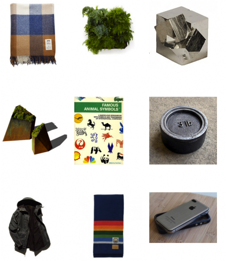
“Svpply helps you find the products you love, from the people and stores you find interesting.”
When I read that it sounded pretty appealing, then I noticed some of my co-workers using it and I dug in deeper and really enjoyed it since I want to bring in more product reviews onto the site next year, especially well designed ones.
Some people MIGHT write it off as “well this is how rich people shop” but a lot of this stuff is in a good price range plus it helps you pick something worth saving your money for.
From what I can gather, Nizo is an app that brings the lovely Super 8 stylings to the iPhone. The app isn’t out yet, but right now I’m just mesmerized by the promo page. Its elegant implementation really stopped me in my tracks this morning. The app is put out by Image Mechanics, who have a pretty darn sexy site themselves.


")
")
")
")
")
")
")
")
")
")
")
")
")
")