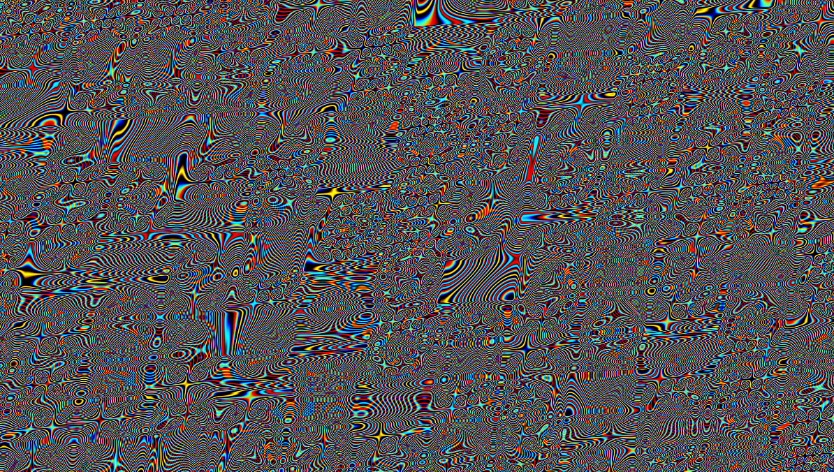
Adam Ferriss Screensaver 2.0
Posted by Jakub
click to enlarge
click to enlarge
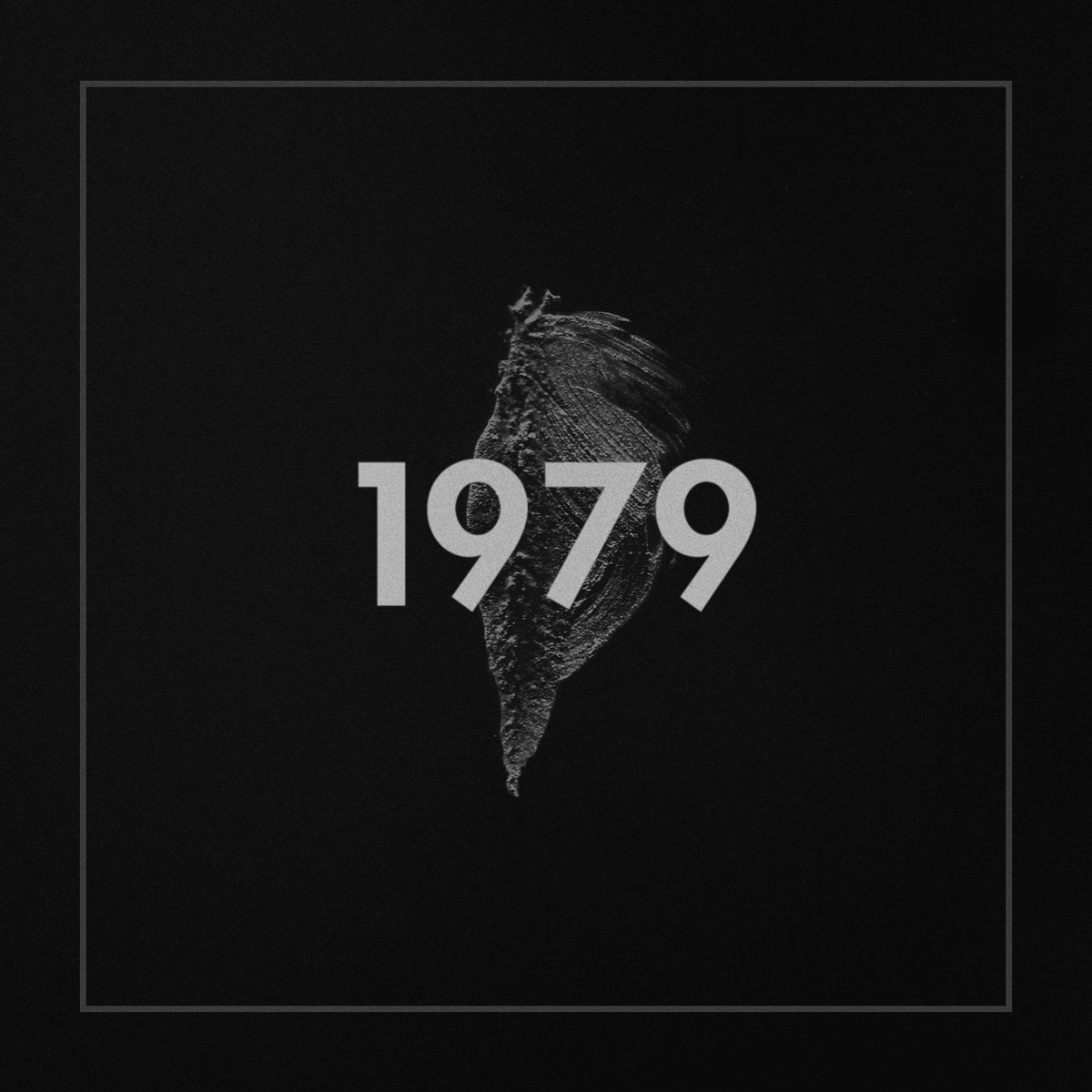
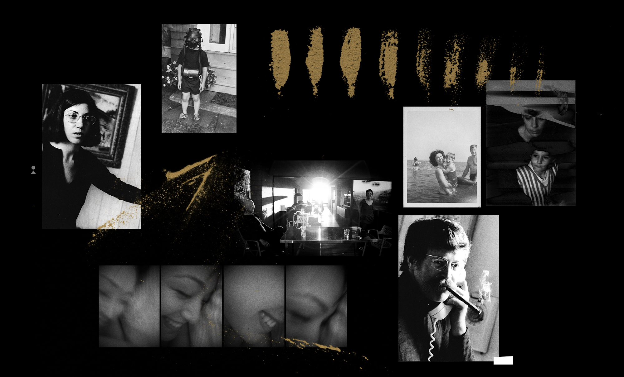
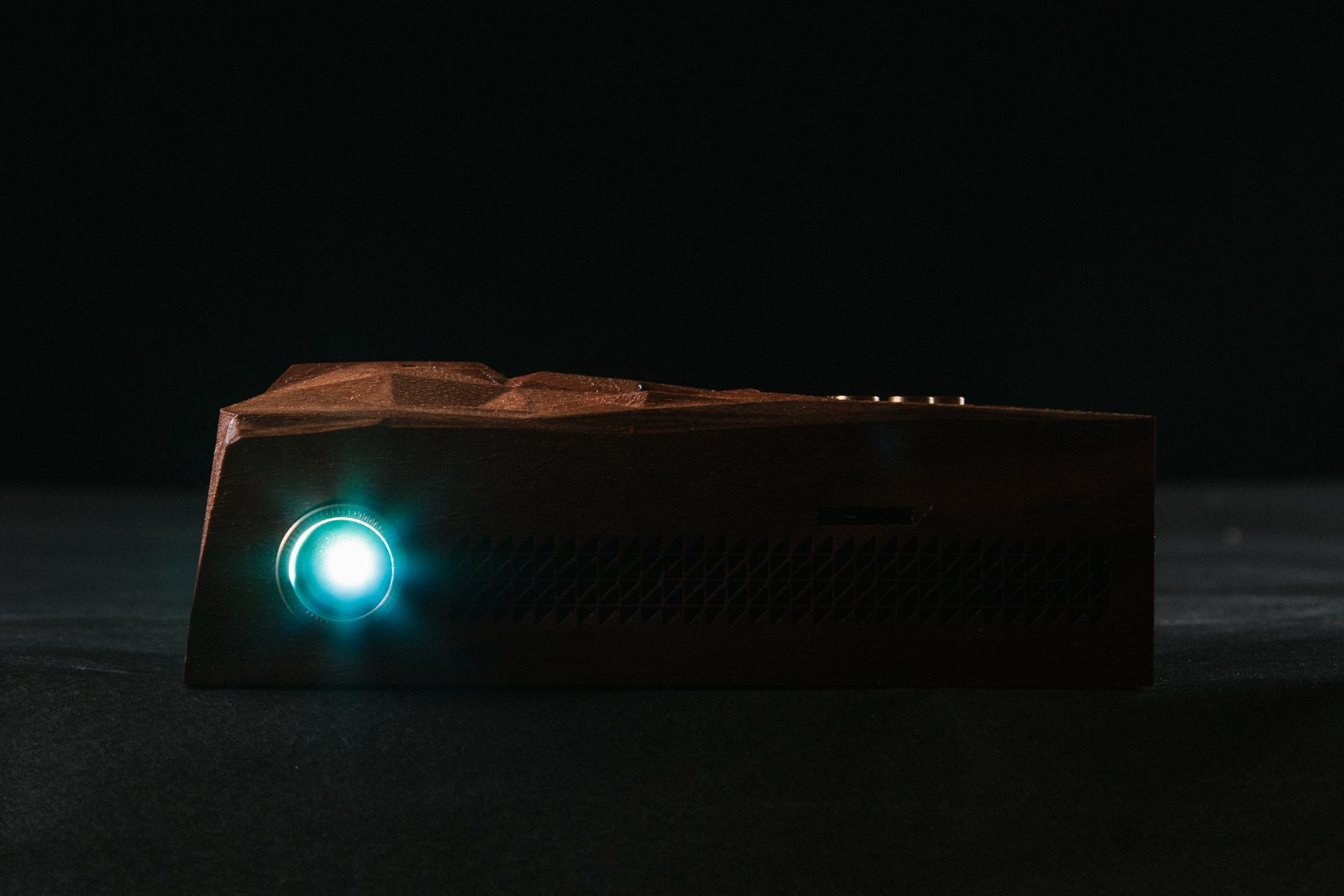
In a time where the devaluation of music seems to be at it’s peak, fans and audiences expect every release to be either for free or donation based, which forces musicians to tour extensively or resort to day jobs in order to support themselves. Deru, an electronic artist who questions this establishment, explores an innovative release of his latest album, 1979. His approach influences listeners to place themselves in an appropriate listening environment, delivering an entirely new experience.
To help him with his vision, Deru enlisted a team of people including the visual artist, Effixx, who collaborated previously on the Outliers, Iceland: Vol. 1 project.
I sat with Deru & Effixx to discuss the themes and concept behind 1979:
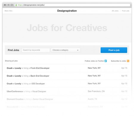
Over the last few months I (Shelby) have been working on a number of large updates to Designspiration. The first of these updates is the job board. The goal of the job board is to help creatives find career opportunities at great companies.
There were a number of challenging aspects of building this site addition, but the main one was how to handle mobile. It’s not something I’ve done a whole lot of and just to complicate things, a new grid needed to be developed for the updates to follow. The restructuring of the grid took just about as much time to figure out as it did to build the job board itself. I’ll follow up this post after the next updates to talk more about making Designspiration fast on mobile (hint, hint).
If you know an agency or company looking to hire, post a job or let them know about the job board. Also, follow the Designspiration jobs twitter @Dspnjobs for job updates.
Check it out: http://ds.pn/jobs

Twitter just rolled out a new profile design that allows you to add your own header banner. Pretty cool, but it’s hard to tell what looks best without fidgeting with it, then waiting. To make it easier on you, I’ve updated my Twitter PSD Photoshop template to the new design.
The profile images in the template utilize smart objects to make it easier to update all of the images in the template at once. The name/username’s in the tweets also utilize smart objects. Double-click to edit, then edit the contents and it will update all of the smart objects synced with it.
This template was built closely to Twitter’s current layout as of September 20th, 2012. Download the template below. Please share the PSD if you find it useful. If you have any questions or suggestions leave a comment.
Enjoy!
For updates to the PSD you should follow @ShelbyWhite.


**log in denied** Does anyone even remember their myspace password? I don’t. I mean look the new Myspace, yeah its visually appealing, it will probably run smoother than any social site out there, and it does everything I need it to if I want music. My first 2 issues that come to mind: sifting thru the content/mass spam from the past to prep it to make my site look as good as Justin Timberlake’s. Second, being a musician and having to care for another site, at this point maybe if they paid me $5 a week i’d consider it.
Honestly, good for them but I see this being kind of a Zune thing, it just came too late in the game, most of us that have a life on the internet are just to settled in with our Rdios, Facebooks, Tumblrs, and Twitters.

For those of you looking to make this Monday go by a bit quicker. Browser Pong is a traditional Pong game played not in a browser window, but with browser windows. Designed by Stewdio, an art practice, code house, and graphic design studio based in London.
Tested and approved for Macintosh using the following browsers in order of preference: Safari 4, FireFox 3.6, Chrome 4, and Opera 10.


David Elgena created this beautiful Braun/Dieter Rams inspired weather iphone app called Wthr. The app is very nicely done and I’d say it’s definitely worth downloading from the App Store.
Via Wanken
![]()
So as many of you long-time readers may have noticed the blog has been a little slow over the past six or so months, especially when commenting on posts. Well thanks to help from the brilliant Karl Peterson of Sidearm Design (who was also involved in the excellent Red Moon project) things are ticking along again. Commenting should be pretty speedy and overall site response time should be much quicker.
You may have also noticed that we had been posting less often over the past few months. Most of the team at one time or the other were on the road for the various Tycho tours and things slipped a bit. Although we will be touring extensively over the summer, we have some new people on board and have added some functionality on the admin side to make posting from the road a little easier, so the content should be flowing steadily again. We also have some new features (finally an HTML5 audio player for streaming playlists and music posts to iDevices etc.) and columns planned for the near future so keep an eye out for those.
As always we really appreciate your support and readership; we hope that in the years to come we can continue to grow our little community here.