iPhone GUI PSD
Posted by Scott
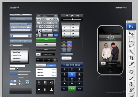
I started out my career in graphic design as an interface architect so I’ve always had a soft spot for GUI’s and user interaction theory. I happened across this post at Teehan+Lax about the GUI for the iPhone. They’ve posted a PSD with most of the assets from the iPhone interface, all in freely-scalable shape layer and PS effect formats. Technically it’s been posted to provide an easy way to create iPhone mock ups but I think it’s a great reference for anyone trying to learn how to create interface graphics in Photoshop (for web or otherwise). Reverse engineering PSDs like this is a great exercise in working with scalable graphics in Photoshop. You can download the PSD from the Teehan+Lax site.

12 Comments Leave A Comment
zeco says:
September 2, 2008 at 4:46 amI like your style ,that feeling makes me comfortable ~~
U are quite fantastic
Justin S. Meyers says:
September 2, 2008 at 6:00 amThey must be from Berkley, the phone is set to “4:20.” Accident? maybe…
So… can this work as a “new-skin” for the iphone? can you deck your iphone out in colors that are more appealing by replacing the images somehow?
I just got the 3g, it’s amazing.
Geoff Teehan says:
September 2, 2008 at 6:56 amThanks for posting Scott – I’m personally a huge fan of your work as an artist and musician. Justin, We’re in Toronto, 4:20 occurs twice a day everywhere doesn’t it?
Greg Formager says:
September 2, 2008 at 7:39 amI’m surprised they’re not using more layer styles to make things easier to control and edit. Or maybe they did, but just flattened them before releasing the PSD to the masses.
Justin S. Meyers says:
September 2, 2008 at 10:48 amGeoff-
4:20 – “international designated pot smoking time” – I believe it has some significance like… Bob Marley’s death or something along those lines. I mentioned “Berkley,” because throughout most of California (especially Berkley), you see “4:20” stickers on cars, etc.
April 20th (4/20) is a day pot-smokers throw festivals and such.
Feel free to “google.”
Geoff Teehan says:
September 2, 2008 at 12:04 pm@ Greg: I suppose there were a few elements like simple backgrounds that remain flat but for the most part we’ve never needed to edit them. I think nearly all the individual elements were created as vector (either in Photoshop or illustrator) then applied with layer styles that match the real UI. Some of the shape info may have been flattened but shouldn’t be for any elements that are actually editable in the real UI. If you can name a few that should be editable we can rework them in the next release.
@ Justin: I know 4:20, was just my attempt at humor.
Justin S. Meyers says:
September 2, 2008 at 12:11 pmAh, my last comment was an attempt to make sure I didn’t offend you in some odd way. You took me by surprise, there’s not a whole lot of humor on Scott’s blog.
Scott says:
September 2, 2008 at 1:35 pmJustin-
yeah, I try to keep it light, but sometimes it gets downright ugly in the comments.
Geoff-
no problem, thank you for posting the PSD, really nice to make those assets publicly available. and yes, it does occur twice a day, but in san francisco we added a third, dynamic bonus iteration, definable by the individual..we’re all about user interaction….
Justin S. Meyers says:
September 2, 2008 at 2:14 pmScott – you joked! *wipes tear of joy from eye.
I know man, I would keep it as “light” as possible as well (for everyone’s safety).
Are you excited about the Elitebook coming out this month? My buddy get’s an 25% HP discount… temptations, temptations…
Scott says:
September 2, 2008 at 3:06 pmjustin-
yeah, excited to check it out in person….but will definitely be holding off on any purchases until I see what apple brings to the table when the new stuff (supposedly) drops later this month. sort of undecided on which to go with at this point, I really like the form factor and feel of the macs but they always seem to lack some of the nice bells and whistles of a true PC (eSATA, dockability, built-in mem card reader, etc…). I know, a lot of people would shrug and say you don’t really need those things, but they do come in very handy. for instance, when I set my current HP down on the desk, I just plug in one cable and it’s set. if I had a macbook I would have to plug in a USB hub, the power connector, the firewire, and the DVI video connector just to use it with my desk peripherals, then unplug all that to take it upstairs. the lack of a dock is reason enough to keep me on the PC side. that said, the sheer badassery of the forthcoming MBPs could be enough to convince me to add those 10 seconds of plugging to my daily routine.
Justin S. Meyers says:
September 2, 2008 at 7:15 pmScott-
I have to be honest, I really haven’t done any research on the new MBP’s that are coming out next month. A few months ago I was scoping out the 8 processor Mac tower at $2500, then remembered the benefits of mobility that a laptop offers.
It’s pretty exciting to see laptops start ramping up to the same specs as desktops.
You mentioned using the Dreamcolor technology for a live ISO50 visuals (for Tycho). So, if for some reason you do land on the side of the Elitebook, I will be pretty excited to hear if there’s any humanly noticeable difference. Or… talk one of your buddies into buying, then borrow it for testing. That might cross the line of frugal and into something completely different…
Side note: just got the 3g iphone, internet speed is quite impressive… liking the difference between 2g and 3g?