Kilian Eng
Posted by Scott
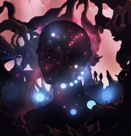
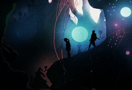
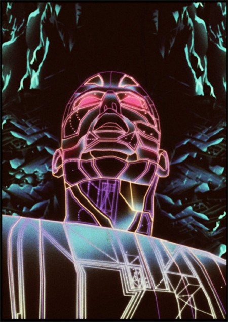
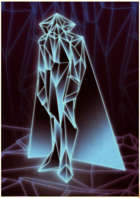
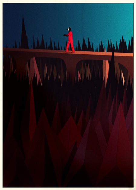
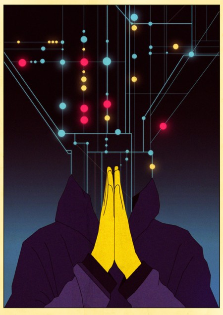
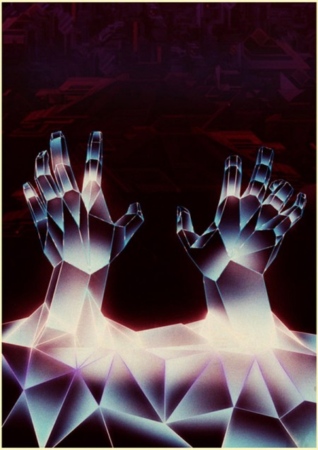
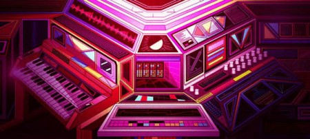
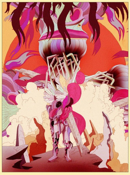
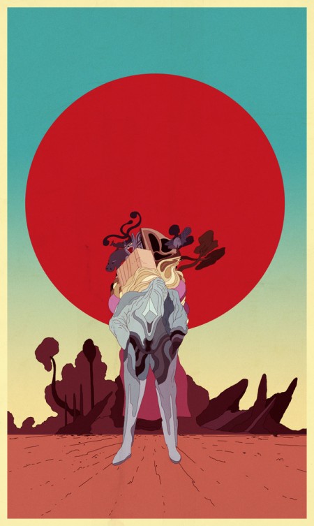
Really refreshing illustration work from Kilian Eng. I’m really getting an Avant Garde Magazine / 70’s-80’s illustration vibe from all this. Love the use of texture, it all feels so authentic.
More of Eng’s work and inspiration can be found at His Tumblr. (thanks Francisco)
Kilian Eng via BDIF

15 Comments Leave A Comment
Francisco Gutierrez says:
April 18, 2011 at 9:08 pmI’ve been following Eng’s work for a while, I love it. His art evokes such a specific feeling, part nostalgia, part ethereal and mysterious. Would be awesome to see you and him collaborate on something.
check out Eng’s tumblr blog: http://dwdesign.tumblr.com/
Great show in Brooklyn this past weekend btw. I hope you come back soon!
Spencer says:
April 18, 2011 at 9:46 pmSo legit.
NAVIS says:
April 19, 2011 at 2:02 amLOVE. I’m a sucker for air brush work. Or work that looks airbrushed. Skillz.
Levon says:
April 19, 2011 at 10:02 amThat one with the guy in the red jumpsuit and mask walking across the bridge with spikes all around, it looks like slipknot…
JConda says:
April 19, 2011 at 11:31 amWhile I appreciate the style of the artwork…I’m bugging on the soundtrack. Who is that?
JConda says:
April 19, 2011 at 11:35 am…ok…wasn’t paying attention:
Philippe Besombes & Gaston Borreani
…early 80’s library music heads? Dope.
Carlos says:
April 20, 2011 at 6:46 amI’ve been loving this guy’s work ever since I saw the cover art he did for the Tesla Boy EP (http://3.bp.blogspot.com/_FmrN8EY0CFU/Sf8DhytWESI/AAAAAAAAAFs/MufiNY0gleQ/s320/tesla-boy.jpg). Just brilliant.
Jeremy says:
April 22, 2011 at 4:38 pmYes! I as well have been loving this guy for a while too. Including that Tesla Boy cover that Carlos mentioned.
I’m glad to see him getting some love. He touches on a sense of that era and nostalgia that I haven’t seen accomplished so well, maybe since its actual hay day.
good stuff!
Patrick says:
April 23, 2011 at 8:02 amI can appreciate the technical prowess of the artist, but I really don’t understand how this work seems “refreshing”. To me, it seems dark and maybe even a little depressing. Reminds me of an apocalyptic movie out of the early 80’s. Maybe I just had a bad experience with a transformer when I was a kid, but I don’t really appreciate this art as much as you guys do. Don’t bite my head off for it.
krusht says:
April 23, 2011 at 4:20 pmSo sick
Angela says:
April 24, 2011 at 10:40 pmLike city hero, hi friend, i found that there is one website offering free puzzle games. Just take one minute to sign up then you will receive one free puzzle game. Its URL is http://www.684899.com/en/CosmicCreature/project_1.htm Click the below button to get in.
Ninetone says:
April 28, 2011 at 2:27 pmGreat surrealism. I checked out his portfolio on Behance and find it full of fantastic stories and worlds. Patrick wrote that its depressing and dark, some of it may be(is that a bad thing?) but for me its so much more than that.
Patrick says:
April 30, 2011 at 8:11 pmI was mainly suggesting that “refreshing” wasn’t a good way to describe the artwork from my perspective. Surely Scott has his own perspective and I can appreciate that, I just don’t personally see it that way. to me it is the quite the opposite of refreshing. Interesting, yes. Refreshing and something I would like to see more of? No, not really.
Komodo says:
May 5, 2011 at 4:44 amWhat a find, amazing imagination and colors!
Designgrill says:
May 6, 2011 at 2:31 pmlove the colours! great work!