Making of The Obama Print
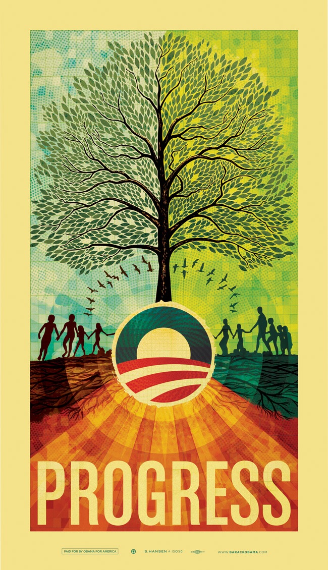
As regular visitors to this site may know, I created a print (Fig.1) this past May as part of a fund-raising effort for the Barack Obama campaign. The campaign approached me earlier this year about creating a poster based on the theme of "Progress" and I decided to take a stab at it. Once completed, the poster was printed in a limited edition of 5000 and has since sold out. I had intended to write this article earlier, but I’ve been rather busy so it had to wait until now.
Overall, the process was something of a roller coaster ride and certainly left me with some valuable lessons learned. It’s been a little over a month now since the dust settled on this whole thing (the final copy sold around June 7th) so I’m hoping that the time passed will lend a bit of clarity and result in a more insightful analysis of the journey from start to finish on this project.
This is, by far, the longest post I have ever written. As such, I wasn’t able to spend as much time as I usually do worrying about the writing. This is mostly just a stream of consciousness recap of the process and is primarily nuts and bolts commentary; I’ll leave the job of deriving the meaning and symbolism of the piece to you.
So here it is, the long and the short of it: everything that went into the making of the Obama print.
Initial Stages
When planning out an image I usually like to dive right into Photoshop as a first step, just to try and establish a color-scheme and basic structure. Only later do I usually start to work with physical objects and pen and paper to try and work out the main elements, keeping in mind the initial digital mock-up. I sometimes hear people talking about always using pencil and paper as a first step in design, but I personally find the computer a much faster and intuitive way to concept things out so I like to leverage that power right off the bat as a good way to kick-start the project.
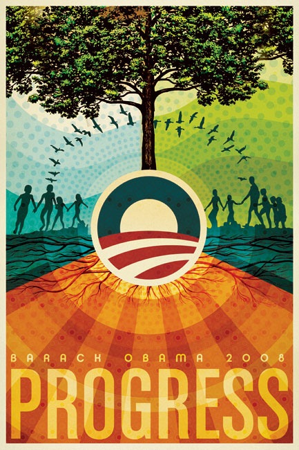
The campaign had asked that I pursue a style in line with my earlier work as they felt it would make the most sense for this poster and I agreed. So I set out working with various elements from earlier works (you may recognize the people from the Skyway print). I also had an old book about trees with a very nice illustration I had always wanted to use so I scanned it and placed it in the mock up as sort of a framework for the illustration I would later create over it. As you can see in Fig.2 above, the early mock-up was already looking a lot like the final product. At this stage I am usually just trying to find an overall form and color arrangement that works, the details always follow, but if I am feeling inspired I’ll often find myself creating the bulk of the piece in the early stages and then later working with that and refining things.
The message of the print had to center around a handful of concepts that the campaign was using, "Hope", "Progress", "Change". Shepard Fairey had already created two prints for the campaign that each featured an image of Obama so I knew I wanted to pursue another theme for the imagery. The fact that this was a fund raising poster and not intended as a campaign poster also made it easier to interpret the imagery more liberally. My initial idea was to metaphorically represent the core themes of the campaign in a collage, some more literally than others. I also wanted to vaguely communicate the concept of peace by configuring the main elements into a somewhat subdued peace symbol and working off of that shape for the core structure of the image.
Comping & Approvals
After a couple nights of working through ideas and pasting things together, I came up with the comp you see in fig.2. I ran this early mock-up by the campaign and they gave me the go-ahead to start production on the final product. This was a relief as the campaign was wanting the as soon as possible and now I’d have a bit more time to work out the detailing.
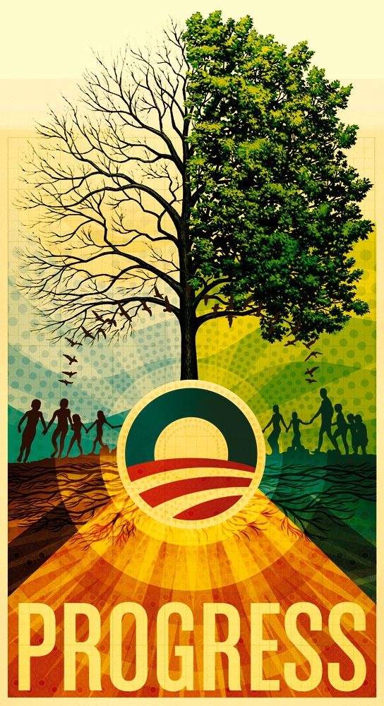
Now that I had the green light on the image I went forward with recreating it full scale. I often concept at a smaller size to make for quicker work within Photoshop so when it’s time to make the final product most of the non-vector graphics have to be re-created at the new resolution. This is always a good time to work out the kinks and really focus on the things that may have been overlooked when working through the rough drafts. Fig.3 shows the product of this second phase, a more developed and balanced overall composition at this point. I am still using the original tree illustration as a stand-in and have now exposed half of it to show the branches. It was later decided to go with a full tree but I still liked how it looked at this time. As you can see, the colors and detailing were all really starting to fully develop by this stage and it’s around this point that you can start to see the finished product coming together.

This is always an exciting time as a designer as you’re getting the first glimpses of the final image. Unfortunately, this is where the real work began.
Production Begins
Because this print was going to be so large (23"x40" @ 300dpi raster), I had to do another phase of re-scaling to reach the final dimensions. To get it that big, I re-created all of the elements that I could in vector and brought them in from Illustrator to Photoshop. In fig.4 you can see the not-so-attractive results of this phase. This shot is from Illustrator so none of the texture or color is there yet, just the raw vector forms. Once I had those imported to Photoshop and had the image resized up, I set about placing all the large raster components again, doing the texture and color work and so on.
In fig.5 you can see that the textures and colors have been restored and the raster tree stand-in has been removed. At this stage the image is at full size and resolution so things are starting to move quite slow. It was also at this point that I had to switch to PSB format since it exceeded the file size limitation of the standard PSD format. With all the full size elements in place it was time to work out the tree illustration.
The Tree
I had been worrying a lot about how to approach the tree throughout the initial stages of the project. It was going to be the central element that tied the piece together and I really wanted it to stand out. I had batted around a few ideas but nothing really panned out until I settled on the idea of using individual leaves on a two dimensional plane as opposed to trying to create something with three dimensional depth as I had previously planned.
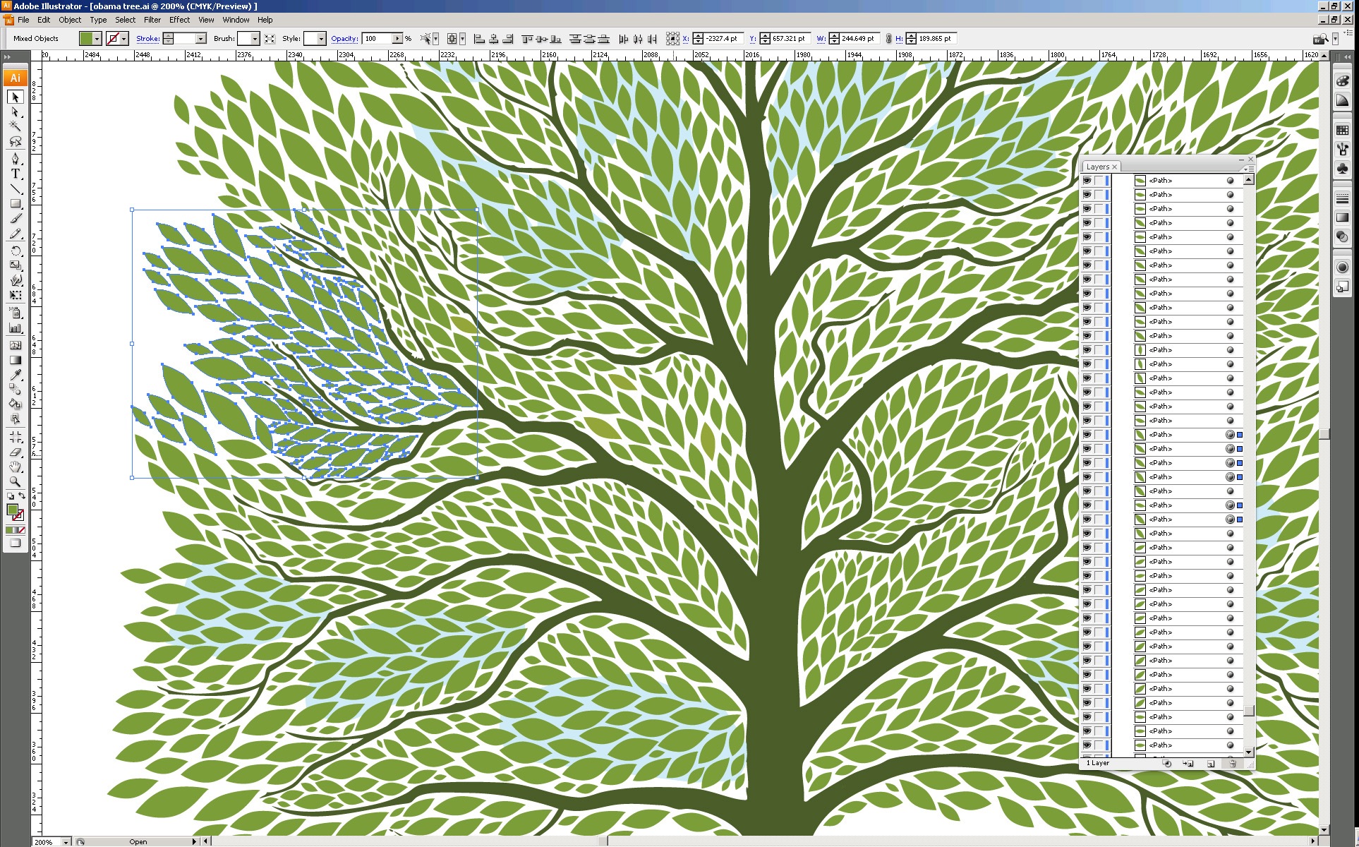
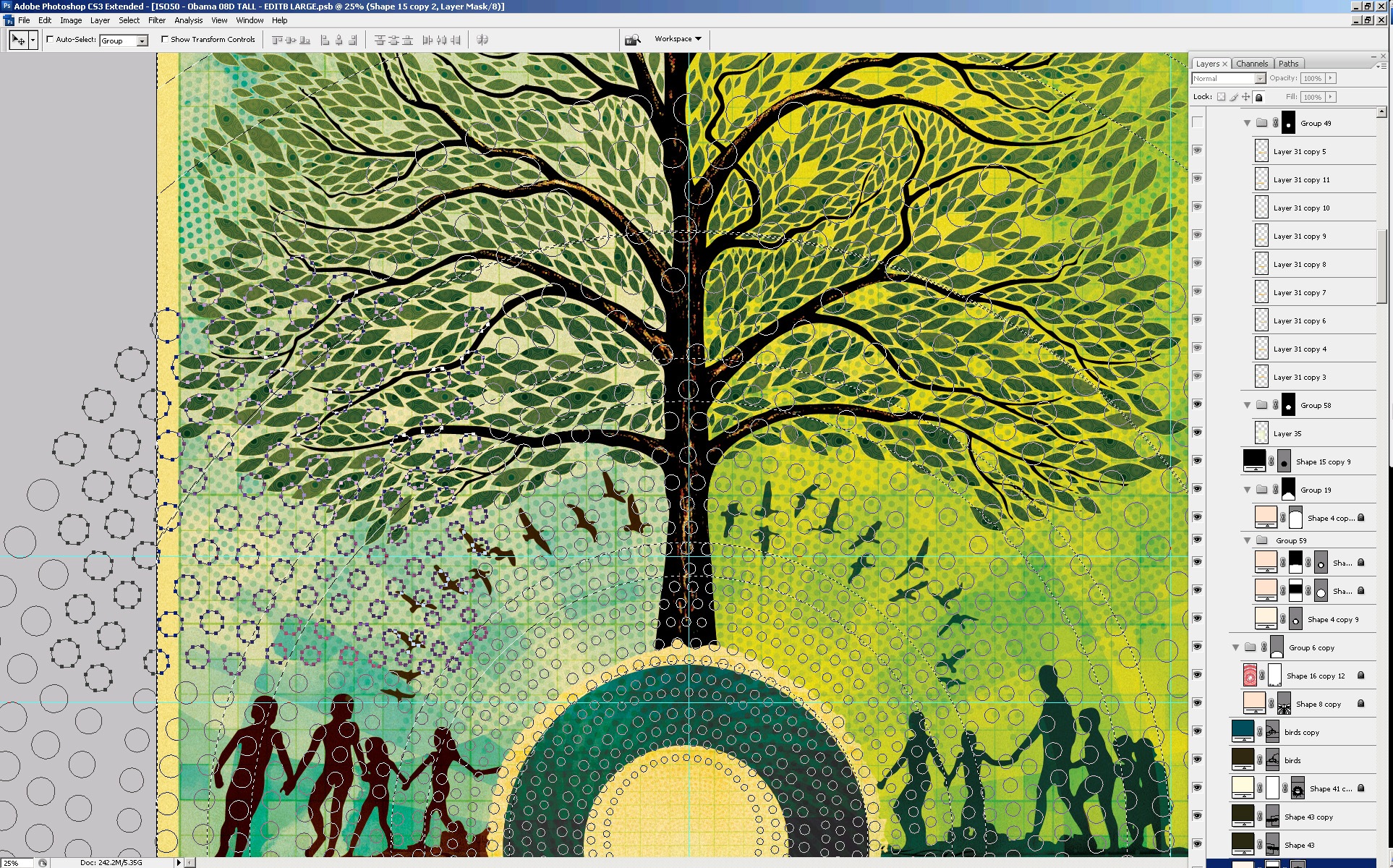
As this was going to be a very complex vector graphic I went straight to Illustrator to create the tree (fig.6a). Photoshop can handle vector but not nearly as efficiently as Illustrator so when you’re going to be doing a lot of moving things around and transformations, it’s best to stick with Illustrator. This ended up being a very painstaking process taking about 3 days to complete. I drew various versions of the leaf and then rotated and resized them to flow into the spaces created by the branches. Once that was complete I pasted the vector leaves as a shape layer in Photoshop. I broke them up into multiple shape layers and changed the colors of each slightly to give some variance and depth.
Once I had the shape layers colorized and laid out the way I wanted them I began the process of detailing and texturizing the leaves. I added various patterns of concentric circles to give some depth to the otherwise solid color of the shape layers. I created a layer mask based on the outline of the leaves over a group containing all of the shape layers so that any elements or textures that I added in this step would only show over the leaves themselves.I also added a lighter stoke outline for some definition.
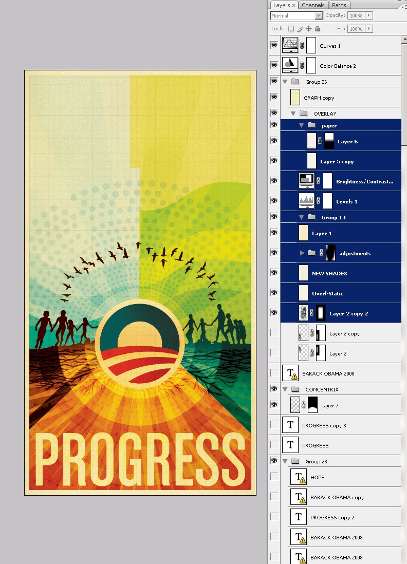
In fig.6c you can see the finished tree detail with the layer palette open. At this point I was getting pretty close to feeling like the image was complete, which was a good thing considering that Photoshop was really starting to slow down; even simple transformations were taking upwards of a minute. It’s a shame how Photoshop begins to break down on very large images even on a very powerful machine. I understand that Photoshop wasn’t exactly designed for this sort of work, but unfortunately it’s the only real option out there.
Detailing & Background
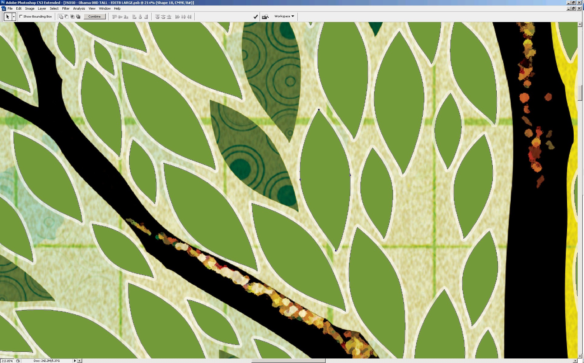
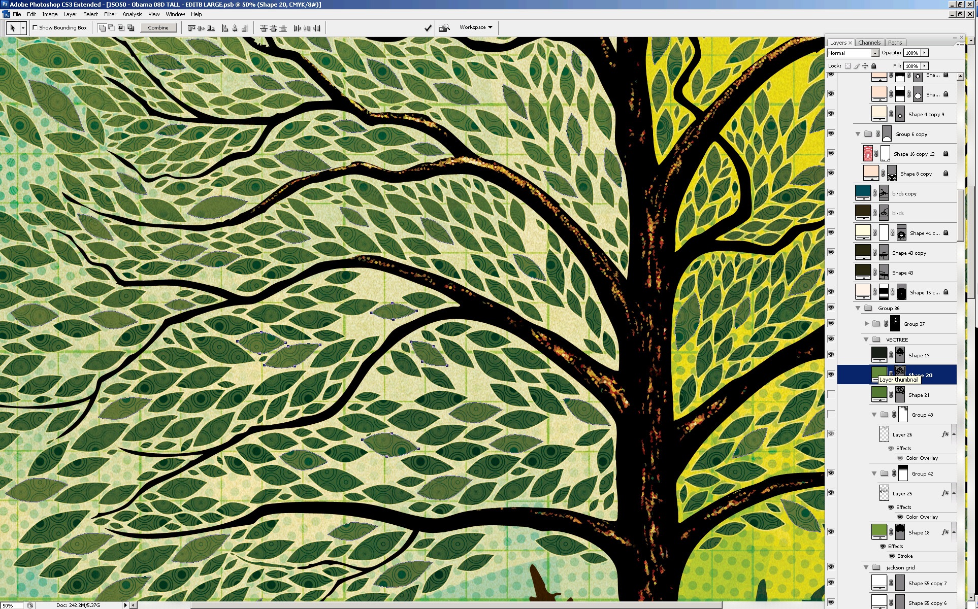
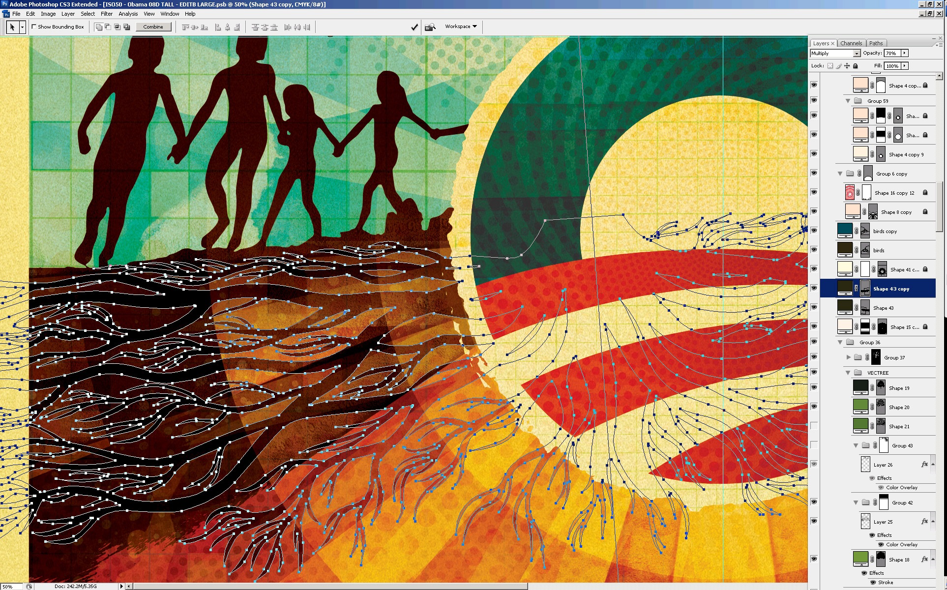
Next up I set about working with the root structure of the tree (fig.7). This got a bit tricky as the roots had to go through areas with different colored backgrounds causing problems with contrast and blending.I ended up breaking them into different shape layers and colorizing each individually. The background detail you see in fig.7 is a result of multiple layers with varying blending modes and color shades.
I did some similar treatments to the various elements that continued across the background of the tree and sky, placing various repeating patterns in different blending modes to lend some depth to the solid fields of color. Most of the layers ended up being in color burn or multiply mode. By combining different overlay modes and stacking layers you can create a lot of depth and color variation, I usually find myself going about 3 levels deep with different textures on each layer and then a base layer with a solid color to anchor it.
Typography
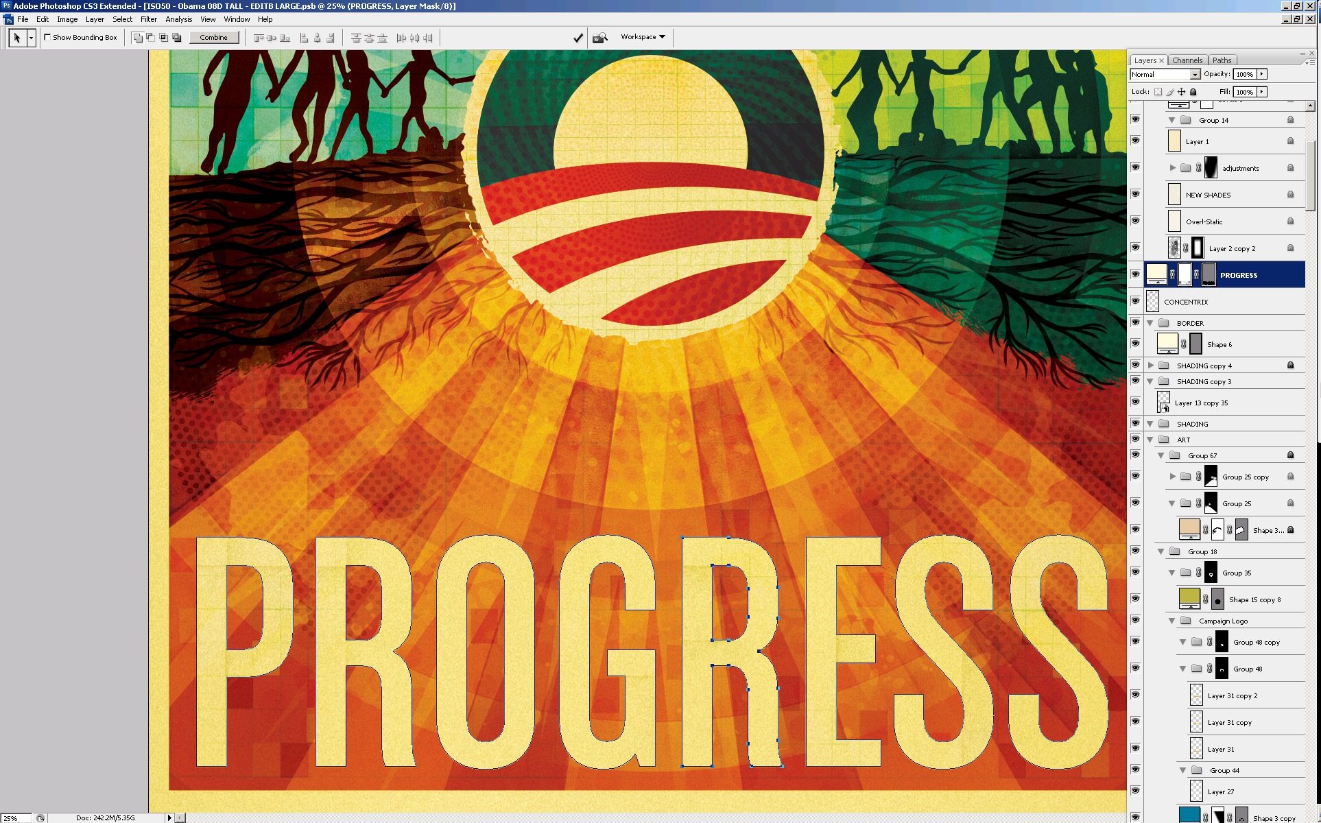
Finally I moved on to the type treatment. For the sake of continuity with the campaign’s own materials and Shepard’s earlier posters, I chose a typeface that somewhat resembled what they had been using. I ended up going with House Industry’s Chalet Comprime which is a compressed variant of their Chalet font. I converted the type to a shape layer to work out the kerning and sizing and created a mask based on the shape (fig.9). I then layered in various paper textures and shading to give the title some depth. It was right around this point that the piece ended up feeling finished, and I say "feeling" because that’s all it is, a feeling; that’s why it’s always so hard to tell when a piece is done, it’s just sort of this sense you get that nothing you could do at this point would improve things. It’s either that or you hit the deadline and in a perfect world you’d get the feeling first, but we all know that’s not always the case.
The Printing Process
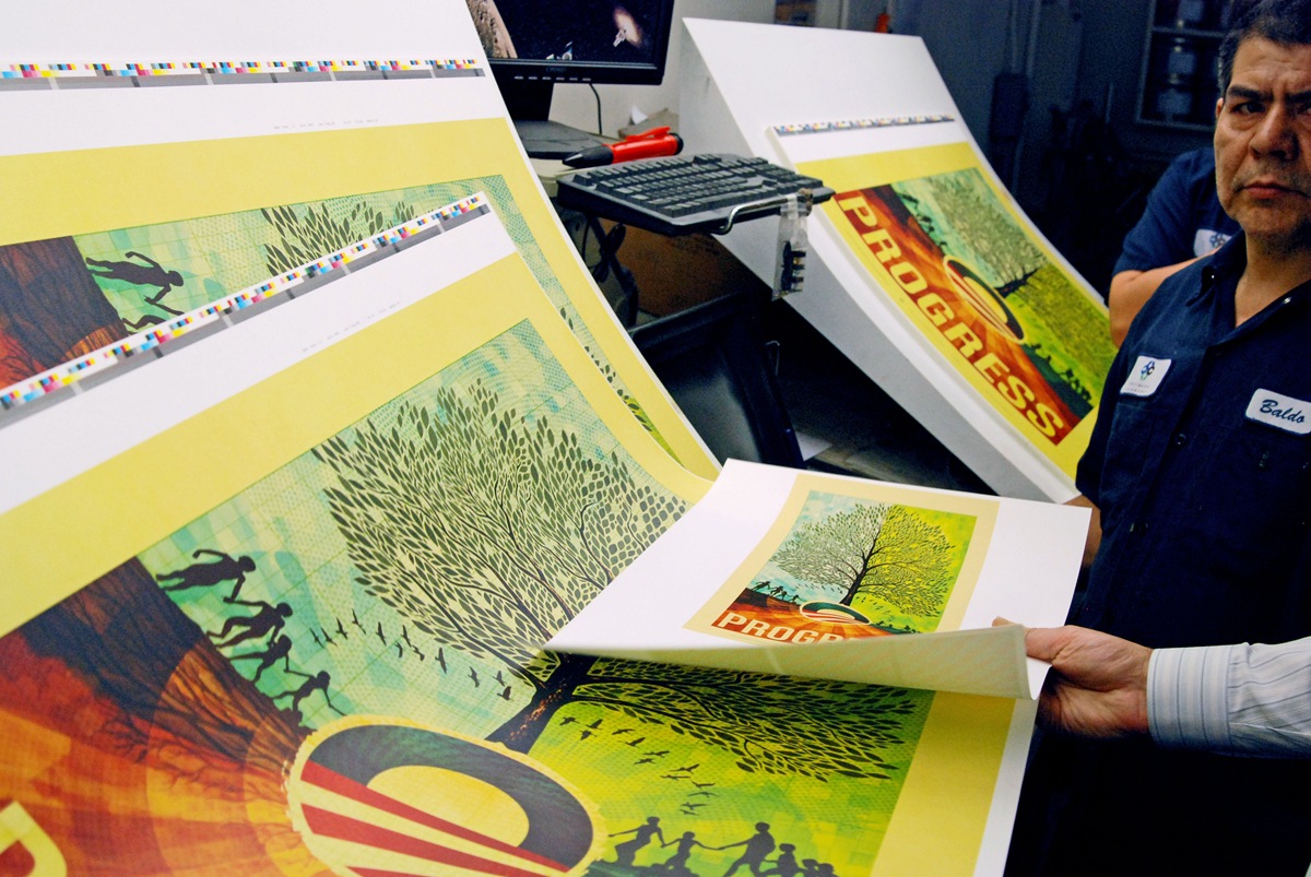
Once I turned in the finished work the campaign flew me down to Los Angeles to be on press at Continental Colorcraft as the poster was being printed. Being on site for the printing helps a lot and saves a ton of time; there are no proofs to mail and changes can be made on the fly. The place was pretty impressive, a bunch of massive warehouse spaces with enormous machines covering the floors.
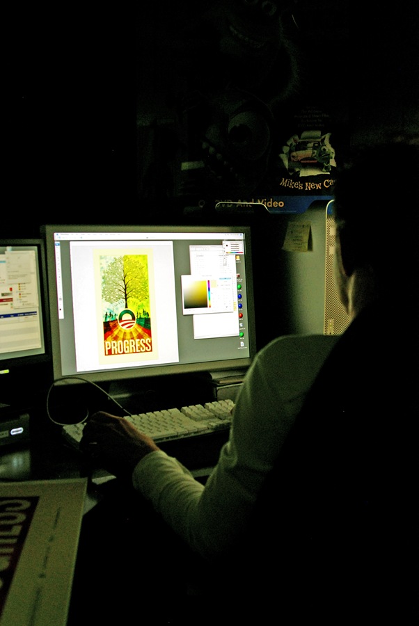
I printed up a proof on the Epson at home to take with me (it’s in the printer’s hand in fig.10). I always find this helpful as it’s really easy to forget what the print is supposed to look like once they start running off copies. It was really nice to have a version that I had already compared to the screen to look at side by side with the press output.
The first run wasn’t very close on the colors so they took it to their pre-press guys to do some tweaking in Photoshop (fig.11). It was pretty interesting how they were able to separate out the various layers from a flattened TIFF file. I learned a lot of color tricks watching them work through the various filters and adjustments,a few I had never actually seen or used before.
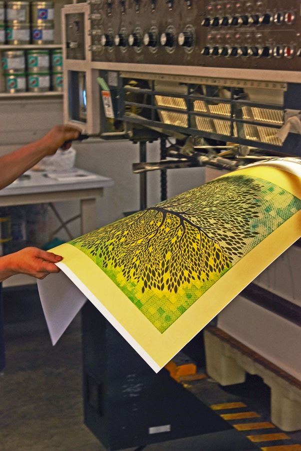
Once we got a solid version worked up they sent it off to etch another set of plates.The plates are large, thin sheets of metal with the four color separations etched into them. The pates are then mounted in the press where Cyan, Magenta, Yellow, and Black (K) are fed to each plate. So essentially the image is comprised of four colors pressed in succession on the same piece of paper. Hence the name, four color process (I know 99% of you are familiar with this but I didn’t learn it until much later in my career so thought I’d share for the few uninitiated that might be out there). At this point they fired up the machines and the prints started flying out, it was pretty impressive how fast they were able to print so many copies. At set intervals the press operator would pull samples and check them against the original proof for accuracy (fig.10, above). All told the printing process only took a few hours. At the end they had five large stacks of prints on pallets ready to ship out.
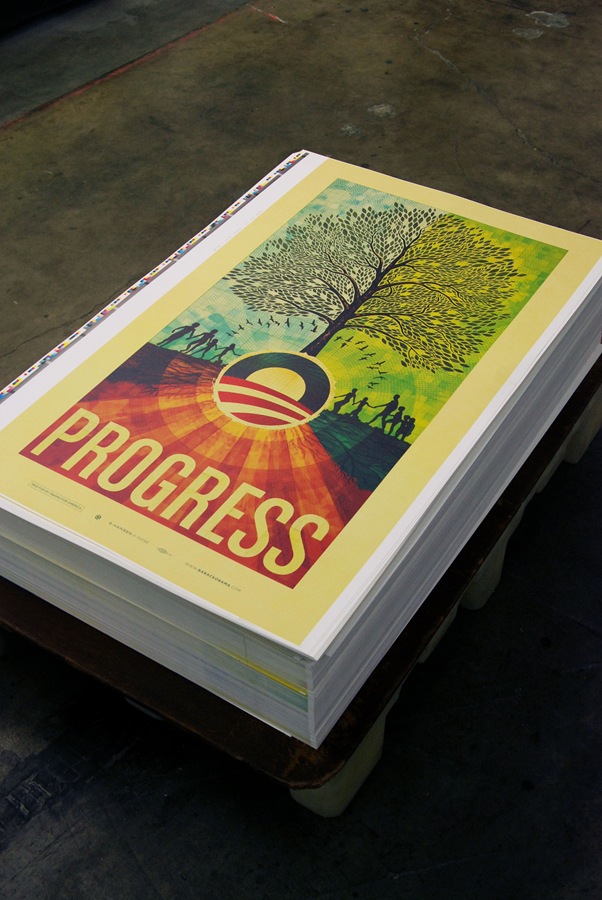
At the end of it all I got to fly home with a tube full of posters and a huge sense of relief that the project was complete and out of my hands.
All in all I had a great time working on the project. This turned out to be a rather high pressure situation so I learned a lot about myself as a designer as I made my way through the various stages. The only stage I wasn’t really prepared for was the release of the print. It’s one thing to release prints to the design community as I have been doing for a while now, but it’s entirely something else to have an audience as broad as the one commanded by the Barack Obama campaign scrutinizing your work. The response was overwhelmingly positive, something for which I am very thankful, but the politically charged nature of the piece seemed to anger some people. This led me to reflect on my motivations for doing the piece in the first place. I have never pretended to be an expert on politics and have always steered clear of espousing my political views, but when you’re facing the potential continuation of a situation like we have endured for the past eight years in this country and you’re given an opportunity to help change that, even in a small way like with this poster, I think you have to take it. Looking back now I ask myself if I would do anything differently with this piece, to be honest I think I would have approached it slightly differently. But hindsight is always 20/20 and given the parameters and constraints of this project I am pleased with the outcome.
Many Thanks to Karl Peterson for helping with the CSS on this article.

127 Comments Leave A Comment
Jan says:
July 8, 2008 at 1:47 pmGreat insights into your working process!
Although it sounds way too normal – considering the great works you’ve done so far. I was expecting at least one or two crazy habits, I think ;)
I also prefer playing around with my first ideas and the composition first in photoshop. But when I’m not gettin forward, I often try to pull back and then do start with pen&paper, to find out what I should be looking for.
Anyway, the result is great and it’s amazing you’re so kind to share some “behindthescenes”-stuff with us. Even the ugly stuff.
Darren Wood says:
July 8, 2008 at 2:10 pmOutstanding! Really enjoyed this post. It’s great to see the process creating something as beautiful as The Obama Poster. Sorry I couldn’t get my hands on one :(
Alex says:
July 8, 2008 at 2:36 pmI like to see the oher side. More photos about the product would have been great.
Here some screen print process we did
http://blog.boxofcookies.fr/post/2008/06/03/Fuck-you
PT says:
July 9, 2008 at 1:24 amGreat post, great insight into the project. Pity it wasn’t available internationally.
Peace. PT
Daniel Carvalho says:
July 9, 2008 at 2:15 amNice article Scott, thanks, appreciate it.
I still have one unanswered question though, I think you were initially intending it to be in the article, about the monitor and calibration. What monitor did you use for this project? I find, a lot of LCD’s have colour fading from the top to the bottom of the screen. If you have for example, I solid mustard yellow colour filling the screen, it would look like it was a gradient.
I’m curious because I’m looking for a new LCD screen and I’ve assumed that you’ve been through this trial before and I could benefit from your experience.
– Daniel
Karl Peterson says:
July 9, 2008 at 2:28 amExcellent post Scott. The layout looks is great :) Wish I could have grabbed one of these posters, but I know there’s more to come.
ed@dupe says:
July 9, 2008 at 2:36 amYou’re a brave man Scott, quite a terrifying process.
Very interesting though. Where to now for ISO50 though?! The only way is up, I’m sure
Mirwen72 says:
July 9, 2008 at 3:47 amWow that was quite a post. For me it was quite interesting because I work completely in different way. I usually start compositing in my mind ( But that involves being calm and completely focused – sometimes it’s impossible but the result is usually very good when it is) or with pencil and paper and after that follows computer. And usually my sketch looks completely different then the result (when not compositing in mind).
It was quite surprising that you didn’t know that much about printing process. But… hey your incredible work balances it quite easily. ;)
Anyway this was a great post with interesting work processes for me
mike says:
July 9, 2008 at 7:42 amGreat post, I always like to hear about an artists process and how they work.
14k says:
July 9, 2008 at 8:18 amHello, can you tell us what printer you use for proof read and color correction? What printer for proof read you recommend for home office? -thanks
Dumitru Tira says:
July 9, 2008 at 8:37 amHey Scott, great work as always. Could you tell us more about the technical aspect of your workflow? For example, you said that the post would be printed 23″x40″ @ 300dpi, what size do you use in photoshop? What is the best method of getting the optimal size for printing stuff like you do?
I’m asking this because some time ago, I made some posters and printed them, at that time I printed them at a small printing shop on a printer that outputs A2 and A3 size posters. All the work was done in photoshop, selecting the approriate size and then cutting-off about 40% of it(the files were getting too big for my poor computer to handle).
Thank you!
Dumitru.
brad says:
July 9, 2008 at 8:46 amScott,
Amazing work. This poster is beautiful. Your concept is displayed wonderfully through your layout, and the color scheme is incredible, as usual.
tim says:
July 9, 2008 at 9:14 amDidn’t you say you worked on a Mac for this poster???
Harley Turan says:
July 9, 2008 at 9:20 amThanks for taking the time to write about the whole process from start to finish, a great read. I’m also interested in how you get your other prints printed, what’s the process for that like?
Harley Turan says:
July 9, 2008 at 9:22 amTim, I think he has Mac OS X installed on his PC, a ‘hackintosh’.
Jason` says:
July 9, 2008 at 9:47 amGreat Poster. Wrong Politician.
Damian says:
July 9, 2008 at 10:13 amHi Scott,
Thanks very much for being so open with you process – it’s always great to get insight into the different ways that creative people work. I’m less interested in the technical side than the creative process, which makes me intensely curious about what changes you might have made in retrospect. Is this something you would feel comfortable speaking on?
Having been a long time fan of your work, and having bought posters from your site, it felt like an added bonus for me when you announced that you were doing this poster. I suppose if I leaned a different way politically I may not appreciate it so much, but no matter what, I think you should be commended for using your talent to try to help the greater good, which is more than most people (designers included) can say.
Many thanks.
david sikma says:
July 9, 2008 at 10:54 amfantastic! thank you for the excellent write up. seeing the way a top notch artist like yourself is a treat!
Jose Espinoza says:
July 9, 2008 at 11:02 amGreat insights and great read. Keep it up!
Thanks for sharing.
Blake says:
July 9, 2008 at 11:05 amI really appreciate the glimpse into your process! Your writeup was wonderful and you are so talented that your article made me feel both like I could make something of that caliber and hopelessly overwhelmed at the same time. I am in love with your work and find it hugely inspirational when I am making my own art. The Obama print turned out beautifully and I wish I could add it to my collection.
Much praise and thanks.
Philip Zaengle says:
July 9, 2008 at 11:11 amgreat post Scott,
It’s always good to hear about another designer process. I’d love to hear about the color tricks they used at the printer. Thanks again.
Horacio says:
July 9, 2008 at 11:23 amThis is so interesting. I almost use the same process when I work (corel / illustrator / photoshop at the same time), but the difference is on the details. You spent so much time creating and looking for details, and that’s how you put out some great works. Very nice!
Great post.
Evan says:
July 9, 2008 at 11:37 amHey thanks so much for sharing this with us!
I found it extremely informative and quite interesting to read. Nice to know that I’m not the only one who prefers to skip the pencil and paper.
I’ve been a fan of your stuff for a while now and have a couple prints hanging in my office. Keep up the great work dude!
joshua says:
July 9, 2008 at 11:46 amThanks for taking the time to detail out the process. Great stuff!
fran says:
July 9, 2008 at 11:49 amwow, great post Scott, im a big fan of urs from Spain, im a graphic designer too. They pay me for trying to copy your works, lol..
Keep on doing such great things, i love ur blog.
I got one question, how the **** do they separate layers from a flattened tiff file? :o
Gracias!!
bobbygrotesk says:
July 9, 2008 at 11:57 amThanks Scott.
Jan says:
July 9, 2008 at 12:35 pm@Daniel Carvalho: I had the same problems with LCD and waited a really long time before I decided to get one – now I have an 24 inch EIZO FlexSan S2431W and there’s no problem with the stuff you mentioned, because it’s a graphic panel. It’s a bit expensive, if you’re a student, but it should last for a very long time and it’s very well calibrated – so it’s a good investment.
steve case says:
July 9, 2008 at 12:52 pm“The campaign approached me earlier this year about creating a poster based on the theme of “Progress” and I decided to take a stab at it.”
Why would you stab progress? Embrace, relish, even embark, but don’t stab!
Matt says:
July 9, 2008 at 1:12 pmI was wandering if it was really necessary to make this poster in 300 dpi. I’ve always heard after a certain size there’s no difference between 150-300, especially with a 23 x 40 size poster. I guess it also depends on the press as well. But with larger prints like this one going down to at least 200 would have brought the file size way down.
What are your thoughts when it comes to this problem?
Jeff says:
July 9, 2008 at 1:25 pmExcellent post Scott! Thanks for the details about your workflow and your creative process from start to finish. I would love to read more “making of” posts about some of your other work. Thanks again for the extensive post. I am a frequent reader of your blog and a big fan of your work.
Thomas says:
July 9, 2008 at 1:28 pm“I’d love to hear about the color tricks they used at the printer. Thanks again.”
YES! PLEASE DO A POST ON THE COLOR TRICKS, SCOTT
Mike Kennedy says:
July 9, 2008 at 1:31 pmI really love the poster and appreciate the insight on creation. It reminds me a bit of Mason Jennings’ Boneclouds album cover.
Jayden Lawson says:
July 9, 2008 at 1:54 pmAwesome post Scott. The final is much bigger than I imagined (we’re not great with estimating poster size in inches in Australia! :). Still wish I could have bought one, just to see the finer detail and composition.
One question – what Epson do you use, and why that printer? I’m in the process of changing printers at the moment, so the advice would be greatly appreciated.
Joaquim Marquès Nielsen says:
July 9, 2008 at 2:51 pmThis is gold right here :) I was expecting to see some hand-drawn sketches though… still, an absolutely amazing peek “behind the scenes”. Thanks man :)
Carlos says:
July 9, 2008 at 4:44 pmI really enjoyed your narrative of the entire process. This is a great treat for those who lurk around your site to actually see your design process.
Thanks for sharing.
Len says:
July 9, 2008 at 4:50 pmAlways great to look inside the mind of a designer. Beautiful work, and a great description of the process. Thanks for this!
TZ says:
July 9, 2008 at 6:59 pmREPRINTS plz!
Bram says:
July 9, 2008 at 10:32 pmGood job Scott, look forward to you sending me a print :P I think they might actually do well in the F13 art store if you’re game. All that’s down there are small copies of your prints, which is why I never picked anything up, waiting for the big ones to drop in :)
By the way, we should chat sometime… not sure if you got my email after FITC Toronto. Drop me a line yea?
Forrest says:
July 9, 2008 at 10:54 pmOne of the best posts from you I have ever read! I just can’t stop staring at that pallet of prints…. What were you feeling when you saw all of them just sitting there?!
I’m with TZ, REPRINT!
Looking forward to more posts like this.
Luis Alves says:
July 10, 2008 at 5:15 amThanks for showing us all the design process!! And by the way, do you usually make your vectors in photoshop?
Greg says:
July 10, 2008 at 8:40 amBram — They’re not selling well at F13. Customers just look at Scott’s prints and put them back.
Jason` says:
July 10, 2008 at 10:31 amThis guy can do my talking for me:
http://www.youtube.com/watch?v=ez5robAWmu4&NR=1
Adam says:
July 10, 2008 at 10:31 amYou are, in my humble opinion, the past poster designer of our era. Hands down. Second place isn’t even all that close. Great to see you worry about the same stuff I do – and also great to hear about someone elses primo machine going slowly once these files start to push a gig+.
Captain America says:
July 10, 2008 at 10:41 am“Customers just look at Scott’s prints and put them back.”
Umm… because its a lame design?
Brent says:
July 10, 2008 at 2:10 pmWas the press guys name really “Baldo”?
luke worley says:
July 10, 2008 at 6:07 pmlove it and look forward to reading the article.
Bram says:
July 10, 2008 at 8:02 pmGreg — Fair enough, I wasn’t aware. I just thought Brandon had a bunch of copies of the ones that are there now. (Don’t let Scott forget about my book please.)
Daniel Carvalho says:
July 10, 2008 at 11:00 pm@Jan
Thanks for the helpful advice. Appreciate it, looks like a sweet monitor. But as you said, pricey, I will have to think long and hard before purchasing it.
– Daniel
Lexor says:
July 11, 2008 at 7:17 amThis is disgusting. I mean, poster’s really neat and all, but what is it about designer’s favoring a conservative christian versus another conservative christian? Please tell me!
Justin S. Meyers says:
July 11, 2008 at 7:29 amLexor-
What in the blazes are you talking about?
Landon says:
July 11, 2008 at 9:32 amReally great to get to peek behind the scenes here, I also thought I remembered you saying you were going to give us some insight in respect to your monitor(s) and color calibration and so on. Perhaps another time.
Thanks for this article.
Kelly Highland says:
July 11, 2008 at 11:21 amThis made a great background on my iphone. haha.. I had to cut of the PROGRESS but it’s still beautiful. Great work and thanks for the insight! I would love for you to give a monitor calibration guide, that would be amazing!
Geof says:
July 12, 2008 at 12:06 pmNice work! Definitely interesting to see what your workflow entails. Pretty sweet to see some insight into the printing process.
mike says:
July 13, 2008 at 2:05 pmthanks for taking the time to write all of this up scott, it is great to learn from your experience!
jefta Varwijk says:
July 13, 2008 at 3:18 pminteresting!!!!!! thank you scott, been reading it with great pleasure!
Matthew Munsey says:
July 13, 2008 at 7:25 pmLoved this post and I have purchased a print off ebay, since that is the only place you can find them now. Really amazing stuff Scott. You are a true inspiration to the design community! It was great to have an inside view of how you went about tackling this project. Thanks for taking the time to share.
Nate says:
July 14, 2008 at 5:24 amGreat post! I always love getting insights into processes and peoples methods.
Anton says:
July 14, 2008 at 6:57 amЭто офигенно. Очень интересно каснуться процесса создания твоих работ, Scott. А даже увидеть некоторые слои:) It`s really really really interesting:)
Darcy Bross says:
July 14, 2008 at 10:33 amLove this post, it was great to get a glimpse of your process. You should really take a look at something like inDesign for your final file assemblies. It imports both vector and raster files quite nicely and outputs reasonably sized sized files as the vector bits remain vector if you are outputting to PDF or EPS. It nicely integrates with PS and AI so you can make changes in those programs and have them show up right away in your inDesign file. Sometimes I hate how much Adobe rules my workflow but they do it so well I don’t really mind that much. I’ve become so comfortable with inDesign now that I’ve even started using it for my initial print mockups and website wireframeing because it is so much faster.
The attitudes in this comment reflect the author’s own and he is in no way compensated by Adobe for them :)
Sherry says:
July 18, 2008 at 12:00 pmHello. I was lucky enough to get one of these beautiful posters from the Obama website. I love it. However, one edge of the poster was not properly wrapped, so it is bent along one side. Is there any way I can restore this to it’s pristine flatness? Thanks.
Claudia says:
July 21, 2008 at 2:53 pmScott…Thank you for sharing your creative process. This is truly a remarkable piece. I immediately purchased your poster from Obama’s website because I admired (and still admire) the overall look of your art. I am mesmerized and still find myself just staring at it sometimes. I was previously unfamiliar with your work and I had no idea about graphic design and the complexities involved, along with all of the details of which you elaborated about in this post. I truly have a better understanding and appreciation for your craft, not just the ‘finished’ work, and I am grateful that you contributed your talents to such a wonderful campaign. I wish you the greatest success in your every endeavor. I regret that I only purchased one poster….would have loved to have given a couple as gifts.
ryth says:
August 1, 2008 at 7:22 pmThis poster looksl ike the tree of knowledge of good and evil to me..People approach the tree from the right in darkness and after encounterfing the obmaa enlightenment they leave in the llight on the right…t he bible says ” do not bow down to the stock of a tree..”” The swarming birds remind me of the fows who come in judgement day to eat the great supper…..He is not the tree of life as some would like tio think..
Dave says:
August 4, 2008 at 3:26 amGreat work. The colours really came together. I would be interested to know more about how this poster angered people and their reaction to it? Maybe you could do a Part 2 of it?
Scott says:
August 4, 2008 at 3:40 amdave-
mix the internet and politics and you’re sure to attract plenty of controversy, even a fair amount of good old fashioned hate. there’s really no need for a whole post on it, just have a cruise through the comments on the original release post: https://blog.iso50.com/?p=1669
Blake says:
August 4, 2008 at 5:22 amBeautiful work!!!! I do appreciate your contribution to this campaign. Well done.
Vlad says:
August 4, 2008 at 5:57 amI really liked learning about the process a little bit. Most of my projects are smaller-scale so I don’t run into the same issues you do, and I usually never have to go in and pay that much attention to detail (my projects usually involve DJ flyers and require more speed than accuracy).
Noel says:
August 4, 2008 at 7:14 amThe print looks amazing… I don’t think I could ever spend that much time on such fine details, but your hard work really paid off because the whole thing looks fantastic.
Nice work. As always. Go Barack! Even though I am Canadian…
The Honest Ape says:
August 4, 2008 at 9:24 amGreat insight. I actually got my hands on a print, before it sold out, along with the Antar Dayal print. Great work man, keep it up.
Abe
The Honest Ape
Roland Glukhov says:
August 4, 2008 at 10:31 amAlways wanted to look, how you work :) amazing print and the idea is just perfect :) Thanks a lot for sharing. Will keep looking at your works and visiting your blog ;)
GB says:
August 4, 2008 at 10:41 amThink its an amazing piece of work.
Not sure I would put that much time and effort into something for a politician though.
Justin Young says:
August 4, 2008 at 11:30 amMusic not politics. If you must say something, attach it to ideals, not a man.
Joe says:
August 4, 2008 at 12:53 pmBravo for applying your talents to this cause. And it IS about a cause, not a man as the shortsighted might see it. Progress is nothing new, it’s just been shoved aside. Thanks for helping to bring it back, and beautifully.
GB says:
August 4, 2008 at 8:49 pmWhat cause? Another harvard graduate who sells golf umbrellas with his name on them, devises strategies based on what ever his focus group tells him gives him the best chance of winning. The whole thing is contrived beyond belief. One big marketing campaign and for what end? Change? Not likely.
If people really care about making a change, give your money to charity over what ever consumer goods your being convinced you have to have and maybe do a years aid work somewhere worth while. But then thats alot harder than going “support obama” on the net and then thinking you have done your good deed for the day in solving the worlds problem while most of the rest of the world haven’t enough to eat or are being blown to bits by our tax dollars.
Joefrey Mahusay says:
August 5, 2008 at 3:06 amI really like the design. Very creative and the design is parallel with the theme “PROGRESS”
Jak Foster says:
August 6, 2008 at 1:34 amHi Scott, thanks for sharing the ‘behind the scenes’ process. It is reassuring to see that you go through the same stresses and elevations as the rest ot of us. I really like the result, as ever your work is inspirational!
Cheers,
Jak Foster
Scotland, UK
Ryan says:
August 16, 2008 at 9:49 pmThanks for sharing your process. It is also really cool to see you use your design process/sensibilities in promotion for such a worthy cause. I’ve purchased two of your posters online and two shirts. This is the best graphic contribution I’ve seen to a campaign that is already visually ahead of the curve comparatively speaking.
jano says:
September 19, 2008 at 12:15 pmThis was really helpful! Thank you. I wonder if you have other similar articles about your previous prints, or if you are planning to post any in the future. Thanks for posting this!
Kevin Brouillette says:
October 17, 2008 at 3:26 pmWOW! I love your artwork, it’s wonderful and for a great cause!
Nate Santa Cruz says:
October 21, 2008 at 12:08 pmHey Scott, thanks a lot for the insight on your process… it was a lot of help on understanding how you do things… lol I never thought such random patterns, like the ones you use, could be so effective. lol
Your good at what you do and you inspire everyone around you.
keep posting articles… they really do help… hahaha
Wolf Vollprecht says:
October 25, 2008 at 4:25 pmHey,
although i really like your work, I think, that the poster is using the same elements than the nazis did… Playing childs and the perfect humans, Obama is just one step before becoming a dictator.
You just don’t have to forget that the germans did like Hitler in the beginning and that he also did speak about change.
But maybe I didn’t got the point :D
Greetings,
Wolf
Dr 007 says:
November 13, 2008 at 4:10 pmScott. Ive also looked to the dreaded Ebay to gt a copy of this print. a few calim to be signed by you. did you actually sign any of the 5000 prints?
Сергей says:
November 17, 2008 at 8:50 amСтиральные машины, холодильники, портативная техника, аудио-видео, варочные поверхности.
Tee says:
November 17, 2008 at 11:02 amHi Scott, Your TALENT leaves me speechless , very creative. I have a question there are people on ebay selling the posters and some have claimed they are signed by you and some claim unsigned and numbered. Can you please advise me if any of these are true.
Thank you
Eric Smith says:
January 15, 2009 at 11:02 amGreat post and nice work, Scott. I really like this poster. I’m curious about the tree you scanned in and wanted to use in the beginning. What are the rules with a situation like that? What made it available for you to use on something like this (copyright issues, etc.)?
ruth says:
March 2, 2009 at 12:34 pmThe tree of life poster is pretty clear to me….It looks like a tree of life but in reality it is a tree of darkness and light, good and evil..And the people who accept thes Wisdom of Barack are enlightened.. As I see it, the whole scenerio is a repeat of the Story in the Garden… We have here an imposter posing as the second coming offering people divine insight but alas like the bad tree in the garden it is satan’s version of enlightenment not of god..
Bill Schober says:
May 16, 2009 at 11:43 amThank you for helping our Nation…and our World!
video42 says:
June 8, 2009 at 4:12 amа ты любится публикуете ролики впроекте?
sandrar says:
September 10, 2009 at 6:16 amHi! I was surfing and found your blog post… nice! I love your blog. :) Cheers! Sandra. R.
angelina jolie says:
September 10, 2009 at 9:15 amI love your site. :) Love design!!! I just came across your blog and wanted to say that I
megan fox says:
September 11, 2009 at 8:43 amSign: umsun Hello!!! rcuwwymhyw and 7369ssgfhphzye and 3868Sorry, what did you mean?? A??
Clean Cut Media says:
September 17, 2009 at 2:16 pmThanks for sharing the process. always interesting to see how others go about creating their designs.
JJ Soteria says:
October 28, 2009 at 11:18 pm“I have never pretended to be an expert on politics and have always steered clear of espousing my political views, but when you’re facing the potential continuation of a situation like we have endured for the past eight years in this country and you’re given an opportunity to help change that, even in a small way like with this poster, I think you have to take it.”
Repeat continuously until 01/20/2013…(The One’s Last Day in Office)…Bush’s fault, Bush’s Fault, Bush’s Fault…
Thank you President Bush for always doing the right thing for this nation, not the right thing for your political party.
celebrity fuck you says:
August 24, 2010 at 11:28 amSign: zdbrw Hello!!! znqgq and 0kqrfqnwxnf and 3951 : Thanks. We look forward to hearing from you again and for your opinions on the world of work.