Design #239
Posted by Scott
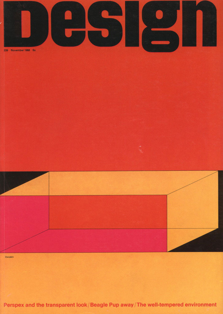
Design magazine Issue 239. Very nice color combo, similar to the Mexico Olympics cover. The cover story reads “Perspex and the transparent look”. Perspex is a transparent glass alternative heavily used in 1970’s interior design. They utilized fluorescent colored Perspex for all sorts of furniture and installations. My neighbor had a lot in his old SF Victorian until they remodeled. Should have snagged a picture before they tore it out. The colors featured in the illustration on the cover of this magazine must have been the common choices, as I recall his were all in these tones as well.

3 Comments Leave A Comment