Nikolay Saveliev: Pop Matters
Posted by Scott


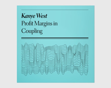
This is f’ing brilliant. Faux-Academic record sleeves by Nikolay Saveliev for Pop Matters. I’ve spent most of my career searching for beauty in design since I’ve neither the mind nor the inclination for conceptual design such as this and seeing an example so well executed always makes me lament that fact. Sort of a minimalist take on the classic Penguin covers. Can’t get over that last one, "The Lactic Euphemism". Wonder if Nikolay wrote the copy as well? And can’t help but be reminded of Joy Division with that Kanye cover.

14 Comments Leave A Comment
Nikolay Saveliev says:
March 16, 2008 at 9:37 pmThanks! Really nice words; I wrote/made/glued all the stuff, it was just a tiny project. We only made like 140-150 of them.
I’ve been a fan of your work since high school, hah! Always good to get a pat on the back from people you admire.
Scott says:
March 17, 2008 at 12:12 amNikolay-
thanks… just had a chance to check out the rest of your work, amazing stuff. I’ll definitely be posting more soon.
Ronnie says:
March 17, 2008 at 8:35 amcool. i’d prefer a different typeface, but cool nonetheless.
Alex / HeadUp says:
March 17, 2008 at 1:50 pmI’ve always loved the idea of “academicizing” things, I used to joke around about having a job as a trashman, and tring to tell people you are the “Regional Director of Municipal Sanitatory Affairs,” or you work as a fry cook and you call yourself the “Territorial Starch Immolation Officer” and such.
This is a very clever and entertaining concept, but where did you get the titles from– they look like they could be either songs or albums (maybe both?)
Scott says:
March 17, 2008 at 3:32 pmAlex-
I think they are all commentaries on the artist’s life or they are playing off song titles / themes. E.g. “Lactic Euphemism” = reference to Kelis’ song “Milkshake”
Gareth says:
March 17, 2008 at 4:39 pmyes, immediately thought of the joy devision cover… which is amazing
Tom says:
March 19, 2008 at 3:39 amPerhaps you are also interested in an article of the german “Spiegel” about the pictograms of Olympia ’72 in Munich.
http://einestages.spiegel.de/external/ShowTopicAlbumBackground/a1515/l0/l0/F.html#featuredEntry
Google-Translation:
http://translate.google.com/translate?u=http%3A%2F%2Feinestages.spiegel.de%2Fexternal%2FShowTopicAlbumBackground%2Fa1515%2Fl0%2Fl0%2FF.html%23featuredEntry&langpair=de%7Cen&hl=de&ie=UTF-8
Best regards for your great work here!
Tom
Chris009 says:
March 22, 2008 at 2:40 pmYes, it reminds me the cover of Joy Division, of course.
And consequently, of the work of Peter Saville, take a look :
http://www.btinternet.com/~comme6/saville/
Lidia Nadezhdina says:
April 18, 2008 at 4:07 amКоленька, я в восторге и горжусь тобой. Бабушка.
Lidia Nadezhdina says:
April 18, 2008 at 4:10 amЯ наконец нашла твой сайт и он мне очень понравился. Ты молодец. Я горжусь тобой.
fdnpluscwm says:
April 23, 2008 at 6:46 pmWow, cool man, big thanks! http://oqbbgvhuek.com