Tampa Airport
 Sorry for the lack of posts this week (thanks Jakub for holding it down), I got back from Florida on monday and have been playing catch-up ever since. I flew Tampa -> Atlanta -> SFO so it was a rather grueling trip as I basically got there, played the show, then turned around and flew home. Thanks to everyone who came out to the show; it was great meeting you all and talking. I also want to apologize for the technical issues. I’m not quite sure what the cause was, but the power on stage was intermittently going out and dropping the sound system, luckily it only went out once during my particular set.
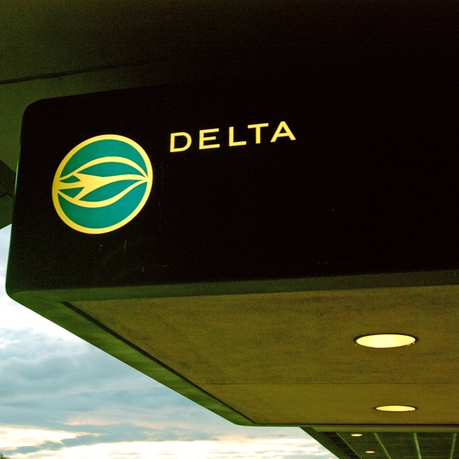
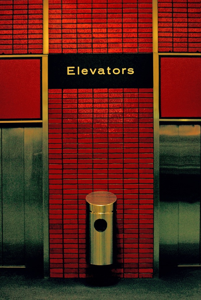
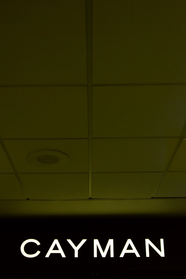
The visual highlight of the trip (aside from the sunset the night of the show which I didn’t have my camera around the catch) was the typography in the Tampa Airport. All of the signage was set in my personal favorite: Trade Gothic LT Std Bold Extended (and look at that logo!). Unfortunately, I dropped my D80 before the trip somewhat crippling it so I wasn’t able to get very good shots. I took a ton and most came out blurry or underexposed. Thankfully, Nikon has a great repair program (which I’ve used many times in the past) which is relatively cheap and quick. So I’ll just have to find a week or so when I can do without my camera and send it in. Or just upgrade…. But given that I just made another major upgrade (more on that tomorrow), I think I need to hold off a while longer on getting a new DLSR.
On a side note: A design student at the show gave me his card (the one with bears on it). I said I’d check the site but when I got home I couldn’t find the card anywhere. If you gave that to me, please drop me the link so I can check it.

19 Comments Leave A Comment
F.A.M.E. says:
November 6, 2008 at 5:27 amI may not be that particular design student Scott…but I am a design instructor…maybe you can have fun with my art.
http://www.gdmworldwide.com
I am also a Graphic Artist/ Musician like you…and I consider yout o be inspiration
http://www.gdmworldwide.com/hwdownload
Jonathan says:
November 6, 2008 at 7:57 amScott, sent you an email with the link. Thanks again, the show was great!
Greg says:
November 6, 2008 at 8:17 amThat Delta signage is KILLER.
neil says:
November 6, 2008 at 8:25 amOh wow. Trade Gothic extended is my favorite too… now there’s a reason to go to Tampa!
On an unrelated note, I’d never heard your music before and noticed just the other day that I had one of your tracks on the Ghostly Swim album, so I played it. Truly incredible, man. It’s exactly the kind of sound I love. So, I’ll be buying more..great work.
Jakub says:
November 6, 2008 at 11:11 amI don’ think the lower case letters of Trade Gothic Extended get enough credit, the “t” “a” & “e” are really strong on simple signage
Dean says:
November 6, 2008 at 12:44 pmLove the TPA logos: leaf or plane-in-a-jet-stream. I happened to see them in person this weekend as well, while waiting for luggage to arrive a few hours late. Nice shots!
Rent says:
November 6, 2008 at 1:44 pmawesome typography…bringing back the fun of airports!
Sonia García says:
November 6, 2008 at 4:11 pmI wrote about you on my blog. Sorry but is in spanish. Thanks for your art!!
And sorry for my english, is horrible.
scott says:
November 6, 2008 at 6:17 pmHmm, I love the font, especially just one word signage, very strong. But i dont think that this example is Trade Gothic Extended. it looks to be slightly more rounded especially when you look at the tail in the a and t.
on a side note, does anyone know when this building was made? i thought you were showing us old photos when i first saw them. really good job processing them!
lol says:
November 6, 2008 at 10:03 pm“But given that I just made another major upgrade”
Yeah, you bought a Mac. Like no one saw that coming!
Daniel Carvalho says:
November 7, 2008 at 4:04 amI really like those photos, especially that Delta identity. I’ve actually just completed an identity which happens to have a very similar vibe.
I wish this style would feature more in modern design, the graphic and architectural features like those characteristic tiles (I am assuming the airport dates back and isn’t a recent development).
Kaila says:
November 7, 2008 at 12:03 pmAwesome pics, got that that typographically kinda 70’s retro feel, like American newpapers still have. I agree with Scott, i don’t think it’s Trade Gothic Extended. I use TG bold (always upper case) quite a bit, and it dosen’t quite feel right.
Scott says:
November 8, 2008 at 4:29 pmjust some clarifications:
– these are recent pics of the airport in it’s current state, taken last week.
– the delta sign is not delta branding. that logo is the standard logo for the tampa airport (it’s on all the carrier signs) and the typeface is the standard airport sign face.
– from the looks of it, the interiors and signage haven’t changed much in a while, I don’t think this is a recent design. it’s hard to tell, but this article seems to point to early 70’s as the point at which it came into it’s current form: http://en.wikipedia.org/wiki/Tampa_International_Airport
scott-
nice call, what is your guess then? I suspected TG but still ran it through whatthefont and it confirmed TG. but we al know WTF is not always 100% accurate.
lol-
wait for monday!
Daniel-
hold off on that mouse purchase! I will do a review early this week.
Bill says:
November 10, 2008 at 6:44 amgotta love the free wireless in the tampa airport as well. it’s a nice place to hange out relatively speaking.
tim says:
December 20, 2008 at 8:43 amI recently moved from Tampa to Gainesville, and I miss my airport already. The Delta “logo” is one of the two airport identifiers — the other is the same logo but in red. It identifies which side of the concourse building the airline occupies.
I love that airport, because it has a very fresh vibe with very 1974 appeal.
David says:
December 20, 2008 at 1:22 pmMy grandmother lived near Tampa when I was little. Every year, we would travel through this airport – I remember all of these amazing iconic pieces. There was some great artwork, too. I remember the early 80’s vibe of the place though – smells of cigars, perfumes and everyone was dressed up to travel, lounging in the beautiful leather chairs. :) Awesome.
Gage says:
January 14, 2010 at 11:58 amI found some fairly interesting information about this here: http://vads.ahds.ac.uk/diad/article.php?title=283&year=1972&article=d.283.28
According to the article:
“The whole system, for interior and exterior signs, uses Architectural Graphics’ specially designed Alphabet A which is based on a German typeface and was re-proportioned to achieve legibility both from an oblique view and at maximum distance.”
Gage says:
January 14, 2010 at 12:10 pmBy the way, I was unable to find any additional information about either “Architectural Graphics Associates” or their “Alphabet A” typeface. I can hardly imagine a more generic couple of names – of course in the 60’s nobody was concerned about “search terms”.