1930’s Interior Architecture Illustrations
Posted by Jakub
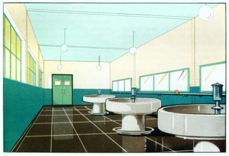
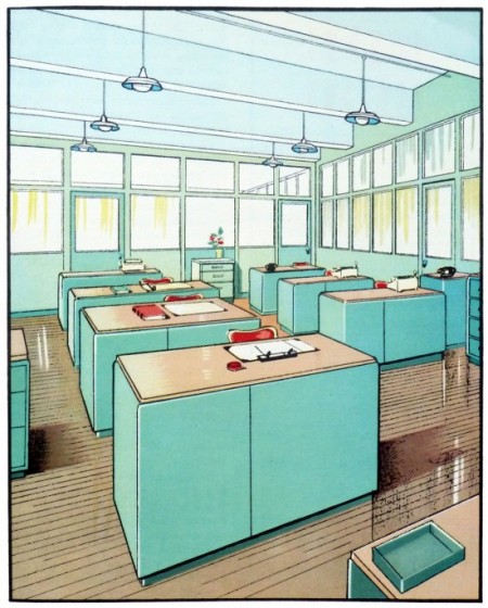
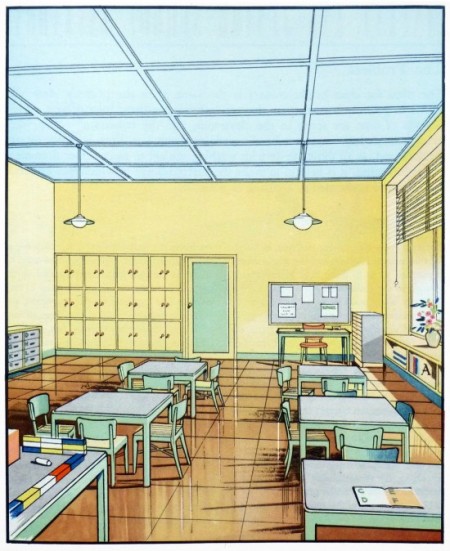

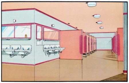
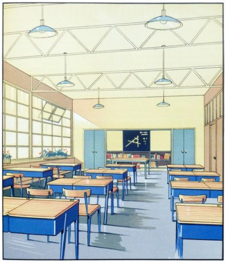
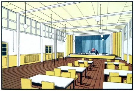
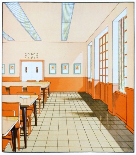
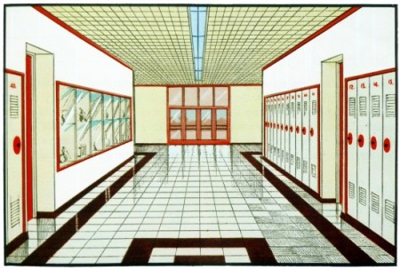
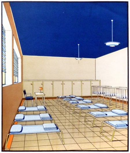
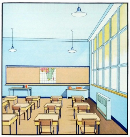
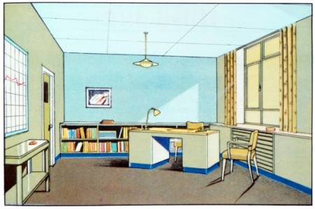
Stunning coloring on these illustrations from the 1930’s, making what some people find mondane very eye catching in my opinion.
“Scans from The function of colour in factories, schools & hospitals; 1930”

9 Comments Leave A Comment
Jake says:
July 26, 2012 at 2:21 amDon’t know why, but this looks Japanese to me :D
Maybe it’s the illustration style…
Tom says:
July 26, 2012 at 2:51 amIt has a cel-shaded feel. It’s lovely
Felipe says:
July 26, 2012 at 3:14 amMan this is awesome! Do you know by anycase where could i find that book? very beautiful!
Michael says:
July 26, 2012 at 10:20 amI can only speak for where I live (England), but regarding the school illustrations especially, it’s actually quite scary how little has changed in the past 80-odd years. I mean, every day on blogs like this we see illustrations of 50’s/60’s/70’s domestic idil that look more dated. I suppose it proves that successful design endures.
Jakub says:
July 26, 2012 at 11:18 am@MICHAEL great point
@FELIPE sadly there isn’t a lot of scans that make it on the internet come with no info.
@JAKE completely agree, damn no info!
Sean says:
July 26, 2012 at 12:57 pmYou’ve got to love the crisp design here. I dig that there are no signs of computers anywhere, save for the typewriters. Digital technology had yet to cast a shadow in these ’30s designs.
Eric Edwards says:
July 26, 2012 at 5:19 pmIts interesting to see this because it is a good bet to think that at the time these were done they looked quite modern, but they have almost the exact look of the extremely out of date and dilapidated classrooms I grew up going to school in… So its interesting to see an architectural style that I thought of as extremely mundane as a kid in the way it was presented in the time when it was cutting edge.
Design + Conquer says:
July 26, 2012 at 5:30 pmIronically an interestingly evocative of the 1980s with the gradients and pastel colour schemes…
Rolland says:
October 2, 2012 at 12:16 pmThat’s what I like about those skates. Mura sad sya’g ski boots and it is very comlrotabfe. Mao jud, ako ra naay helmet. But I’d rather look stupid than end up with a fractured skull. Safety first is my motto.