Jamie Beck: Cinemagraphs
Posted by Alex


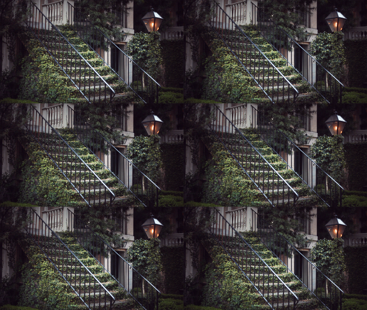
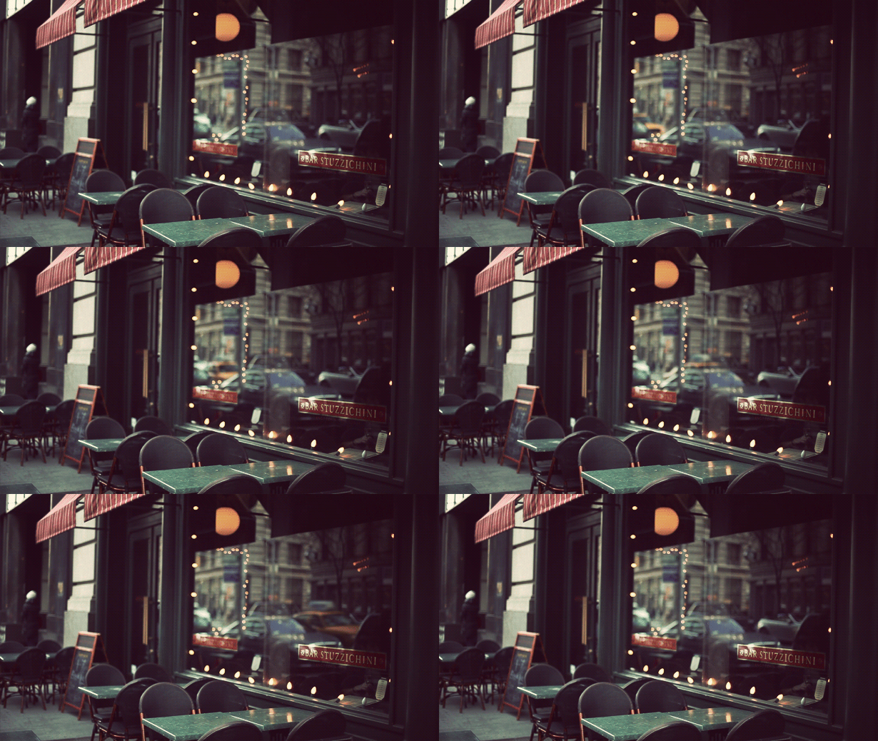
This is my favorite thing on the internet right now. These terrific animated GIFs were created by Jamie Beck, a NYC based photographer. The allure is simple: rather than overtly drawing your attention to obvious movement, these animations are very subtle and controlled.
*Tasteful* I think is right word to describe them. It’s what sets them apart from all the other nonsense GIF animations. The subtlety creates a kind of serenity almost — sort of a halfway point between film and real life. Definitely makes you do a double take the first time you see it.
Prediction: I know animated GIFs are as old as time, but I think soon this subtle spin on the technique will be absolutely everywhere. Enjoy it now.

24 Comments Leave A Comment
Shelby says:
June 17, 2011 at 12:09 pmWow! Totally forgot about these. So well done; such subtle motion that they feel entirely real.
Schroeder says:
June 17, 2011 at 12:11 pmI’ve seen a few of these popping up in photography recently, they have a really nice effect. Here’s another site that’s got some great simple GIFs from films as well: http://iwdrm.tumblr.com/
Harley Turan says:
June 17, 2011 at 12:24 pmYeah, definitely check out If We Don’t, Remember Me. I’d love to know how they’re made, is it just frame-by-frame masking?
mg33 says:
June 17, 2011 at 3:14 pmAnimated GIFS are the silent film of the modern age. There’s an amazing thread of GIF’s over at qbn.com. There are probably more than 7,000 in that thread now.
http://www.qbn.com/topics/354436/
A guy named moldero does a ton of them like you’ve posted here. These are great, but they’re nowhere near as good as this:
http://28.media.tumblr.com/tumblr_lmcgef3ldp1qcr7fqo1_500.gif
Have a good weekend!
Ivan`= says:
June 17, 2011 at 4:15 pmThis is the future of photography.
Treb says:
June 17, 2011 at 5:53 pmA classy illustration of what sets digital mediums apart from the rest. I still feel we haven’t seen the full potential of the web but this seems to be a beautiful example of where we could be heading..
cameron ballensky says:
June 17, 2011 at 6:14 pmI remember seeing this on the Memoryhouse blog-
http://cdn.pitchfork.com/media/Memoryhouse_-_SK.gif
As simple as it is, i think it makes the portrait seem so much more natural than a single static image.
Steve Marsel says:
June 18, 2011 at 2:03 amHere’s my contribution to this new and exciting technique! http://www.stevemarselstudio.com/blog & http://www.stevemarselstudio.com/blog/2011/05/26/cinemagraphs-bring-life-to-photos-on-the-web/
Thanks!!
Steve Marsel
chris says:
June 18, 2011 at 2:58 amNot the same at all but cyriak deserves a nod for keeping the gif relevant: http://i.cr3ation.co.uk/dl/s1/gif/847032b8a331def77529b6a0384db1fe_cowboogie1.gif
Bryce says:
June 18, 2011 at 8:45 amOne site that uses a slightly similar idea (except to disturbing effect – not tasteful and serene) is http://threeframes.net.
web design says:
June 18, 2011 at 8:00 pmlove those masked gifs!
Joseph says:
June 18, 2011 at 11:05 pmThese are dumb. I can’t look at them without also seeing 8-bit poptart cats flying through the sky. The vulgar GIF connotation is ever prevalent.
Nani Marco Mirko says:
June 19, 2011 at 6:44 amincredibile davvero!
un idea geniale e un effetto assolutamente innovativo :D
grazie ISO50Blog
Nani Marco Mirko says:
June 19, 2011 at 6:44 amincredibile davvero!
un idea geniale e un effetto assolutamente innovativo :D
grazie ISO50Blog
Maria says:
June 19, 2011 at 12:24 pmA really nice way to take recontextualize the capabilities of animated gifs. I’m a fan :)
UnderWorld Magazines says:
June 19, 2011 at 6:36 pmI saw this type of images about 2 months ago and was looking to see how to do it. it look awesome
Andy says:
June 20, 2011 at 12:40 aminformation on the fit is good enough to increase my knowledge further
Elaine Cantrell says:
June 20, 2011 at 7:13 amThese images are wonderful. I’ve never seen them before, but I love them.
NAVIS says:
June 20, 2011 at 4:51 pmI dig these a lot but I’m not sure how this is the future of photography. Unless the art of printing completely dies and everyone owns an iPad, then perhaps. Or if some technology is invented that replaces paper and allows for animation.
To me it’s not a photograph anymore. It’s a film loop. Or whatever you want to call it. Although the name cinemagraph suits the art perfectly.
Cool stuff.
Adam says:
June 21, 2011 at 8:08 pmThere’s going to be an extremely fine line between beauty and Limburger with this technique. The first three are sheer beauty, while the one of the woman is borderline cheesy (and a little creepy thrown in for good measure).
Good find!
Rodion Kovenkin says:
June 22, 2011 at 7:06 amLove them.
Craig Rozynski says:
June 24, 2011 at 8:10 amScott, I believe this technique originated with “If we don’t, remember me” http://iwdrm.tumblr.com/ The artist is anonymous as far as I can tell, but I’ve been enjoying his/her capture of famous cinematic moments for a long time now.
Craig Rozynski says:
June 24, 2011 at 8:12 amLooks like SCHROEDER beat me to it.
Martin says:
July 14, 2011 at 7:07 amI am wondering if these masks are exported frames from (hd) video footage or achieved by single photo exposures.. real video, isn´t it?