Swiss Holiday House
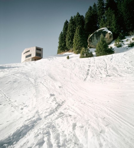
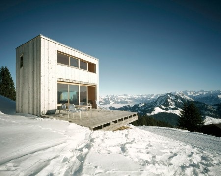
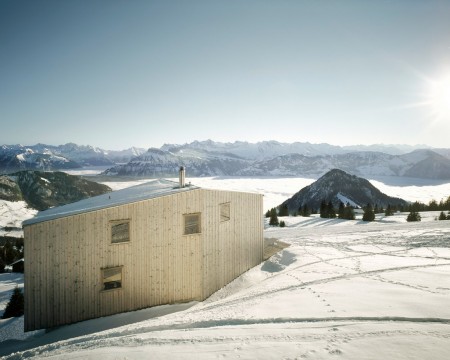
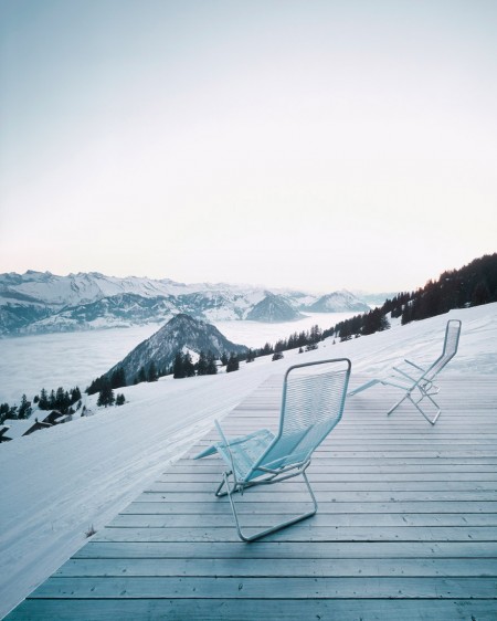
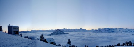
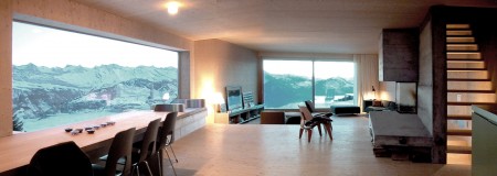
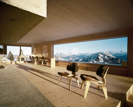
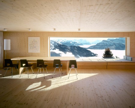
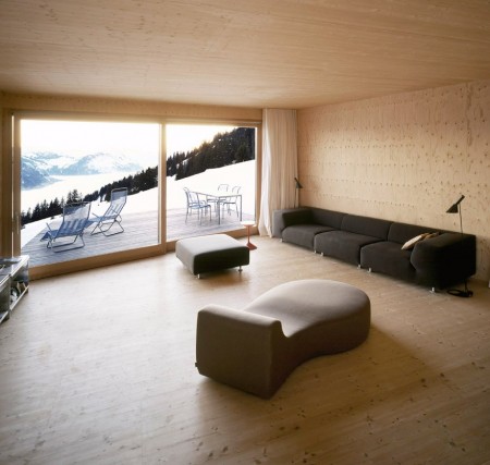
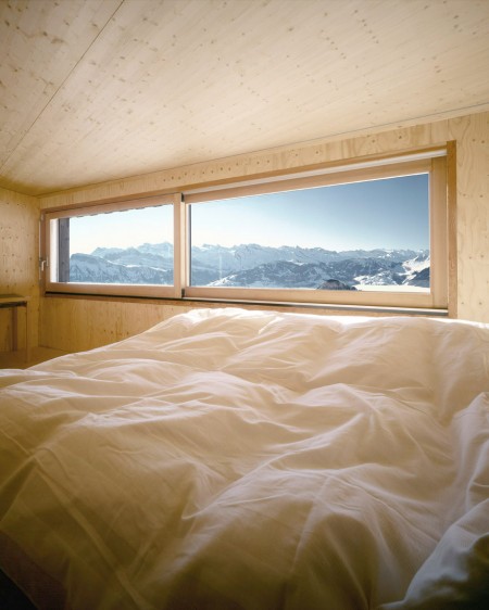
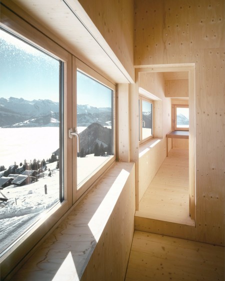
Houses like this one outside of Rigi-Scheidegg, Switzerland just make my jaw drop. The view is simply stunning. There is nothing like being able to look out above your neighbors’ houses, through a 5-meter long window or in the lawn chairs on the deck and still see a mountain range with snowcapped peaks every morning. You just couldn’t ask for a more beautiful view.
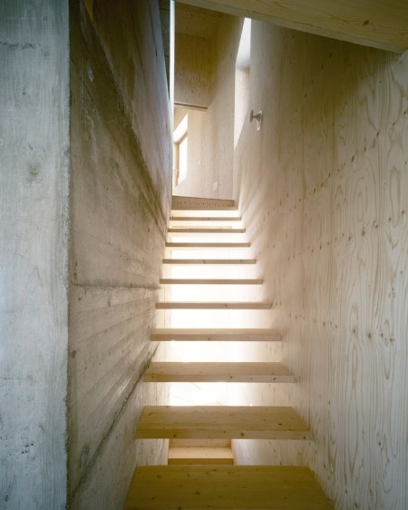
Parts of the house utilize a lower ceiling to help give it that mountain hut vibe. It’s also helped by the cement and wood combination, giving a super raw feel. It’s almost too raw which doesn’t make the house feel all that comforting. A little interior flare would warm it up and make it more welcoming. Perhaps some deer head mounts on the wall or large floor rugs would do the trick.
Found in the archives of Arch daily.

34 Comments Leave A Comment
MATTHEW BUTLER says:
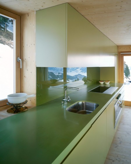
July 14, 2010 at 7:37 amNot sure about the green kitchen but everything else looks amazing! I WANT ONE!
Matthew Tellier says:
July 14, 2010 at 8:50 am**NERD ALERT** That first pic looks like the scene in Star Wars when the Jawas’ Sandcrawler stumbles upon C-3PO and R2-D2 on Tatooine.
Shelby says:
July 14, 2010 at 8:58 amIt seems like a lot of the architecture I see has one thing that I don’t care for and that green kitchen is that thing.
@Matthew Tellier — I totally thought the same thing. It looks like the body of the Star Wars AT-AT: http://www.comparestoreprices.co.uk/images/re/revell-star-wars-at-at-kit.jpg.
Jonny says:
July 14, 2010 at 9:39 amthat house would be so amazing for a studio bit out of the way but just that view would inspire you
Scott says:
July 14, 2010 at 10:20 amI’m crying on the inside.
Mitchell says:
July 14, 2010 at 10:24 amWOW!!
tea says:
July 14, 2010 at 11:10 amow.my.god.
while i am sweating from all this sun,
snow is something so outstanding to see now.
and specialy and that beauty of a house <3
is amazing while its so bright through sunny day,
but i wonder how it looks in deep cold winter days:D
Christopher says:
July 14, 2010 at 11:16 amRidiculous. So good it hurts.
@Tellier – that’s hilarious; I vaguely thought the exact same thing when I saw it but it didn’t make it to the surface. Well done.
Nick says:
July 14, 2010 at 12:10 pmI really don’t think it looks raw at all Shelby, adding any clutter and noise to the walls would go against what this architect was aiming for. The style that this architect shoots for is minimalism. This style is great for its landscape and surroundings. The landscape of this plot is what? White, snow, blank, its a minimalist house on a minimalist landscape. Although the minimalism in this house serves perfect contrast to the Swiss mountains in the backdrop. What are the mountains? They are full of details, full of line. Specifically line that is not uniform or tame. The architect’s design of this house serves with perfect contrast to the mountains. The lines are uniformed, square, straight edged. It’s the reasoning as to why there are no round windows, no spiral staircase, and especially; no mounted animals (natural and full of nonuniform lines).
Shelby says:
July 14, 2010 at 12:29 pm@Nick
By raw I’m merely mentioning the cement and wood being in its natural state; not yet processed.
As for adding elements to the interior, almost anyone who would live in this house or stay there momentarily, would add objects to the home. Be it dishes, clothes, travelling bags—really any objects that a person would bring into the home, would make it more welcoming. My point is in that.
But sure you can argue that its no longer “true” minimalist, but I personally would add a few elements for my own sake, “true” minimalist in mind.
The inclusion of the deer head was more so sarcastic.
Christof says:
July 14, 2010 at 1:19 pmLove those panoramic windows!
Mark C. says:
July 14, 2010 at 1:26 pmLove this!! The view is breath-taking. I’m particularly fond of the expansive layout and the simplistic, yet modern lines. I *would* however, change the color of the kitchen; navy blue perhaps, for a punch of color!
mp says:
July 14, 2010 at 2:25 pmLove the location, but not so much my style. Very minimal. I have fond memories of more traditional chalets.
Cory Gibbons says:
July 14, 2010 at 2:36 pmwow.
Lucas says:
July 15, 2010 at 2:06 amYou are all crazy. I love that green kitchen!
golden nos says:
July 15, 2010 at 5:29 amplanning to spend my honey moon there.
Alex Key says:
July 15, 2010 at 8:02 amAaaahhh that window with the panoramic view of the mountains makes this place worth whatever amount of money it took to build it. Seriously, the stuff of dreams.
Simon says:
July 15, 2010 at 5:59 pmThe pizza delivery guy is gonna be pissed.
nevsum says:
July 15, 2010 at 11:16 pmThis one belongs on http://unhappyhipsters.com/ Whether you like contemporary/minimalist architecture or not this website is pretty funny. As for this house- great view but not where I’d want to stay on a cold winter’s night.
Patrick says:
July 16, 2010 at 9:53 am..agreed, I think its better as a banquet center or something more business oriented than home sweet home
Patrick says:
July 21, 2010 at 6:15 amIs it me or does anyone else hate the chairs? They remind me of something in a high school library. Love everything else. Outdoor fireplace would be perfect. No real common area for people to gather, and you know, face each other. But I see how this would be a great place to seclude or bring a female companion. I think some more color would be nice while preserving the minimalist feel. By the way, where is the ski lift? I want one going from my house to the mountain and back. Otherwise no deal.
John says:
July 22, 2010 at 2:57 amAs a skier, i have fallen in love. Wow!
zach says:
July 23, 2010 at 11:29 am@Tellier
yes i see it omg im coughing
john says:
July 29, 2010 at 8:20 pmlove it!! i have fallen in love. Wow!
Boris Müller says:
August 19, 2010 at 6:47 ami used to live in switzerland, so i sent this to my dad and he was like “yeah we used to go up there when you were small, you’ve skiied that mountain!”
apparently there are a lot of houses like this one springing up in switzerland. as usual they’re not affected by the global slowdown it seems.
Shelby says:
August 19, 2010 at 10:16 am@Boris, that is very cool. It’s a shame you don’t recall going up there.
Pegasus says:
August 25, 2010 at 1:29 pm@Tellier. Yes! Hilarious. (And it may explain the low ceilings.)
re: stark look. Like most architectural photo series, this one was shot after the site was cleaned up, but before people moved in. It’s kind of a blank canvas, which I’m sure was cluttered up a bit with the detritus we tend to bring with us into our dwellings. Once the owners moved in, I imagine a few pictures or ornaments made their way on to walls and shelves … maybe even a tastefully mounted head or two, which actually wouldn’ t look that bad, in my opinion, against all that plywood wallboard.
Rana Khoder says:
October 19, 2010 at 3:42 pmAbout the shape of the house it is somehow strange. But I really like how the architect connect the outside of the house with the inside, by make the outside setting area, it really connected the house with its surrounding. Also I like the large windows which help the sun light to enter the house.
Dina Al-Suwaidi says:
October 20, 2010 at 1:11 pmThe building is in a significant location and its design matches with the location. The view is astonishing and it adds a dreamy look to the building. The style is very simple and there are few subdivisions. The idea of the terrace is incredible in this building.
Arne says:
November 15, 2010 at 7:32 pmNothing like the decapitated heads of dead ungulates to warm up that Modern architecture… I hope that was supposed to be sarcastic.
giuliaci says:
November 17, 2010 at 5:48 amlove