ISO50 Madrone Studio Giclee Released
Posted by Scott


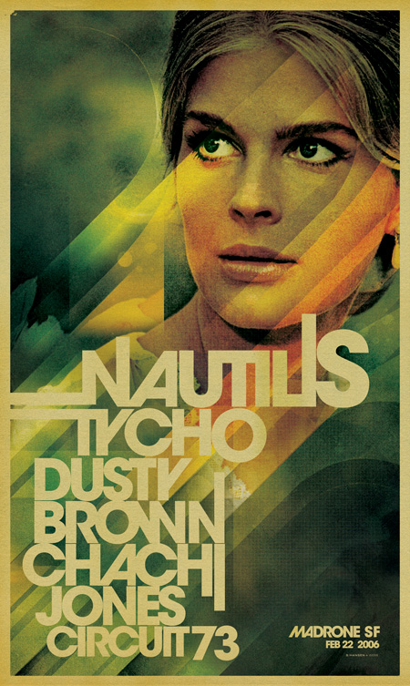
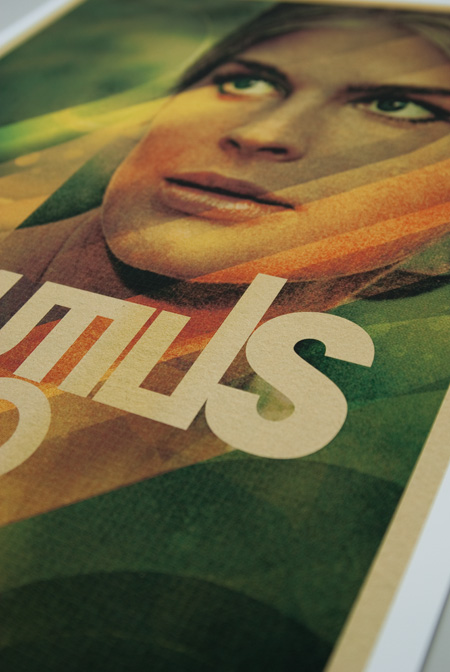
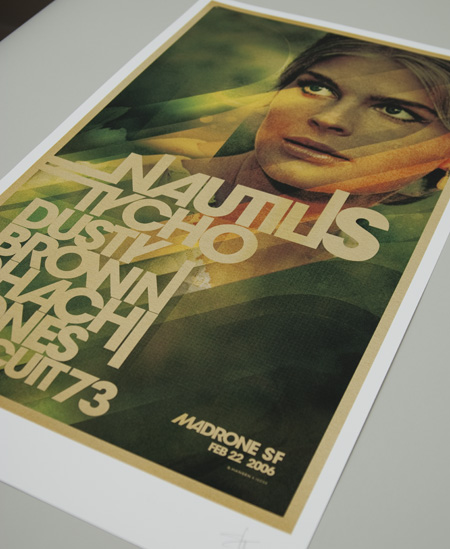
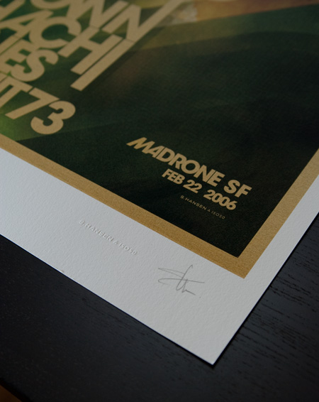
ISO50 Studio Edition #008, Madrone, is now available through the ISO50 Shop. This print features updated artwork from the original poster for the Madrone show in San Francisco. Four limited edition formats are available: 14×24″, 18×30″, 24×40″, and 36×60″. All are printed on Hahnemühle German Etching 310 gsm (120# cover, 100% alpha-Cellulose white mould-made) using the Epson 9900 10 color UltraChrome HDR™ pigment-based ink system.
You can view the Madrone print here and view other Studio Editions here.


26 Comments Leave A Comment
Imar says:
May 25, 2010 at 2:11 amWow, it looks REALLY good.
I think you may have discussed this before, but what’s the story behind the design? Who is the woman on the poster? Where is the photo from? Also, how has the artwork been updated from the original?
Thank you!
Nate says:
May 25, 2010 at 8:10 amScott, looks fantastic. Gear head DBag question: Where did you pick up the custom one line embosser?
Ian says:
May 25, 2010 at 9:19 amI’m gonna add this to my list of things I would buy if I didn’t have to spend money on food and rent.
Frank says:
May 25, 2010 at 9:23 amScott,
I know going through the store is perhaps the best option, but do you know of any brick and mortars that sell your Merch in NYC or San Fran?
Thanks!
MMC says:
May 25, 2010 at 9:24 amThis has always been one of my favs. Great work, Scott.
Jakub says:
May 25, 2010 at 9:39 amYESSSSSSSSSSSSSS!
Andy W. says:
May 25, 2010 at 10:03 amStill hanging on my wall!
Mat MacQuarrie says:
May 25, 2010 at 10:04 amI’m so glad this is finally available in the sop. This was my favourite print until you came out with Analog Visions.
Alex says:
May 25, 2010 at 10:29 amIt’d be great if there were a version without any copy, but this is good too!
mg33 says:
May 25, 2010 at 10:44 amI love all the Tycho posters, but I would love to see some pure imagery prints somewhere down the line. I’m a huge fan of the Tycho music, but it’d be great to have an incredible print on my walls that didn’t reference a band or show and was just a kick-ass print in your style of photos/artwork. THAT is something I would gladly pay money for.
Some Guy says:
May 25, 2010 at 10:52 amI picked up the largest size…..will post pics as soon as i get it back from the framers.
Jakub says:
May 25, 2010 at 11:03 amSome Guy –
please do
Some Guy says:
May 25, 2010 at 11:23 amwill try to squeeze in the ducati in the living room. Kind of douchy…..but still so much fun.
Matt Davis says:
May 25, 2010 at 11:57 amMy favorite OG ISO50 print.
I’ve always wanted to see this one at a larger size. I like the way the type helps frame and balance the image, but would still like to see an option that focuses more on the image.
Kevin says:
May 25, 2010 at 11:57 amI’ve loved this poster for a long time now. Glad its available again!
Adrian T says:
May 25, 2010 at 12:42 pmAlso my favorite!
@1Imar
Scott has mentioned it before but the girl is a very young Candice Bergen from an early 60s copy of Newsweek, where she appeared as an “up and coming” actress.
Mark C. says:
May 25, 2010 at 1:39 pmThis is pure BADASS–I *love* this piece, man! It reminds me of one of those old cigarette ads in magazine from the 1970’s. Great job!
Some Guy says:
May 25, 2010 at 1:55 pmi like the photography base, versus the graphic base of some of my other favorites.
mg33 says:
May 25, 2010 at 1:56 pmCandice Bergen! LOL
Jakub says:
May 25, 2010 at 2:57 pmMurphy Brown!
Tardlovski says:
May 25, 2010 at 3:20 pmshe was mad hot back in the day…
i’m probably the only one, but i would like this sans the type.
Alan LeBlanc says:
May 26, 2010 at 12:44 amMy favorite
Mikael says:
May 26, 2010 at 6:28 amThis is one of my favorite designs. I have the poster and it looks great, would love to get the Giclee version but I already purchased the Ghostly International print and one only has so many walls to put things on.
Christof says:
May 26, 2010 at 3:47 pmI’ve always loved this poster. It may, in fact, have been the startling image that instantly lured me to the ISO50 blog a few years ago. One day I want to have this poster at 36×60″, and build my future living space around it.
Devan says:
May 27, 2010 at 11:47 pmJust curious if you print in house or do you go some where to hve your work printed?
Wotsie Pebber says:
June 14, 2010 at 7:02 pmHate to say it, but this design looks extremely dated at this point (and not in a good “retro” or “vintage” way). You should’ve left it in the past where it was.