Top 3 Logos / Alex

I am usually reluctant to list my favorites of anything. It’s hard to establish a consistent criteria with which to judge all items fairly, and even if you do, the list changes so frequently that it’s pointless to commit it to writing. My one exception has always been logo design, and Scott’s recent post got me thinking about it again. For as long as I’ve been interested in design I have always maintained the exact same favorite logos. They aren’t necessarily in any particular order, but the three pictured above are far and away my favorite marks of all time. I’ve never been satisfied with logos that gain their strength over time or with gradual brand association; for me, a successful mark works right away.
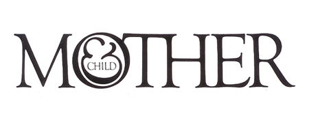
Mother and Child by Herb Lublin
The immediate cleverness of this one is probably what is most attractive to me. I remember staring at it for about five minutes the first time I saw it in the back of Area. I couldn’t believe how at once simple and wonderfully complicated it was. The ampersand has always been my favorite symbol, so to see it employed so unusually was also very exciting.
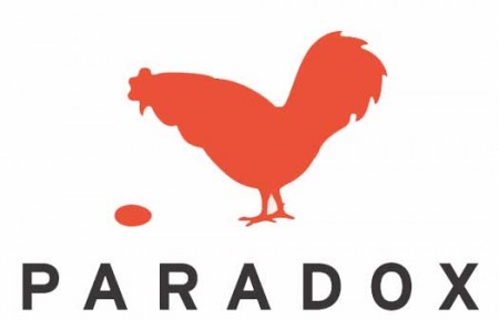
Paradox by Christopher Simmons
Another perfectly clever image. It needs no explanation and the “aha” moment occurs instantly. I’m still impressed how much wit was able to be squeezed into one tiny little mark. Like many great logos, it appears incredibly simple and seemingly obvious, but only after it’s come to fruition at the hand of another designer.
Modest Mouse by The Decoder Ring
What a perfect single image. This is one I can’t look at without feeling incredibly jealous for not thinking of it first. It encapsulates so many different feelings and emotions in one single mark, while still managing to be aesthetically pleasing at the same time (though I can’t stand the colors). The designer sums it up nicely: It’s an idea I came up with because it represents stasis — the balloon will never go up or down. It’s just a general feeling I have about everything: Every time we seem to cure or solve something, another problem pops up.
Of course there are many other wonderful logos out there, but this is a top 3 after all. List yours if you can think of them!

8 Comments Leave A Comment
Alex / HeadUp says:
March 30, 2009 at 7:14 amI worship Lubalin like a god…love that logo. He did so many nice logos, and his process is pretty interesting too.
Jeff says:
March 30, 2009 at 9:29 amI’m surprised at your top three. I guess if this is the space where you live, getting back to the basics and going minimal is where the gold is.
NAVIS says:
March 30, 2009 at 11:43 amI keep trying to think of my favorite logos but I’m having one of those moments where my mind is completely blank. So annoying.
But the Modest Mouse logo reminds me of one of my favorite quotes from the movie Blow:
“When you’re up it’s never as good as it seems and when you’re down you think you’ll never be up again.”
Bijan says:
March 30, 2009 at 12:09 pmLubalin is amazing, love his magazine design for Fact and Avant Garde.
Alex / HeadUp says:
March 31, 2009 at 8:28 amNothing from Paul Rand btw???
Zach says:
March 31, 2009 at 2:04 pmThe mother and child logo is one of my all time favorites as well.
I came across this similar logo (though not as clever/elegant) on ffffound:
http://ffffound.com/image/09541421889fb641172c014d9b5660e115069af4?c=2822594
Sean says:
August 13, 2009 at 10:28 amThanks for sharing these Alex.. weirdly I was just looking through Area yesterday and was drawn to Lubalin’s logo. It’s interesting that it was never used.
I’ve always loved Michael Schwab’s NPR logo. Although not especially clever, I think it captures the feeling of paying homage to the continued craft of credible journalism.
http://www.michaelschwab.com/logos/images/npr.gif
Regemite says:
October 25, 2010 at 2:29 pmMy favorite is not the actually logo itself, but the evolution of the U.S. Postal Service eagle logo. Over time, the eagle has become more aerodynamic to cope with a growing society and implicate speedy service.
Also, check this out; it’s pretty funny:
Top 13 Worst vs. 13 Best Logos
http://scarletbits.com/2010/top-13-worst-vs-13-best-logos/