1971 – Reprinted

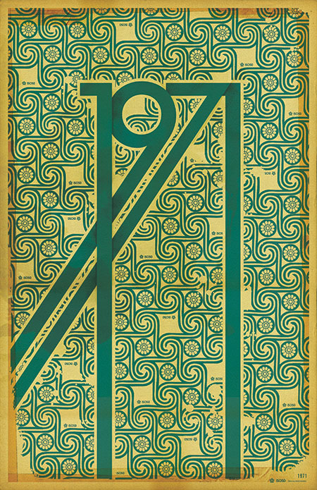
The 1971 Print has been reprinted and is now in stock at the ISO50 Shop.
A lot of people have asked me what the significance of the year 1971 is (no, it’s not the year I was born). Hunter S. Thompson’s “Fear and Loathing in Las Vegas” first appeared as a two part series in Rolling Stone magazine that year. Wikipedia sums up the main theme of the book which was based on these articles:
“It explores the idea that 1971 was a turning point in hippie and drug culture in America, when the countercultural movement no longer had momentum and its innocence and optimism of the late 1960s turned to cynicism.”
This print sort of juxtaposes the design ideals of the 60’s: the earth-tones and swirling, psychedelic, patterns; with the harsh, solid forms of the gothic lettering.
Oh, and also 1971 just looks badass all stretched out like that.

6 Comments Leave A Comment
michael j. says:
October 17, 2007 at 12:23 amfuck yeah it looks badass. it also reminds me of some of these beauties: http://www.vintagewallpapers.be/collection/wallpaper/?offset=0
Ed says:
October 17, 2007 at 9:08 amI love after all the technical explanation the true reason comes out. It’s does look badass stretched out like that.
Scott says:
October 17, 2007 at 5:34 pmEd-
yeah man, cause at the end of the day it’s all about making something look good. You build your meaning into it, but everyone who looks closely is going to get what meaning they personally want out of it, and the more visually striking you make something, the better chance of that happening.
greg says:
October 25, 2007 at 11:57 amLove it! And it’s my birth year as well…
Your work amazes me in general. Cheers!
-Greg
greg says:
October 25, 2007 at 12:26 pmBTW, any chance you’ll be doing this design on a t-shirt in the future?
If you do, consider one already sold. ;)
John says:
November 18, 2007 at 1:48 pmHi, there!..7d3b084308d33ed32324018b9f72177d