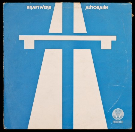
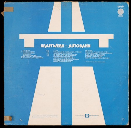
Kraftwerk Autobahn Sleeve
Posted by Scott


Hard Format has some great shots of and original 12″ sleeve for Kraftwerk’s Autobahn (the brown tape just makes it that much better). This has to be one of my all-time favorite covers; I cut a picture of it out of Rolling Stone and had it on my fridge for years, but if I had this is would be framed in the middle of the room. What are some other great minimalist sleeves? Link them in the comments.
Source Hard Format

27 Comments Leave A Comment
Norman says:
September 20, 2010 at 3:36 pmsmell the glove: spinal tap. ;)
Bryce says:
September 20, 2010 at 3:53 pmWhoa. That’s way better than the reissue.
I’ve always been a big fan of the original Music for 18 Musicians sleeve:
http://4.bp.blogspot.com/_pw9QK4mGtiI/S92Ov0ABb9I/AAAAAAAABPg/VH4sDhwTvjc/s1600/musicfor18musicians.jpeg
han valen says:
September 20, 2010 at 4:15 pmhttp://en.wikipedia.org/wiki/File:Van_Halen_-_Diver_Down.jpg
patrick says:
September 20, 2010 at 5:28 pmThe Persuasive Percussion album cover comes to mind.
http://en.wikipedia.org/wiki/Persuasive_Percussion
turns out Josef Albers did it.
the entire Persuasive series is minimal goodness.
Akzidents says:
September 20, 2010 at 5:32 pmLast but not least, MGM Records sleeve with more circles in multiply (someone should make a book or a movie about them)
via http://crossedcombs.typepad.com
Akzidents says:
September 20, 2010 at 5:35 pmmmm, here are the links
http://crossedcombs.typepad.com/photos/uncategorized/2007/11/17/pye.jpg
http://crossedcombs.typepad.com/photos/uncategorized/2008/01/27/dolton_60s_us.jpg
http://crossedcombs.typepad.com/photos/uncategorized/2007/08/23/20th_century.jpg
http://crossedcombs.typepad.com/photos/uncategorized/2007/07/08/mgm_lion.jpg
Ian says:
September 21, 2010 at 1:19 amAgreed on the Kraftwerk cover but I can’t go past this little gem
http://en.wikipedia.org/wiki/File:Unknownpleasures.jpg
@juandoscuartos says:
September 21, 2010 at 3:45 amWell, here’s a sample from Autreche’s EP7.2
http://bit.ly/cmtyZ8
Actually, a lot of great graphic work exists among the entire WARP Records catalogue.
;-)
petr says:
September 21, 2010 at 4:02 amPatchfork series
http://theflavor.com/wp-content/uploads/2010/09/11_instax-mini-7s-white.jpeg
petr says:
September 21, 2010 at 4:05 amsorry, wrong link
http://img268.imageshack.us/img268/3843/42588475.jpg
Alen says:
September 21, 2010 at 4:53 am..and one from absolutely other genre
Alen says:
September 21, 2010 at 4:58 amSorry, I missed the link
http://aqua-velvet.com/blog/images/2010/07_july/15_vinyl4.jpg
Wietse says:
September 21, 2010 at 5:53 amWheezer’s new album cover
http://www.musicreviewsforidiots.com/wp-content/uploads/2010/09/Weezer_Hurley_album_cover.jpg
It’s Hurley! jk :)
Here is a classic minimalist album cover:
http://i165.photobucket.com/albums/u41/siblog/50-6.jpg
Blake Barton says:
September 21, 2010 at 5:55 amScott, you will love this one. This is one of my favorites. Type on top of an eerily simple photo; Trans Am ‘Surrender to the Night’. Link Below:
http://a1.vox.com/6a00c2251c04e5604a01101630bae9860c-500pi
Carlos says:
September 21, 2010 at 6:38 ami don’t think anyone’s mentioned this one yet, but Joy Division’s “Unknown Pleasures”
http://gothstore.piratemerch.com/images/joy-division.jpg
Colin says:
September 21, 2010 at 7:32 amI took these pictures for a post on my website, Hard Format published in June ’09. If you read the notes, you’ll see that my father applied the brown tape and finally gave me the album recently after my first listening to it on its release at the tender age of 8. The images were used for an interview with me on the Eye blog.
I’d be grateful if you would acknowledge the source of the images on your post.
PS Thanks for the mention of the site the other day in reference to the OMD sleeve.
PPS My copy’s framed and on the wall too!
Rich says:
September 21, 2010 at 8:38 pmPretty much everything on this site is a winner
http://www.projectthirtythree.com/
Scott says:
September 21, 2010 at 11:23 pmColin-
sorry! must have mixed up the links, fixed…
Jay says:
September 22, 2010 at 7:05 amHey Scott,
I just have a question: you love simple and minimal designs, yet most of the work you do (which is great) is not, often the opposite. I would love to see some work of yours the follows in the footsteps of so much of the work you post.
Alen says:
September 22, 2010 at 10:46 pmhttp://www.discogs.com/viewimages?release=1340573
Colin says:
September 23, 2010 at 10:55 amNo worries and thanks for updating.
Kyle says:
September 23, 2010 at 11:32 amWire’s 154: http://www.flickr.com/photos/bradley_loos/374685387/
Röyksopp’s Melody A.M.: http://4.bp.blogspot.com/_rYlf1VHkhCo/SxT0QMLJoQI/AAAAAAAAALM/hfivfGjvidU/s1600/R%C3%B6yksopp+-+Melody+A.M.jpg
chris says:
September 29, 2010 at 12:21 pmHey Scott, here my contribution to your great blog.
A – A vs. Monkey Kong. Love this monkey.
http://mediaboom.org/uploads/posts/2009-03/1238354910_agkwpsrs7g.jpg
The Chemical Brothers – Dig Your Own Hole. Classic.
http://bednarik.files.wordpress.com/2008/06/chb.jpg
Hard-Fi – Stars of CCTV. More geometric, similar to Kraftwerk’s cover.
http://www.scenepointblank.com/reviews/covers/00837.jpg
Marvin – Hang Over The Top. One of my all time favourites.
http://fiverosespress.net/wp-content/upload/marvin_cover.jpg
Secret Machines – Ten Silver drops. Come with a nice glance effect.
http://images.uulyrics.com/cover/s/secret-machines/album-ten-silver-drops.jpg
There would be many more to mention, but your time is too precious …
Rock on, cheers!
Steven says:
September 30, 2010 at 4:45 amLove the sleeve but I would just like to make clear that instead of designing something overtly minimalist, they just used the road sign that commonly denotes ‘Autobahn’ or ‘highway’ in most parts of Europe.
So, yes, minimalist, but the minimalism of widespread, universally acknowledged symbols and signs, not the intentional minimalism of 70s graphic design design …
Still love the sleeve, though …
B.C. says:
October 2, 2010 at 12:04 amhere are two i really like:
Sabu Orimo- wind songs
http://www.siwarecords.com/images/BigWS1.jpg
and this Unframed records comp.
http://www.unframedrecordings.net/catalog/idv2/preview2b.html
you can find a ton of amazing album art on http://www.mimaroglumusicsales.com/
Antonio says:
December 21, 2010 at 10:23 pmyeah
http://4.bp.blogspot.com/_vY8I5HvOvk8/TIgF1Lsh_BI/AAAAAAAANwU/UmNvbR6m9vg/s400/17724L%5B1%5D.jpg
mg says:
January 8, 2011 at 8:24 amOne of my favourite minimal design covers is FUMIYA TANAKA “MIX 1/2” Double album.
http://www.kompaktkiste.de/cd/_abc/_h/hdca10102cd1.jpg