Ken Garland: St. Pancras ’66
Posted by Scott
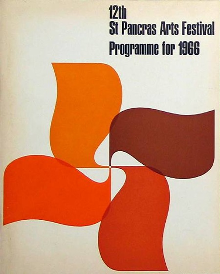
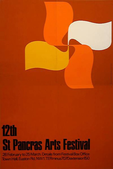
Just a couple examples of the influential work Ken Garland was doing in the 60’s and 70’s. See more at his portfolio. Sorry for the quality on the second one, couldn’t find a large version so I had to scale it up.

6 Comments Leave A Comment
Joaquim Marquès Nielsen says:
June 1, 2008 at 5:32 pmThe one on the top is my favorite. Color wise, it’s less “loaded” than the bottom one. The negative shape of the “pattern” remind me of those tiny windmills on a stick for children :) The inner shape seems to rotate counter clockwise and the outer shape clockwise. Very dynamic to look at.
Mario says:
June 1, 2008 at 9:46 pmI agree with that. The one on the top is much more balanced.
gwdesign says:
June 1, 2008 at 11:49 pmWhen i see designs like this one I read it as a swastika. Then I spend the next few minutes looking for reasons not to think its a swastika. Steven Heller (Print Mag) self published a book “The Swastika: Symbol Beyond Redemption?” very interesting.
Scott says:
June 2, 2008 at 5:10 amgw-
I did not read this particular image that way, but I do agree that the Swastika is somewhat of an enigma as images go. In the modern (post WWII) Western mind it symbolizes all that is ugly and flawed in humanity, yet in many cultures it is regarded as a sacred religious symbol of purity and perfection.
It is interesting to posit whether the shape itself is beyond redemption though; it would be sad to think that a small minority of hateful and angry people could co-opt and marginalize a symbol that, until their very brief period of influence, stood for something good. I’ve often wondered whether re-using offensive imagery for other purposes could somehow render impotent the power of symbolism like this so that fringe groups could no longer employ it as a tool of hatred and fear.
That said, the Garland images evoke visions of pinwheels and windmills for me. I do not think the have such sinister leanings as you suggest.
gwdesign says:
June 2, 2008 at 6:36 amI took a brief look at the Ken Garland site. Being an English designer only 21 years after wwII, when he did this, and due to the fact he states that the early work he did was for “social and political causes”. I cant help but think that this design might be a good-faith attempt to pull “the shape” back from its ugly co-opted meaning of the ’30s-40s.
Over a decade ago now, I lived next door to a Vietnamese illustrator. one day he showed me a painting he was working on for a martial arts studio. It was a huge purple hard edged swastika with an eye in the center. I was a bit taken aback (being from the western mindset) but he seemed to be totally unaffected by the fact that a symbol used by his culture for centuries had been borrowed and used by evil people for a relatively short time. In a global sense this symbol isn’t beyond redemption, and I agree about re-using it for its original meaning to make its evil meaning fade away.
Scott says:
June 2, 2008 at 11:47 amgw-
now that you put it in that context, I have to agree that he may have been using it in the way you suggested. if so, that would be a very brave move as a designer.