Anton Stankowski
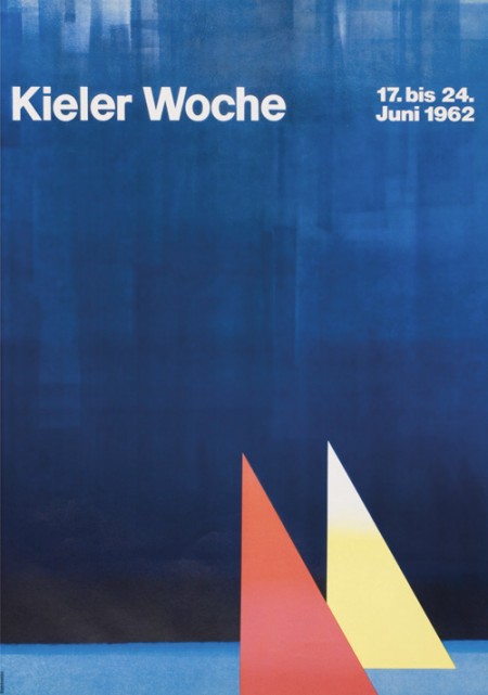
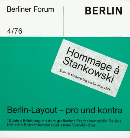
First off let me just say that it’s awesome to have come across this beautiful archive of work by German graphic designer, Anton Stankowski. The images in the archive are fairly large so the detail of the design becomes evident. In the first image of this post it looks to me like the background of the poster was painted with a brush then overlaid by the type. The process of how this was done would be refreshing to see.
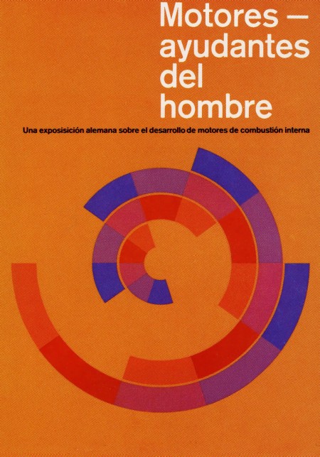
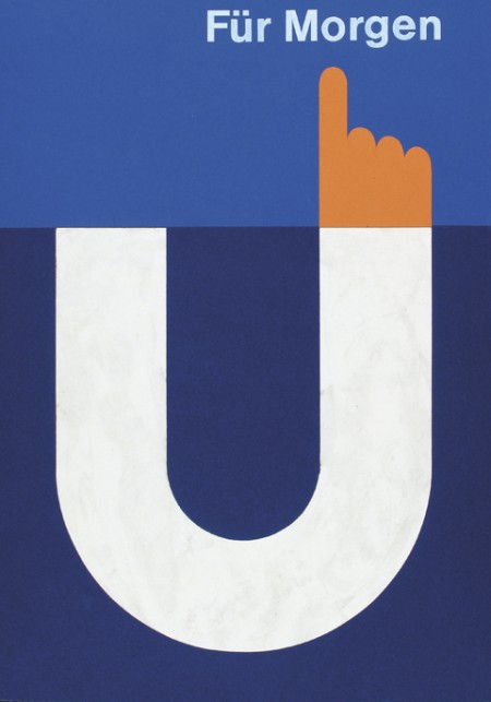
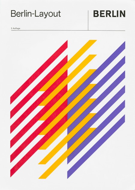
The first thing about Stankowski’s work that pulled me in was the amount movement. Nearly every one of these pieces utilizes a visual system that controls your eyes across the graphic elements and to the typography. The system is very effective considering that I keep looking at these pieces every couple of minutes to see how my eyes move around.
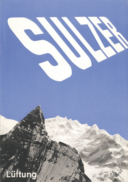
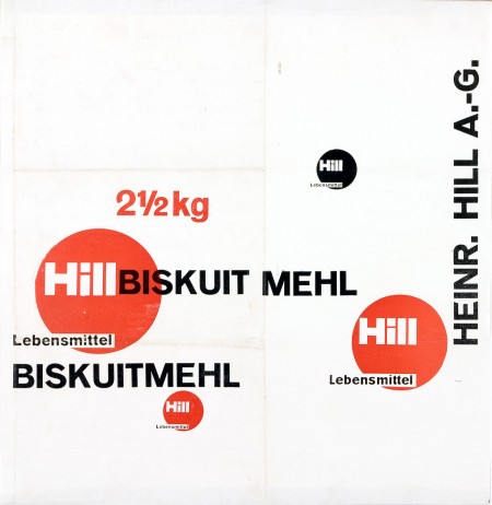
The Sulzer poster and the Hill Briskuit Mehl packaging are undoubtedly my favorites. Even though both are very simple they still have a lot of motion in them. Also in the Sulzer piece, the transition of the mountain peak to the type sings composition to me and in the Briskuit packaging I really admire the grid and typography.

12 Comments Leave A Comment
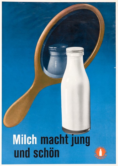
Daniel Carvalho says:
April 21, 2010 at 12:18 pmNice find Shelby. I dig the texture of the large areas of solid colour on the various prints.
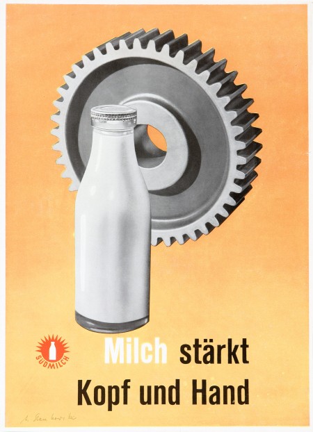
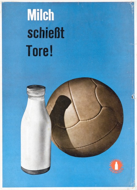
But, when I was viewing the large detailed image; what really stole my love was that little Südmilch logo.
Tyler says:
April 21, 2010 at 12:32 pmNice find Shelby … first post? What’s your association with the IS050 crew?
Tyler says:
April 21, 2010 at 12:34 pmHah … scratch that, scrolled down a bit further and saw the intro post. Welcome aboard!
Mitchell says:
April 21, 2010 at 12:58 pmamazing work! nice debut post man! :)
tomdahm says:
April 21, 2010 at 1:43 pmwow, great find! Great debut!
Chris Deutsch says:
April 21, 2010 at 1:54 pmI absolutely LOVE this style of posters. I own several classic posters and I actually might own one by Anton Stankowski, although I’m not sure it’s him. The post I have says “Bauhaus” and has three colored shapes (square, triangle, circle) and three grayed shapes (cube, cone, sphere), if memory serves (this print is in my guest room, so I don’t see it every day). This is a well known print, but I’m not clear on the designer, so if I have it wrong and you recognize who did this, please let me know as I’d like to know. He actually signed it too, but I can’t read it…artist’s sig’s are like doctors’ ;)
And welcome to the blog, Shelby. I’m looking forward to gaining more or your artistic perspective. I can already see we enjoy a similar aesthetic, so I’m excited to see what else you’ve got coming.
Doug says:
April 21, 2010 at 3:43 pmAwesome find. Definite indication of an awesome addition to the ISO50 Blog Crew!
Jefta says:
April 21, 2010 at 3:52 pmSO happy with Shelby on board. Love these images. Thanks.
huckleberryhart says:
April 21, 2010 at 9:41 pmgood eye amigo.
mike cottone / the green kingdom says:
April 22, 2010 at 7:34 amVery nice stuff. Your blog has some amazing design and architecture as well!
T▼g▲mm▲ says:
April 22, 2010 at 9:53 amvery nice work, 2 frist are awesome. hit debut