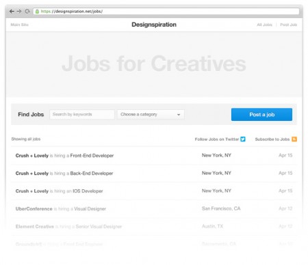
Over the last few months I (Shelby) have been working on a number of large updates to Designspiration. The first of these updates is the job board. The goal of the job board is to help creatives find career opportunities at great companies.
There were a number of challenging aspects of building this site addition, but the main one was how to handle mobile. It’s not something I’ve done a whole lot of and just to complicate things, a new grid needed to be developed for the updates to follow. The restructuring of the grid took just about as much time to figure out as it did to build the job board itself. I’ll follow up this post after the next updates to talk more about making Designspiration fast on mobile (hint, hint).
If you know an agency or company looking to hire, post a job or let them know about the job board. Also, follow the Designspiration jobs twitter @Dspnjobs for job updates.
Check it out: http://ds.pn/jobs

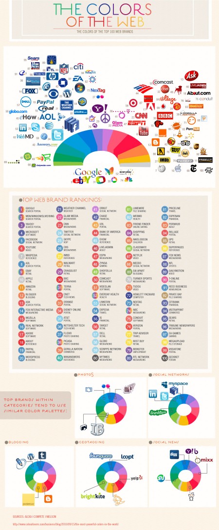
While the initial reasoning for the colors chosen may be trivial, the impact that these dominant players now have in the web world will surely influence the smaller startups that want to share in the positive color associations created by their bigger siblings
The fantastic Colourlovers put together this chart diagraming The Colors of the Top 100 Web Brands. A fascinating chart — the results of which you could probably guess — but it’s cool to see them all laid out and analyzed. Click here for the full size image.
via Josh Spear


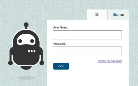
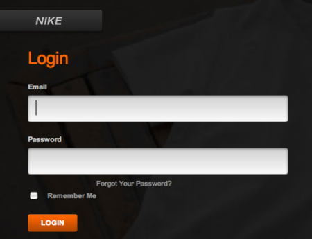
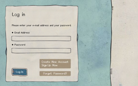
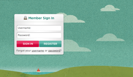
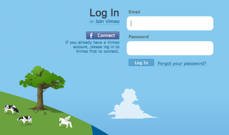
Recently I’ve been obsessing over an often overlooked part of web design: the login form. There are few sites that have aggregated examples of login forms for perusal; this one by Design Reviver is pretty good. I’d prefer the list to be more like 500 examples, but it’s easy to go in search of other cool login form designs. The ones above are fun, but I’ve yet to find one that really knocks my socks off. Anyone know of some really superb login forms?
One of my favorite trends is the use of oversized text in the forms. Tumblr was one of the first places I saw it. Scott and I discussed it a long time ago in reference to the Nike login form, pictured above. Still not sure what it is about the giant text field that feels so right — maybe it just seems to reinforce what you’re writing. Like “Yes this IS my email address. BAM.”

Cargo is a terrific web publishing platform built with creatives in mind. Like many content management systems (Squarespace, Indexhibit, Joomla etc), Cargo provides a backend that allows you to quickly publish and maintain a website without ever opening Dreamweaver. What distinguishes Cargo is a focus on simple and effective design. Consistent in all Cargo templates is a layout that is clear and simple; allowing the work to speak for itself without a complicated interface getting in the way.
Cargo evolved out of the system that runs the SpaceCollective community. We found it remarkably successful and efficient in creating visual content on the web, placing a strong emphasis on design, layout, image quality and typography. Our goal is to dramatically increase the accessibility and exposure of creative individuals on the Internet, while aspiring to build a networked context that will contribute to the culture as a whole.– Cargo Collective.
– Free hosting with the ability to set up a custom URL. This is awesome. I have also played around with Squarespace, but their hosting costs are a little frightening — especially if you are also paying URL registration on top of that.
– Multiple template designs to build off. Each one starts with a great layout and it’s really easy to apply your own brand. Simple manipulations of color, font, and header images etc quickly distinguish your site from the skeleton template.
– Follow feature, similar to Tumblr or Twitter — allows you to keep tabs on your favorite Cargo pages.
– Developer forum. I had a small issue which I posted to the forum — received a response within 3 hours. Not bad!
– Slideshow and Fullscreen features for viewing images. This is exceptionally easy to incorporate (just a matter of clicking the buttons) and is a really great feature. Works flawlessly and adds an extra touch of unique functionality.
I spent the last few days migrating my portfolio to the Cargo system. I had done a lot of the preparation work a while ago, when I put a portfolio up on Behance, so I didn’t have to spend too long sourcing my images and writing description paragraphs. I was thrilled to be moving to a more personalized portfolio space — as much as I love Behance, sometimes it can feel a little too much like a design Myspace.
The set up process was quick, easy, and remarkably enjoyable. All in all I would say it took about 6-8 hours from start to finish. Most of this time was spent designing the look and feel after the content was uploaded. Once I got familiar with the CSS at work, it was just a matter of figuring out exactly how I wanted to look — altering fonts sizes, small layout tweaks, and making sure everything worked properly. I only hit one or two speed bumps, all easily solved by a quick Google search.
I think it’s important to note that I am not a “web guy” by any stretch of the imagination — if I can handle it, this is a good sign for anyone intimidated by the words “CSS” or “target blank”. Having a basic understanding of CSS/HTML helps, especially if you are planning on tweaking the template significantly, but it is not completely necessary. Even with my limited knowledge, I was able to make the adjustments necessary to create a site I am happy with. As mentioned, the important part of a site like this is the work, and I didn’t really feel like I needed to brand the site too extensively.
As of now, Cargo is in the pre-release stage. I am really excited to see how this system evolves as more and more people get involved. I would highly recommend it to anyone debating which CMS to choose. If you would like to apply for an account, use the contact address on the website.
but does it float
superfamous studios (aka Folkert Gorter)
The Office of Feltron
Avant
Jory Dayne
