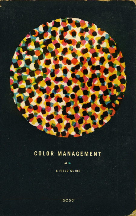
Cover image by S.Hansen
Whether you are designing for print or for the web, making the leap from what you see on your computer screen to the outside world can be a tricky process, fraught with unpredictable changes and unexpected results. The web is full of information regarding color management and sifting through it can be very overwhelming. Contradictory opinions abound and it can be difficult to find reliable sources of information.
Over the last few months, Scott and I have been researching this topic extensively. With the addition of the new Epson 9900 to the studio, we wanted to be sure that our printer workflow was optimized and producing a consistent output. With the help of Kirk Economos of Meridian Cyber Solutions, we have implemented a color management system that works for us. Below we have tried to aggregate this knowledge into a simple and useful guide, designed to help you ensure your studio is set up correctly. It is not intended to be the end-all article on color management by any means — but it’s a good place to start if color management isn’t something you have previously implemented or considered.
Continue reading →

A while back Computer Arts magazine asked me to write an illustration tutorial for an issue which focused on textures. The idea was to revisit the classic Bob Dylan Blowin’ In The Wind / Mister Tambourine Man poster. I really enjoyed the project and ended up using the resulting image as the basis for my Progress Austin concert poster. Computer Arts has made the entire article available on their site as a PDF which you can download here. They’ve even made the original source files available so you can follow along with the tutorial. If you have any questions feel free to post in the comments and I’ll try and fill in any blanks.
Here’s an excerpt from the introduction:
Raster and vector collide
“Creating eye-catching imagery for print can be a balancing act between the two distinct worlds of computer-based design. Scott Hansen shows you how to get explosive results in Photoshop…
The strengths and weaknesses of vector and raster graphics have long been apparent: vector is known for its clean lines and resolution-independent scalability whereas raster has a more photographic nature. Although vector graphics are particularly suited to print work thanks to their scalability, there are some things you can’t do without bringing rasters into the picture.
In this tutorial we show you how to bring together both vector and raster elements to create a seamless piece that sits well in both worlds. The concepts we explore will lend a timeless, weathered feel to what would otherwise be a rather stark design. Relying on Photoshop’s powerful raster tools and quite adequate stable of vector tools, we can tap the strengths of both without leaving the familiar realm of Adobe’s most powerful graphics app. We can unite two styles of design by employing Photoshop’s powerful blending mode options along with advanced gradient masking techniques to produce an illustration style that is truly unique.”
Download Tutorial PDF
Download Support Files


