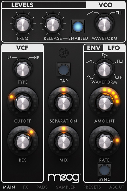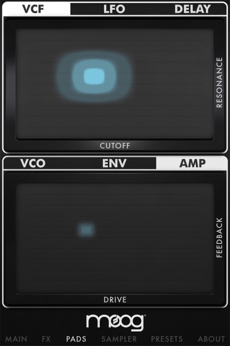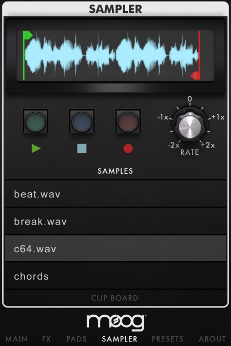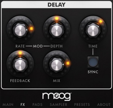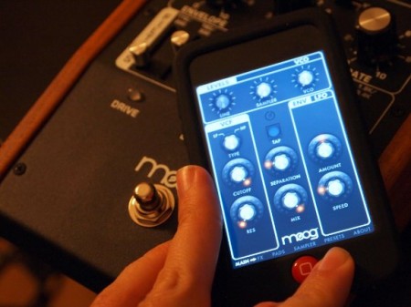


CDM is reporting on a new iOS based Moog product called Filtatron, “an iPhone Filtering, Effects, and Sampling App”, basically Moogerfoogers on your phone. This is looking pretty amazing interface-wise; very true to the signature Moog aesthetic with the Little Phatty style rotary encoders and soft buttons. From a strictly user experience perspective this must have been a lot of fun to design. It will be interesting to see how it actually sounds compared to the real thing though — I’m going to take a wild guess and say it sounds nothing like a MoogerFooger. Software analog modeling is an imperfect art (or perhaps too perfect); it’s best to think of it as it’s own beast entirely than a faithful representation of the sonic characteristics of a true analog circuit. At any rate it’s interesting to see music technology makers pushing the capabilities of mobile devices. Software like this can may never replace analog hardware, but it would be nice to have the portability and power when you’re away from the studio, even if it comes with a healthy dose of compromise. See also: iRig
Source MatrixSynth via CDM

Cover image by S.Hansen
Whether you are designing for print or for the web, making the leap from what you see on your computer screen to the outside world can be a tricky process, fraught with unpredictable changes and unexpected results. The web is full of information regarding color management and sifting through it can be very overwhelming. Contradictory opinions abound and it can be difficult to find reliable sources of information.
Over the last few months, Scott and I have been researching this topic extensively. With the addition of the new Epson 9900 to the studio, we wanted to be sure that our printer workflow was optimized and producing a consistent output. With the help of Kirk Economos of Meridian Cyber Solutions, we have implemented a color management system that works for us. Below we have tried to aggregate this knowledge into a simple and useful guide, designed to help you ensure your studio is set up correctly. It is not intended to be the end-all article on color management by any means — but it’s a good place to start if color management isn’t something you have previously implemented or considered.
Continue reading →

I have 39,447 fonts on my computer. Or at least I did, up until about 30 minutes ago when I cleansed my machine of all the typographic nonsense that was polluting my list. I had thought about doing this font purge for some time, but hesitated, just in case I might one day need to design a document using the official Jedi Knight font, or something similarly ridiculous.
I remember hearing Massimo Vignelli say in the Helvetica documentary that he only uses about three typefaces. I was embarrassed at the time, thinking of my infinite list compiled over many years of dafont downloads and “BEST FONTS!!!” torrents. I guess I considered myself a typeface collector and I worked hard to “get them all”, even if I had no idea of what use some of them would ever be.
As I progressed through school, I noticed that just about everything I had ever designed used the same 5-10 typefaces. Every time I opened Illustrator I scrolled endlessly past hundreds of handwriting fonts, “distressed” fonts, you name it; always searching for the same go-to options. When I did deviate, the work usually suffered.
After much deliberation, I widdled my list down and trimmed the fat as it were. No longer will I be tempted to use weird knockoffs of Gotham or Helvetica clones. I consider myself much better off because of this — not just because it’s easier to manage a smaller list — but because the typefaces I kept are good typefaces. They’ve stood the test of time, and are the result of a tremendous amount of hard work and development by expert typographers. I know something about each one; who designed it, where it came from etc. In this way it’s a bit like my iTunes library; I probably have about 60,000 songs, but mainly listen to a few selected playlists. I have thousands of songs with a play count of “zero”. Why I keep them around I have no idea.
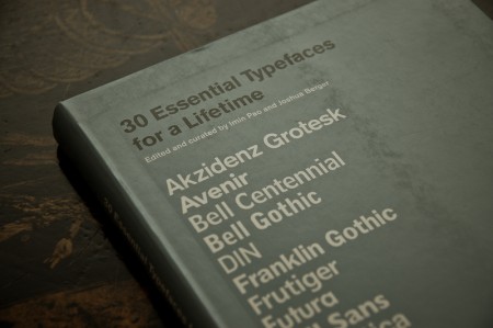
The book pictured above is 30 Essential Typefaces for a Lifetime by Imin Pao and Joshua Berger. It’s a good place to start if you are considering a font purge of your own. (Though I disagree in a few places; for example I would not include Trajan on my list). My final count is now about 50 typefaces; a much more manageable number I’d say. It’s not Massimo’s magic number — I don’t think I could survive on three alone — but scrolling through 50 sure beats scrolling through 39,447.
note: I, and and many designers I know, tend to use the terms “font” and “typeface” interchangeably. Technically this is incorrect as they are not the same thing. Both this and this article do a good job illustrating the difference. Old habits die hard for me; I didn’t actually know there was a difference until about a year ago, so it’s taken some time for me to change my language.
