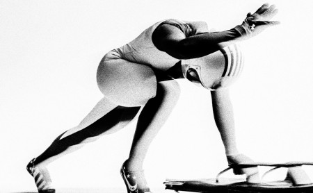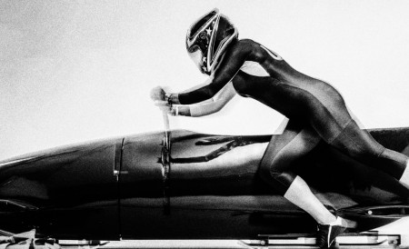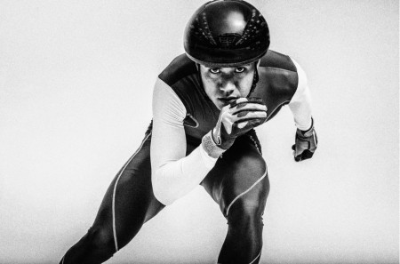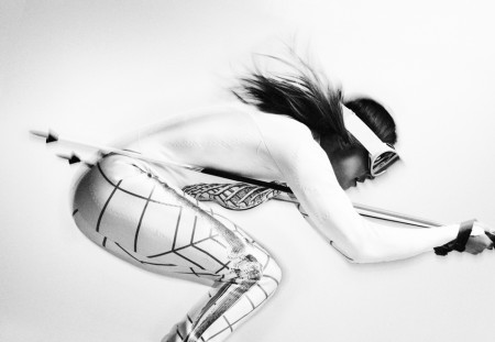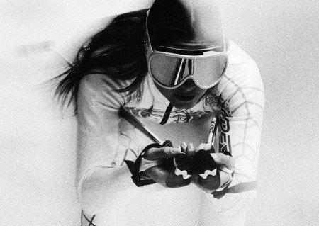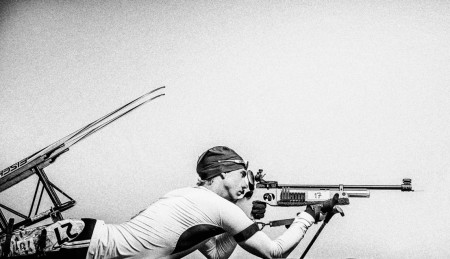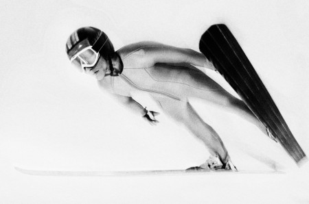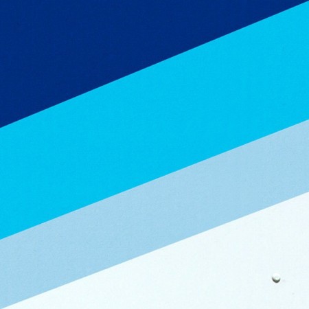


I know I’m a little late on this post since the 2014 Winter Olympics have ended but that doesn’t mean that these images from photographer Carlos Serrao aren’t badass. I’m really loving the ultra simple approach to these images that showcase each individual sport’s iconic form in action. If you’re not familiar with Carlos’ work, check out his website and, chances are, you’ll see an image on there you have seen before. The swimmer’s series is simply awesome.


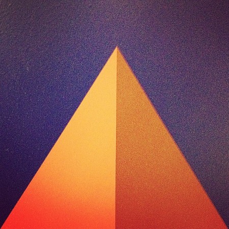
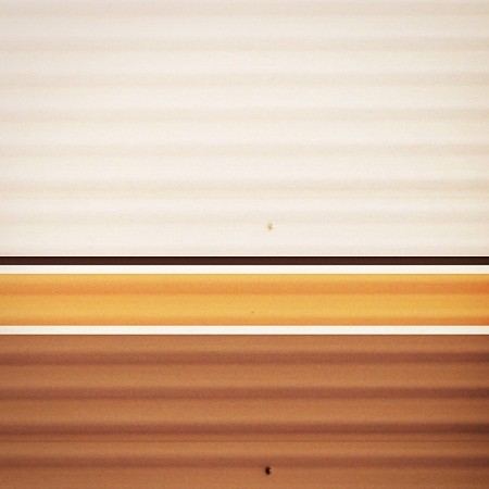
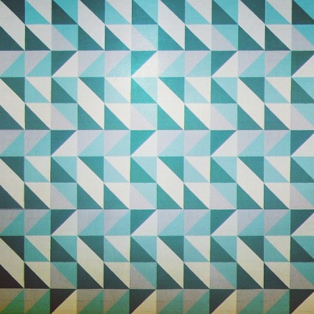
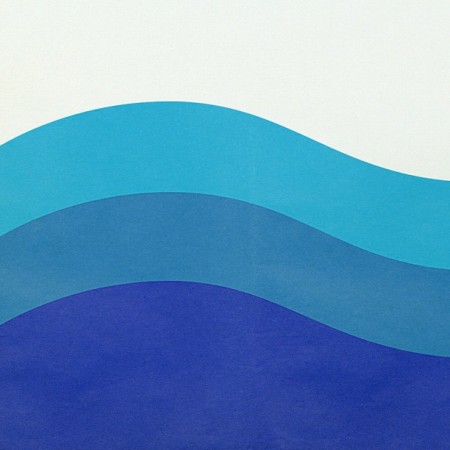
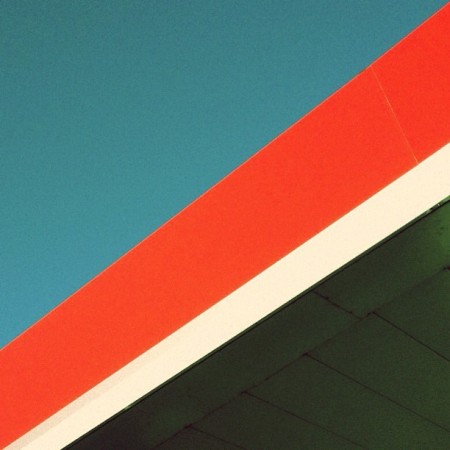
For the last month and a half I’ve been posting a series of found “shapes” on Instagram. The objects in the images are various places, signs, or vintage objects. Each image expresses my affection for simple, clean and effective design. It’s also about connecting with those lines; It’s about the feeling you get when viewing it.
It’s a challenge finding new compositions that really give off that spark, but it’s also fun. It’s also really interesting to see how others react to certain shapes and colors. Hope you enjoy!
View more from the series.


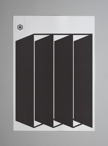
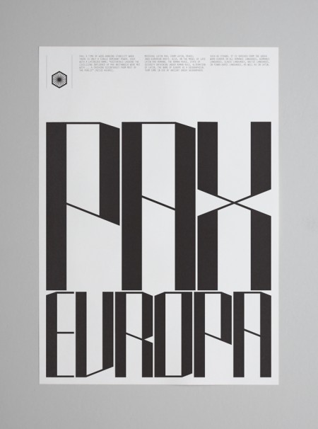
The work of Tom Balchin stopped me in my Google Reader tracks this evening. His Pax Europa project was my initial favorite, for the bold simplicity and terrific layouts, but there is a ton of terrific work in his portfolio. I came across the phrase “talent turbine” in the NYT Magazine the other day and have been itching for an opportunity to use it, so here goes; Tom Balchin is a talent turbine.
via Changethethought


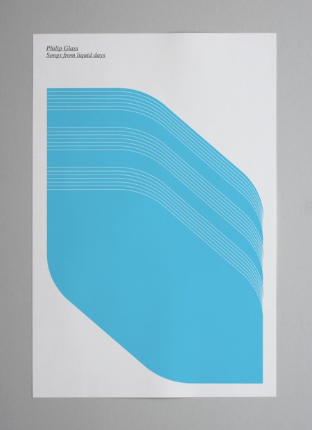
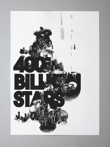
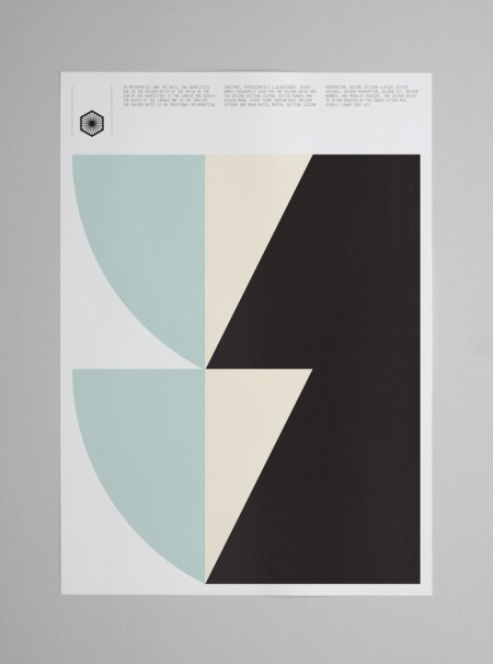
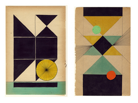
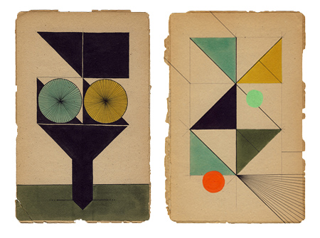
Assorted works by Dutch graphic designer Louis Reith. I really love the texture and the color of the paper he’s working on. I’ve spent hours in Photoshop trying to replicate that same off-white mix; can’t beat the real thing. Even more exciting is the color at work in the shapes — each hue is dialed in exactly where it should be. Some of the forms in the bottom image remind of the typographic stylings of Non-Format.
More info about Louis, including upcoming gallery showings, can be found on his Myspace.

