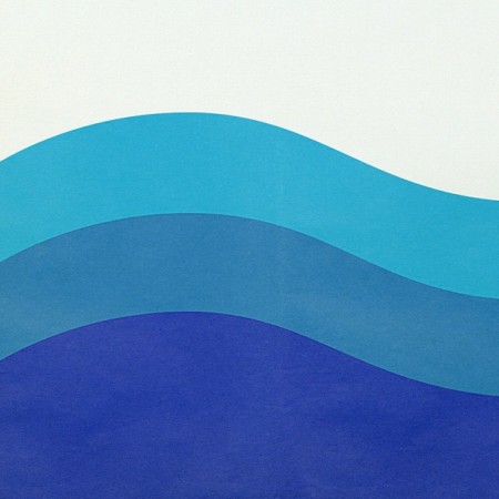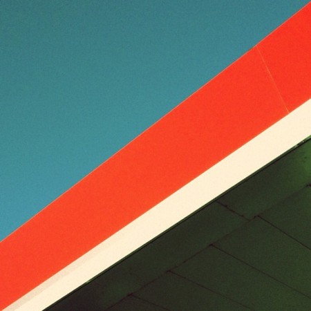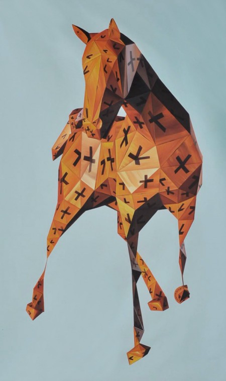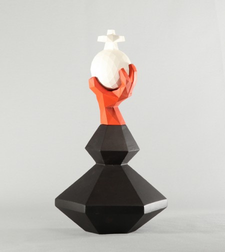


For the last month and a half I’ve been posting a series of found “shapes” on Instagram. The objects in the images are various places, signs, or vintage objects. Each image expresses my affection for simple, clean and effective design. It’s also about connecting with those lines; It’s about the feeling you get when viewing it.
It’s a challenge finding new compositions that really give off that spark, but it’s also fun. It’s also really interesting to see how others react to certain shapes and colors. Hope you enjoy!
View more from the series.


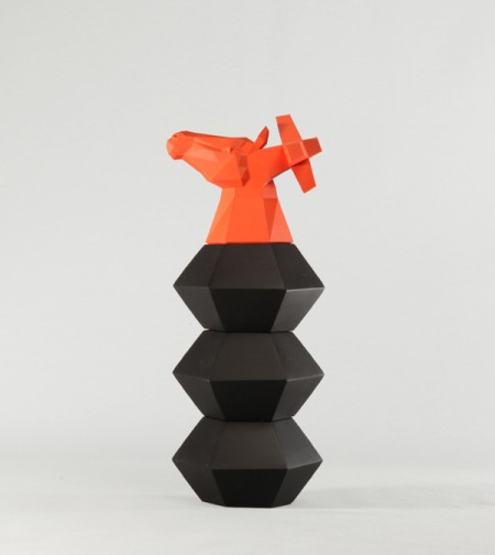
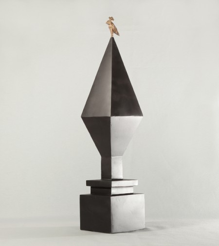
These shapes by Axel Brechensbauer remind me of some strange and wonderful life-size chess set. They certainly don’t look like objects I normally come upon in real life. If one day I do, I will purchase and display them atop of my home for all to see.
via cargo


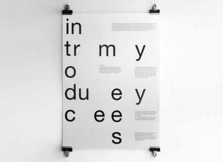
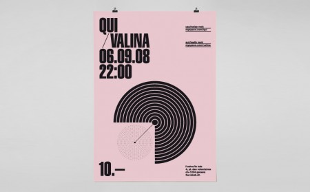
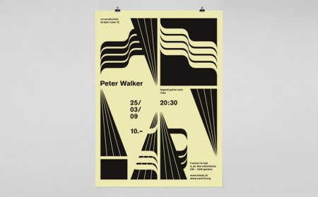
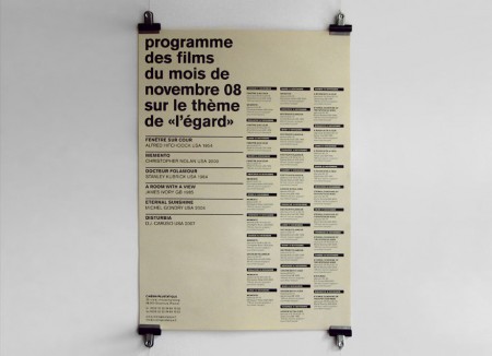
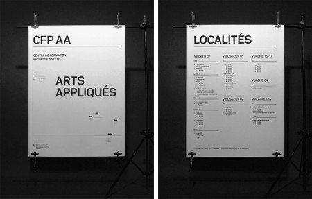
Yes! League! When I look over my ffffound over the last few weeks, there has been one dominant style I’ve been gravitating towards for its beauty and sophistication. This work by League sums it up perfectly. It’s often imageless, utilizes type in some unusual way, is bold and graphic, and has some crazy asymmetrical balance at work that makes me want to practice graphic design forever and quit it immediately…simultaneously.
I love layouts with many scattered elements, all necessary and unable to be removed, but you’re not sure exactly why. For example, those tiny thick black lines on the CFP AA poster above — wee bits like this are amazing to me.
And by the way their home page might be my favorite single page on the web right now.
via Dirty Mouse

Maybe it was my last post, or Scott’s recent travel adventures, but something has reinvigorated my desire to go back to Japan. I guess I’ve always wanted to go back, the feeling is just very acute right now. As Jon and Kjell mentioned in the Non-Format interview, Tokyo is a rather hard city to beat. Personally I can’t imagine a more inspiring place.
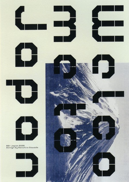
Anyway the poster above is by Yasuhiro Sawada and I’m sorry to say, I don’t know too much more about it. I’ve always loved it for the simple shapes and unusual layout. It also took me repeated viewings to see that there was a message in the shapes — felt pretty oblivious after that. The image comes from GD in Japan, where you can find many other excellent works like this.


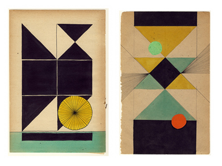
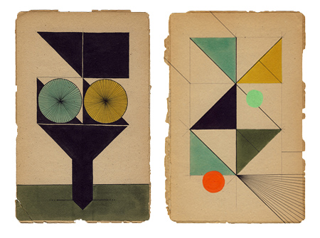
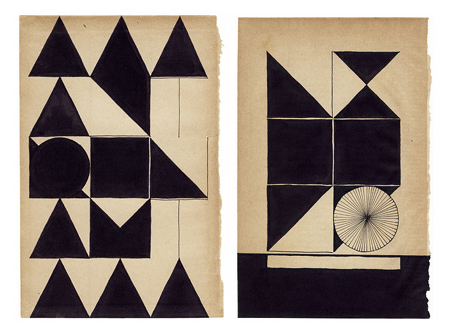
Assorted works by Dutch graphic designer Louis Reith. I really love the texture and the color of the paper he’s working on. I’ve spent hours in Photoshop trying to replicate that same off-white mix; can’t beat the real thing. Even more exciting is the color at work in the shapes — each hue is dialed in exactly where it should be. Some of the forms in the bottom image remind of the typographic stylings of Non-Format.
More info about Louis, including upcoming gallery showings, can be found on his Myspace.
