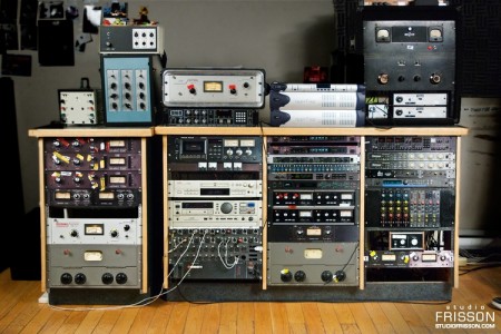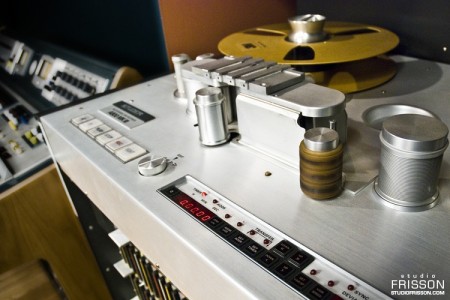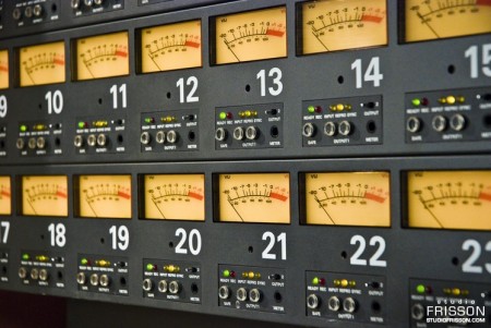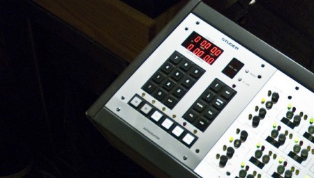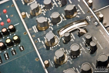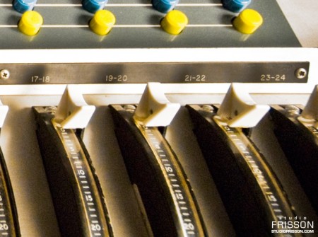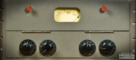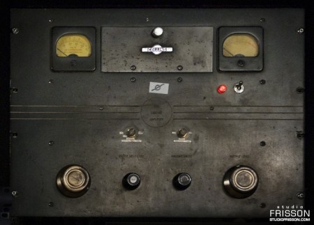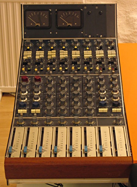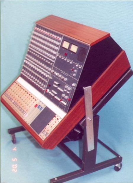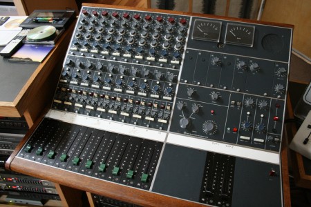


I came across these great photos from Québec-based recording facility Studio Frisson while gear-lusting tonight and was stricken by their quality. Most studios don’t do a very good job of tastefully photographing the facilities so it was refreshing to see these very well executed portraits of some of the most rare and prized recording equipment in the world. Some of the post on the photos is a little synthetic for my tastes, but still nice. Unfortunately the images are watermarked so you’ll have to imagine what they’d look like clean.
Speaking of watermarked photos, I’ve really been getting annoyed by the practice, particularly by good photographers. I get why they’re doing it, but honestly, is the damage it does to your image and composition worth whatever infringement someone could pull off using a 650px, 72dpi JPEG? Just asking for the sake of argument, I can certainly understand the motivation.
Anyways, you may not share my hopeless obsession with analog audio hardware, but you can’t deny the sexiness of these machines and their interfaces. I’ve always found equipment like this a good source of inspiration when designing realistic software interfaces.
Sorry, no mention of the photographer that I could find. If anyone knows please speak up!
Studio Frisson

My rebranding Playboy project came to a close last week with the end of our fall semester. If you read the last article, you are familiar with the first part of this project, which was the new logo for Playboy. While it is absolutely the flag bearer of the entire project, the logo development represented a small amount of the work we were required to do for the overall project. The final deliverable for the class was a book in which we the explain history of the brand, walk through our rationale for the new identity, explore the process of the logo development, present brand standards and guidelines, and show example brand implementations and extensions. Other than this required content, there was no specific criteria for the book. Each student also gave a short final presentation explaining their rebranding and the choices they made along the way. Everything was created for the Nature of Identity class at the Academy of Art, as part of the graduate graphic design program.
I really enjoyed the conversation the first post on this project generated. I was excited to see that the new logo was as polarizing as it was — I feel like these types of solutions are the most exciting and rewarding for me. I noticed that many people were up in arms about the idea of Playboy removing nudity and becoming an all article magazine. While I would like to note that the new strategy was purely a conceptual exploration constructed in an educational environment, I actually do think they might be well served to switch things up this drastically. Playboy was once irreverent and boundary shattering. They are no longer. I can think of no better way to recapture this audacious spirit than by doing something this extreme…
Continue reading →


In the world of audio engineering, the name Neve has become almost mythical. Rupert Neve was responsible for a very popular EQ and preamp circuit design that helped produce many a hit record over the years. I personally love the Neve sound and record everything through a set of four Neve clones. While clones are great and can approach the sound of the original, they’re still not truly a Neve. So to see an actual Neve Sidecar show up on Ebay was a surprise. Just seeing pictures of these is pretty intense, I can’t imagine what it would be like to actually use one. To me, the color and design inspire a sort of reverence, kind of like the Futura of the sound engineering world; classic, refined, and functional. At any rate, a $40k mixer is just a dream…but what a nice looking dream.
