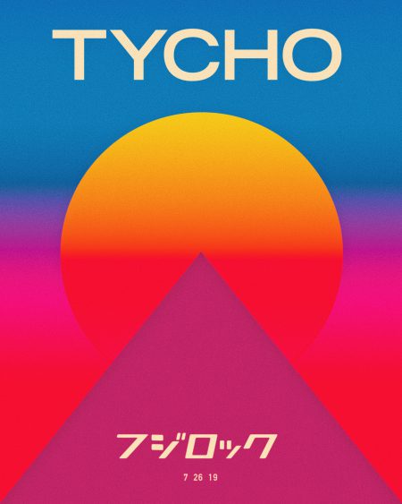
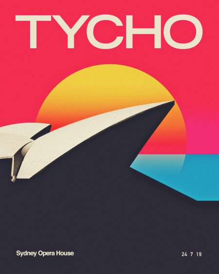
Been a while! Back on the road and did some posters for the Fuji Rock and Sydney Opera House Tycho shows. US tour starts Sep. 5 in LA, more info at https://tychomusic.com/home/#tour
Apple was up to some cool stuff in the 80s. We’ve seen evidence of it before with Apple’s 1986 clothing line and with this Apple gift catalog from 1983. The logo made it on a range of products including race cars, kites and carpets.
Matt Lehman is really good at logos, and illustrations. It’s been a long time since I’ve seen such a fun and well executed branding portfolio. There are some straight up classics in there, and that Warner Nashville one, wow. I’d love to see this guy get more into poster work, but simplified. I feel like some of his illustrations tend to get a little busy while minimalism seems to be his strong suit. The two included above are good examples of a nice balance of clean lines and texture.
Another day, another poster. I usually just do one poster for longer tours but this time around I wanted to do something specific for a couple of the shows this summer. First was the Troubadour print and now it’s this one for the July 14th Tycho show at Webster Hall in NYC.
Several other Tycho live dates have just been announced (see below or check the Tycho tour page), really excited to be making it out to some new cities this time around. See you this summer!
Classic branding and packaging design by Barcelona-based firm Marnich Associtates. The stuff for Noguera & Vintro is incredible. Interestingly enough — and despite that excellent branding — they’re apparently the “exclusive distributor of Hello Kitty in Spain”. Good thing you have this incredible, minimalist branding, because we all know Hello Kitty retailers and very concerned with modernist graphic design.
All joking aside, this seems like a very strange choice of branding considering the product / market. It also just plain looks weird on the site with all that garish Hello Kitty stuff going on in the middle. Do you think the client asked for this seemingly incongruous style of branding or was it foisted upon them by an overzealous design shop? Judging from a lot of the playful work on Marnich’s site, I’d bet on the former as I could see them treating this right. Odd.
Mike Joyce has created an excellent — and rather extensive — collection of re-imagined vintage punk / indie rock posters in the International Typographic Style. Beautiful stuff, you can even score some prints from the Swissted Shop.
These are from a great vintage science and tech ads set on flickr. There are over 1400 examples in the set so it will keep you busy for a while if you’re looking for some weekend design inspiration.