Paris/Dakar
As busy as we are recording & preparing for the Tycho shows coming up, Dakar is celebrating it’s birthday this week and I didn’t want to miss out. Here is some great imagery captured in the 34 years since the rally raid’s inception.
As busy as we are recording & preparing for the Tycho shows coming up, Dakar is celebrating it’s birthday this week and I didn’t want to miss out. Here is some great imagery captured in the 34 years since the rally raid’s inception.
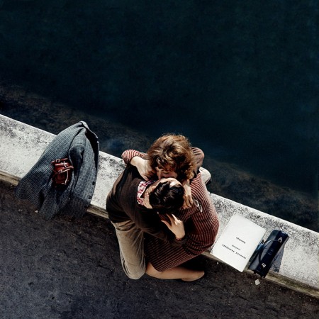
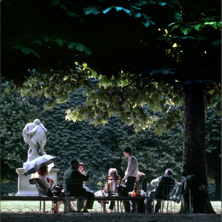
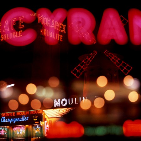
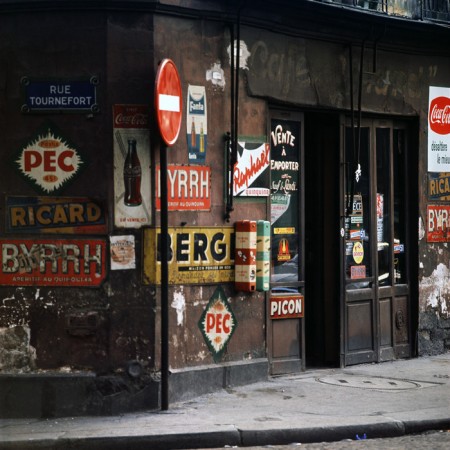
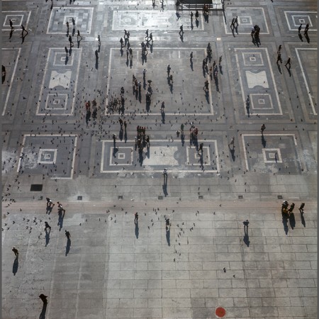
Born in Switzerland, Hans Mauli was a graphic designer who worked with Herb Lubalin and designed the typeface for the World Trade Center signage. From 1971 to 1991 he worked as an advertising photographer in Paris, after which he moved to the United States and began to focus on fine art photography. When he began his photographic career he did not have access to a darkroom, so most of his early work was not printed until much later. See more of them here.
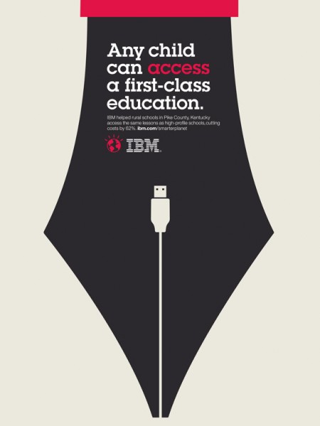
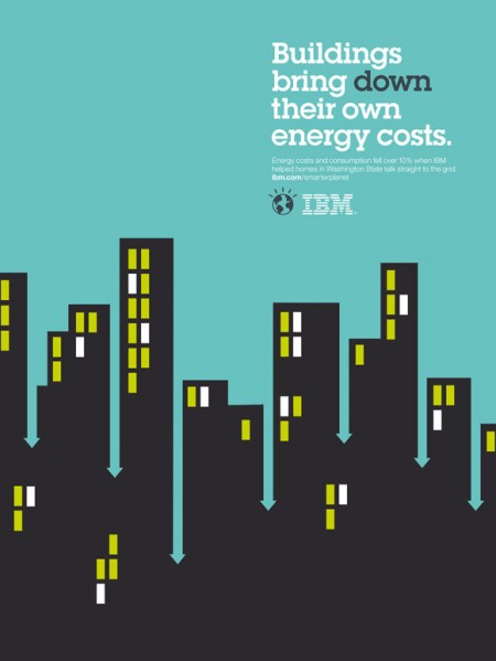
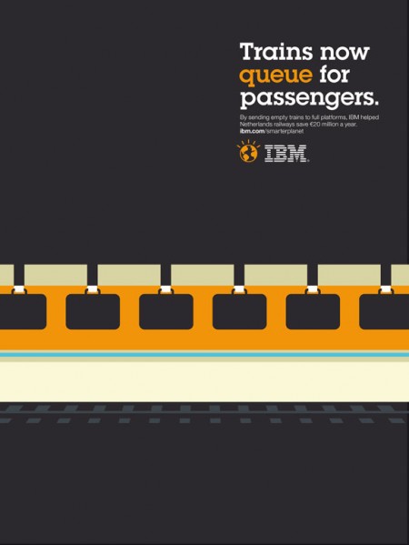

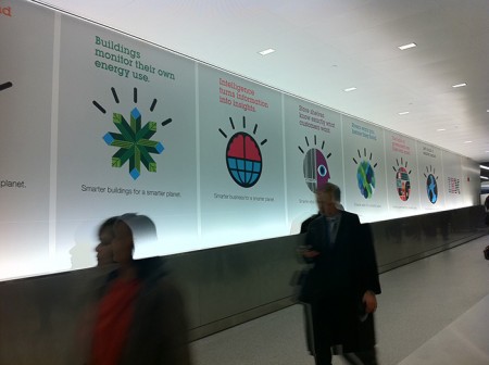
Ogilvy Paris turned out some nice looking posters for IBM’s Smarter Planet campaign. Some dicussion of the fonts and more posters over at Fonts In Use.
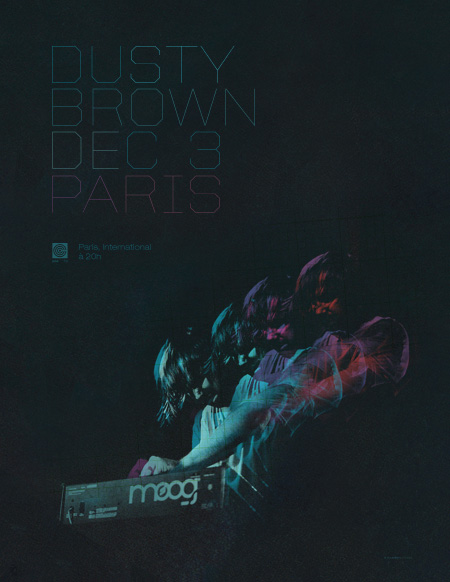
All you Parisians are in for a treat this Friday as Dusty Brown will be playing live at L’International. Here’s the details, wish I could make it!
DUSTY BROWN
w/ STEREOTYPE, DLGZ
Friday, Decemeber 3rd, 2010
@ L’international
9pm – 12am
5/7 rue Moret
Paris, 75011 FRANCE
And to get you ready, here’s a new track Dusty was kind enough to share with us:
Dusty Brown – 101 Nights Like This – Download
[audio:https://blog.iso50.com/wp-content/uploads/2010/11/100nights.mp3]
You can also snag his latest EP for free over here

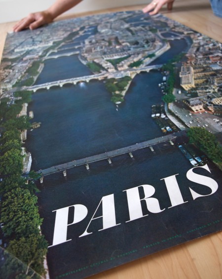
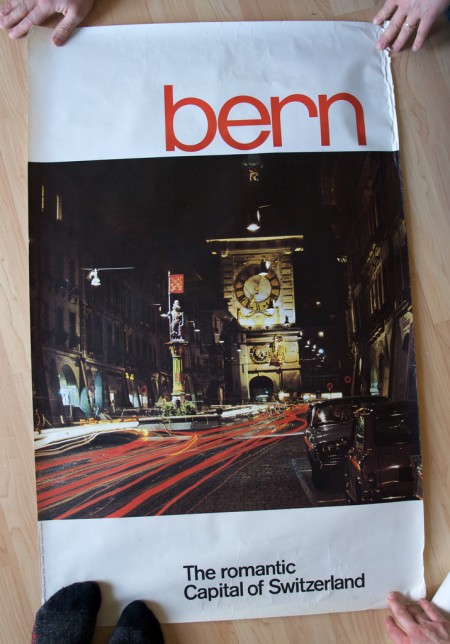
Stephen over at Mid-Century Modernist posted shots of some great European travel posters sent to him by his late father. Apparently the posters had remained in the shipping tube for a few years until discovered during a move. Thanks for sharing Stephen, and thanks to all your friends for holding them down in the shots! (what is that like 3 people holding the Bern print down?) Link
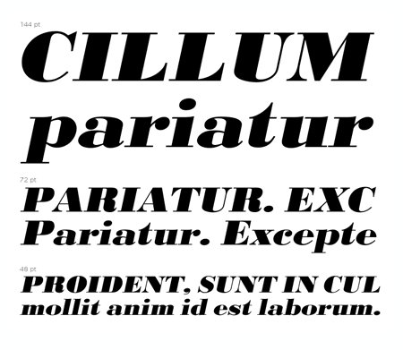
And in case you were wondering, the “Paris” font seems to be URW Bodoni Extra Bold Extra Wide Oblique. There are some slight differences but I am assuming these are artifacts of the digitization perhaps? I hate it when I see a classic font used like this and then find the modern version and it’s just a bit off. “Bern” seems to be PL Brazilia Three.