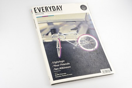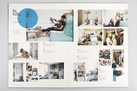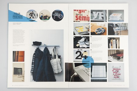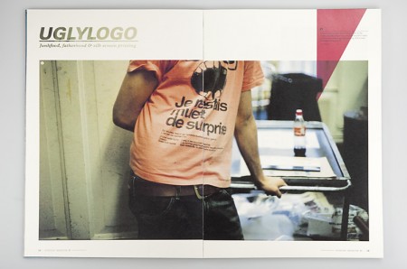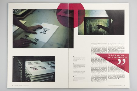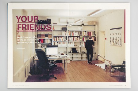


Everyday Magazine is a magazine that focuses on the behind the scenes of creative folks. I find the design to be quite relaxing and the inner pages to be nicely laid out. The project was created by Mikael Floysand as an assignment at Westerdals School of Communication.


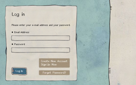
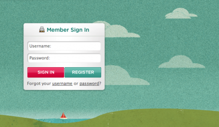
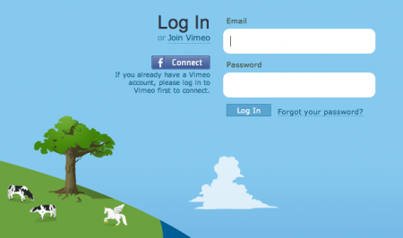
Recently I’ve been obsessing over an often overlooked part of web design: the login form. There are few sites that have aggregated examples of login forms for perusal; this one by Design Reviver is pretty good. I’d prefer the list to be more like 500 examples, but it’s easy to go in search of other cool login form designs. The ones above are fun, but I’ve yet to find one that really knocks my socks off. Anyone know of some really superb login forms?
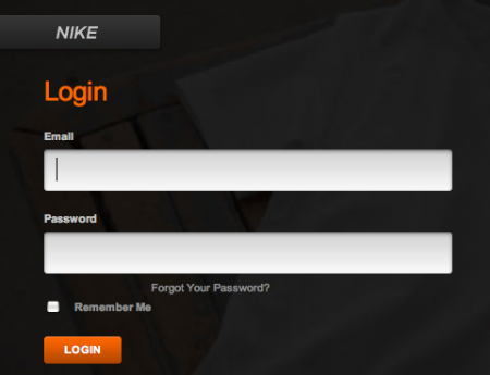
One of my favorite trends is the use of oversized text in the forms. Tumblr was one of the first places I saw it. Scott and I discussed it a long time ago in reference to the Nike login form, pictured above. Still not sure what it is about the giant text field that feels so right — maybe it just seems to reinforce what you’re writing. Like “Yes this IS my email address. BAM.”


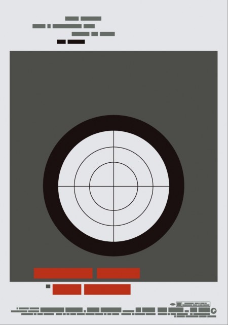
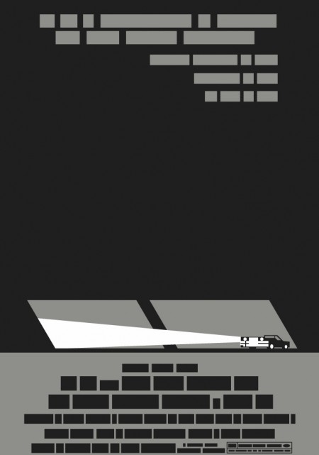
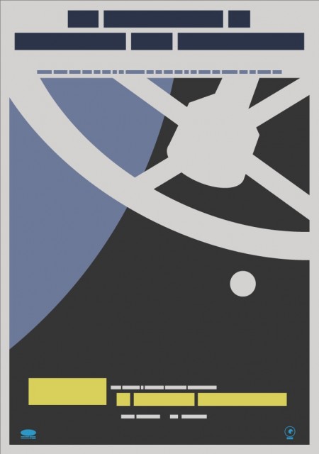
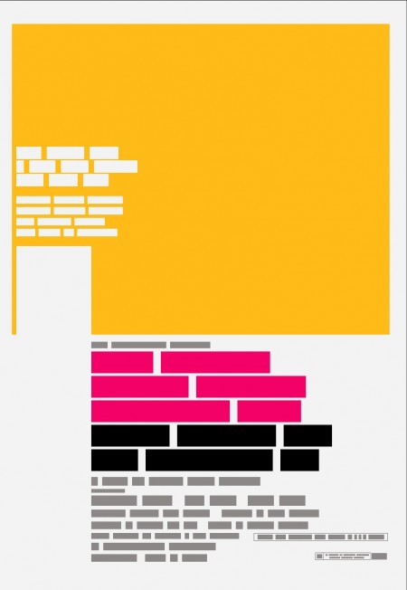
Film the Blanks is an ongoing design experiment that takes existing film posters and abstracts them down to their core elements. The project has garnered much press over the last few months, and I figured I’d post up some of my favorite pieces. I like the work because of the visuals, but there is also a strong participatory component that sets it apart. Each time a “blank” is uploaded to the site, users are invited to guess which film the abstraction represents. In some cases the solution is obvious, but it’s often remarkably difficult to discern which poster is hiding behind the blocks. Eventually clues are released and points are awarded to the successful guessers. It’s an exciting format for a design project; one that takes a strong concept, built around a fairly standard medium (poster), and twists it into something unique and engaging.
You can find all the posters in the Flickr set. You can also buy a few over at the Buy the Blanks store.
