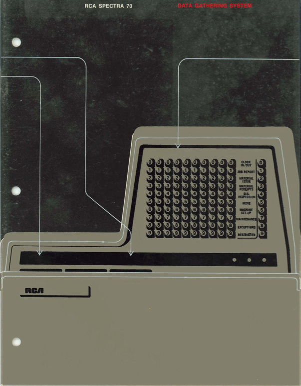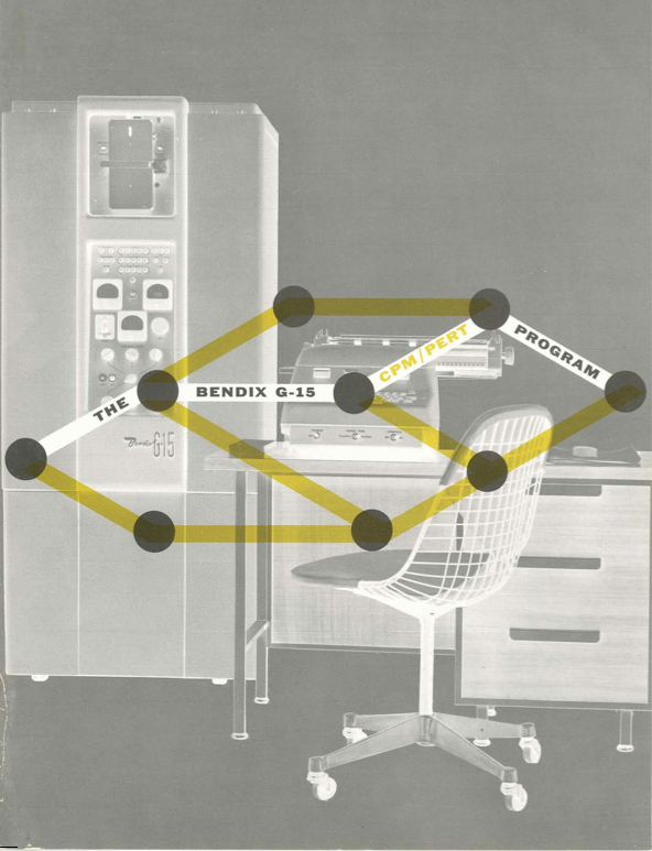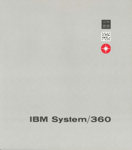
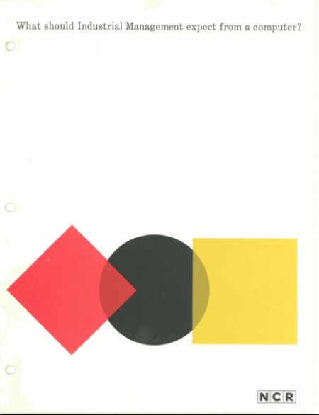


The Computer History Museum has a great collection of vintage computer brochures from the 1950s to the early 1980s. I love the bold type, colors, and shapes working in these designs. You might recognize the IBM System/360 name from previous posts.


Ogilvy Paris turned out some nice looking posters for IBM’s Smarter Planet campaign. Some dicussion of the fonts and more posters over at Fonts In Use.
Fonts in Use via Aisle One


Came across these really great shots via Colorcubic’s Flickr. The images were taken for an IBM catalog in 1964. Take note of the great compositions and use of bokeh in the first image. Not sure that IBM would let that fly nowadays. Also, the super warmth and contrast of the film really make those panel interfaces look stunning.
Seeing these images in spread form would be interesting. Rather curious whether or not the designer overlaid the type on them or if the images stood alone. In some IBM ads, it appears that type was both on and off the images.