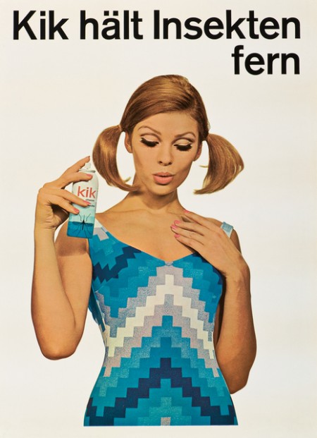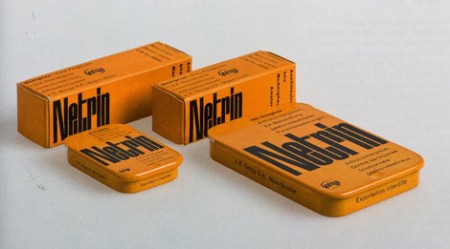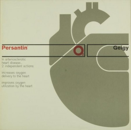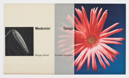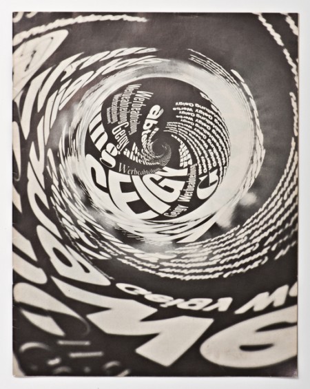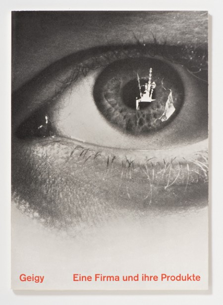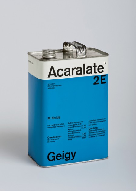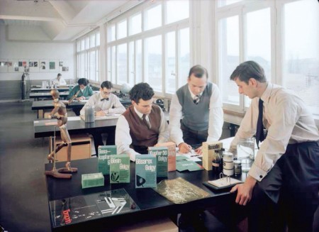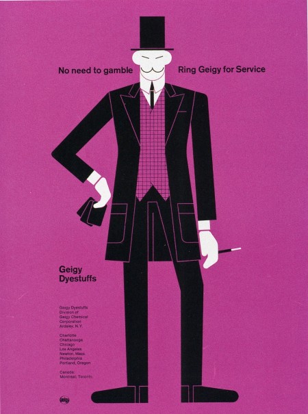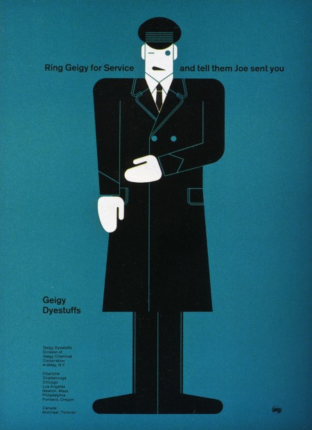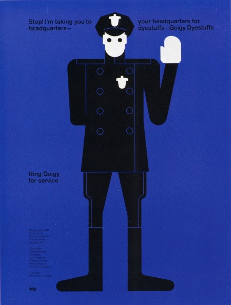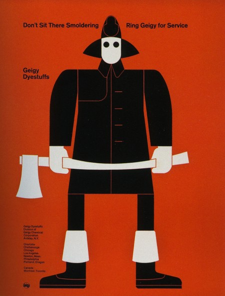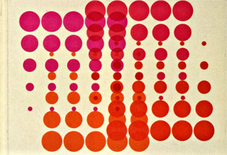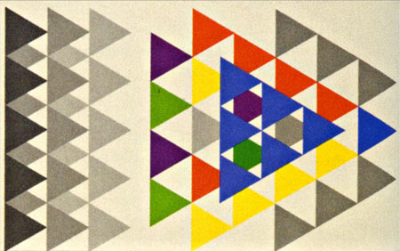


Dwell has an excellent piece on Swiss design shop Geigy. The in house agency has such a rich portfolio of beautiful work, most for the medical industry. I particularly enjoy the packaging work.
Grain Edit also has some more info and pics from a book about Geigy design here
Source Dwell


These advertisements are part of a Geigy campaign from 1965. They are all letterpress illustrations by Fred Troller. Each version pairs a striking figure with a related slogan and encourages you to “Ring Geigy for service.” I probably would have called these guys up even if I had no idea what “service” they could provide.
I like Winkreative’s identity for Porter Airlines for similar reasons. I wouldn’t stack one against the other by any means, but the use flat colors, stark figures, and limited perspective at least puts them in the same inspiration folder for me. (And the panda is awesome)


Swiss pharma company Geigy (now Novartis) cranked out tons of drugs and tons of great designs to sell them during their time. The images above are from the book “Corporate Diversity : Swiss Graphic Design and Advertising by Geigy 1940 – 1970” (amazon) which chronicles their best work during that period. There are more images and info over at Things To Look At and Grain Edit.
Images via Things To Look At
