Discovery: A Visual Eulogy
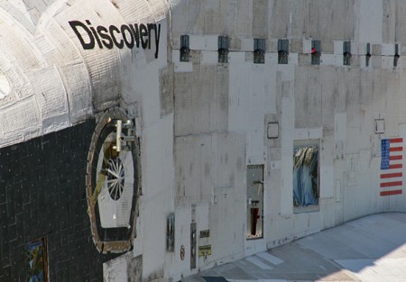
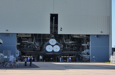
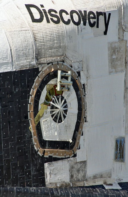
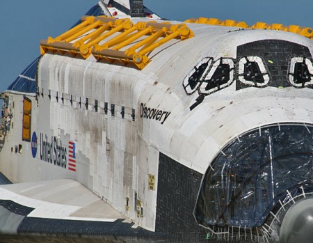
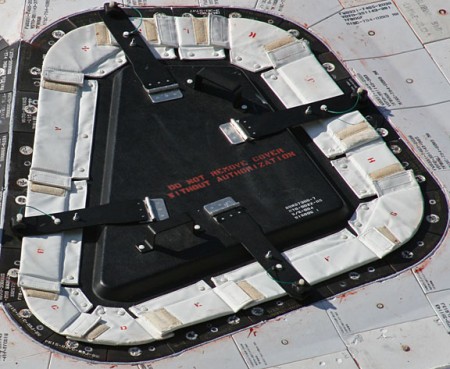
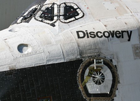
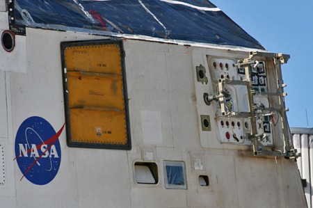
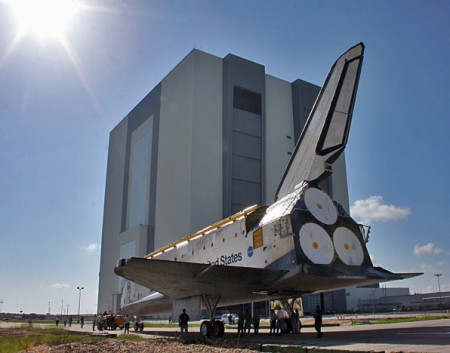
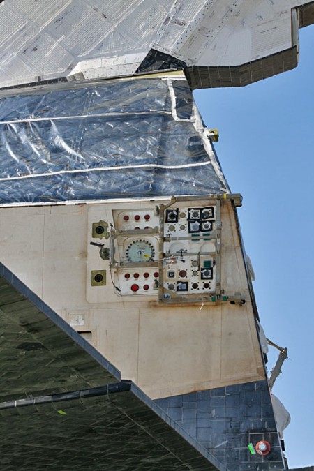
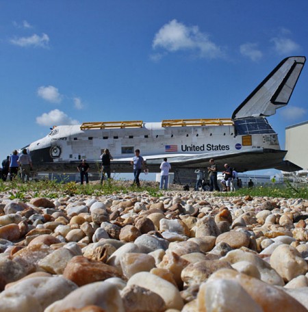
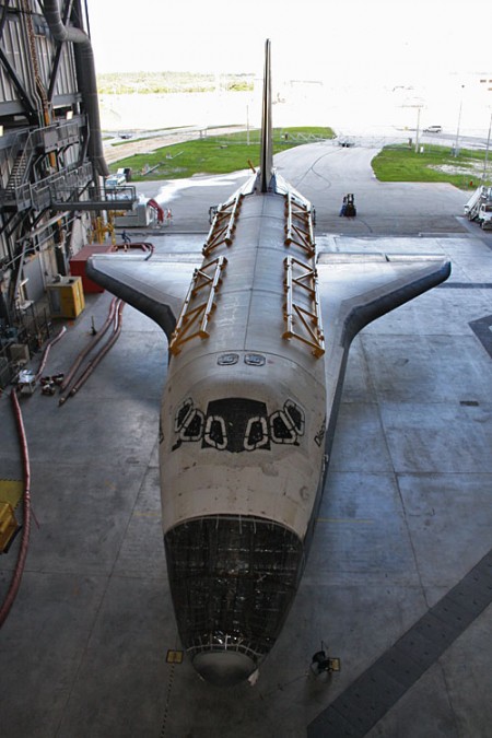
I’ve seen a lot of beautiful, moving images of the Shuttle lately but none have felt so intimate as these by Justin Ray for Spaceflight Now. Something about these photos of the now decommissioned spacecraft, engines removed, mission complete, bring the idea of it to life like none I’ve seen thus far. It’s the textures and details that highlight what an incredible machine this was and what a profound achievement for humankind it represents.
And look at that lettering! I’ve never seen it so close; it has such a handmade feel to it at this scale. The logos and typography of the Shuttle program always intrigued me, they seemed to represent the idea of the United States as a brand, an ideal to be consumed by the rest of the world. Then when Canadarm was installed on STS-2 it became apparent that even other — less crazy — countries felt the desire to push themselves as a brand in space. Of course, pushing your national space-brand became a bit more accessible with the ISS, but the US and Canada used Helvetica and were way ahead of the curve so I’d say they won whatever prize you get for most recognizable space-brand.
I wonder what we all gained growing up in a world where the Shuttle existed. I know it was a big part of my consciousness as a kid and probably had something to do with how I felt about my national identity. For me it symbolized the combined efforts of some of our greatest minds collectively reaching for a better understanding of the world we live in. For some — and perhaps rightly so — it probably represented a colossal waste of resources in the face of more earthly problems. Maybe it was both, but I I’ll personally miss it as a symbol of what we as humans can achieve when we work together.
