TCHO Chocolate
I’ve noticed these high end chocolate companies springing up left and right over the past few years. The paper-made thing seems to be the prevailing aesthetic of retail chocolate branding; employing one-color screened ink on kraft paper along with things like wax seals and cardboard hang-tags to give off that organic, handmade vibe I guess. It’s usually done to good effect but it’s nice to see a fresh take every once in a while.
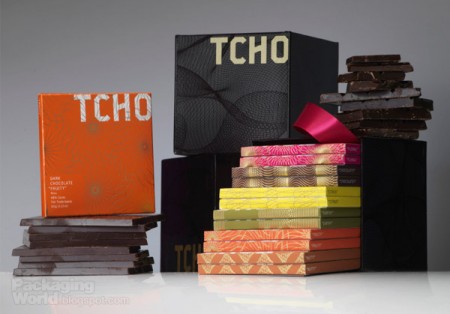
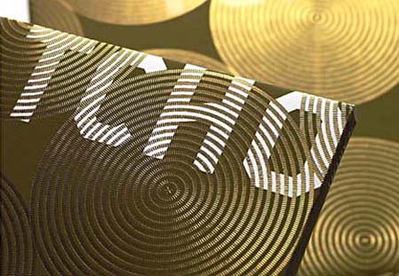
When I first saw San Francisco-based Tcho Chocolate I was struck by the name (no, I didn’t trade my studio for a chocolate factory down by the pier) and then by the design. I regrettably couldn’t find many decent pictures of the actual packaging, but suffice it to say you need to hold it in your hand to really appreciate the finer points. The letterpress and gold leaf inlay are a very nice touch that I don’t think is really captured properly in the above shots.
The video above goes over the concepts that informed the TCHO branding. I particularly like the central idea of chocolate as currency; design firm Edenspiekerman’s implementation of that concept is well executed. The result is a striking design which vaguely conjures the notion of European currency whithout making you forget you’re supposed to eat it. I don’t really enjoy chocolate on it’s own but they still had me wanting some just from the packaging.
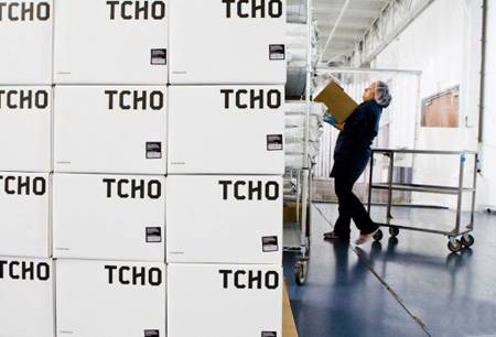
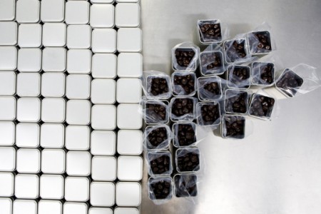
First two images from CNET’s tour of the Tcho factory at Pier 17.


