Typography of the Fashion World

In honor of the currently unfolding (ha) Fashion Week in NYC, I thought I’d post on some of the terrific typography at work in the fashion world. When I first got into design, I used to think the typeface for the Louis Vuitton logo was the epitome of graphic design. I remember writing everything in Futura Medium for a good month (even research papers, nothing was spared). These days, I still to pick up the occasional GQ or etc just for the ads — usually can pick up a few interesting things. There are always a number of logos that catch my eye, continue reading to see some of the marks that resonate most.
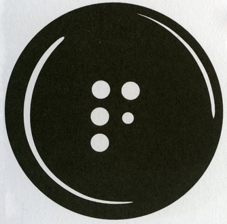
The mark for The Fashion Center (above) is perfectly simple. How brilliant to utilize the button holes to form the F! This is probably one of my favorite logos of all time. What it comes down to for me is that the 5th button hole is slightly smaller than the rest — this subtle scale shift makes the whole thing. Developed at Pentagram.
