Anton Stankowski
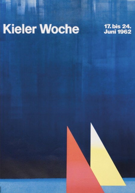
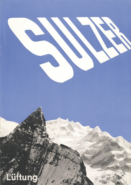
First off let me just say that it’s awesome to have come across this beautiful archive of work by German graphic designer, Anton Stankowski. The images in the archive are fairly large so the detail of the design becomes evident. In the first image of this post it looks to me like the background of the poster was painted with a brush then overlaid by the type. The process of how this was done would be refreshing to see.
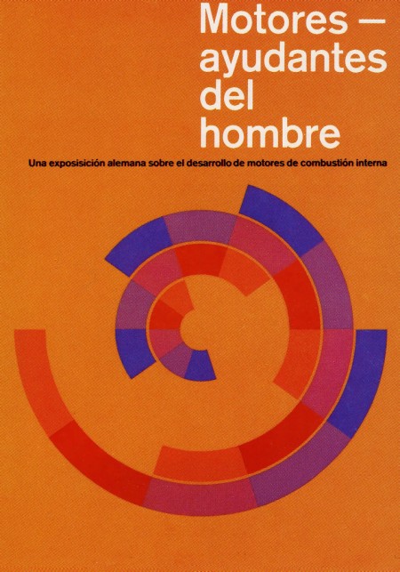
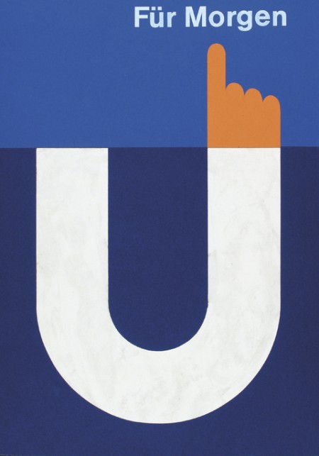
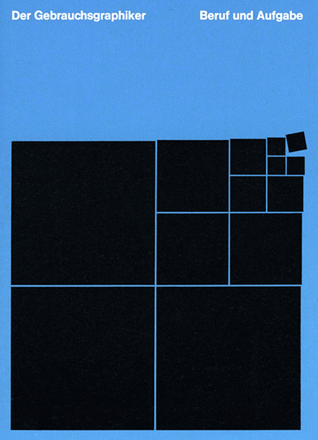
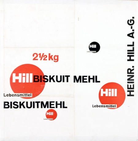
The first thing about Stankowski’s work that pulled me in was the amount movement. Nearly every one of these pieces utilizes a visual system that controls your eyes across the graphic elements and to the typography. The system is very effective considering that I keep looking at these pieces every couple of minutes to see how my eyes move around.
The Sulzer poster and the Hill Briskuit Mehl packaging are undoubtedly my favorites. Even though both are very simple they still have a lot of motion in them. Also in the Sulzer piece, the transition of the mountain peak to the type sings composition to me and in the Briskuit packaging I really admire the grid and typography.
