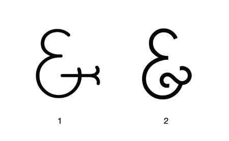
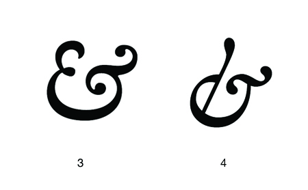
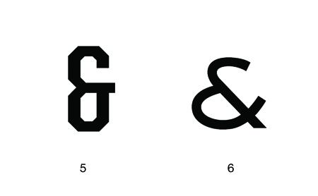
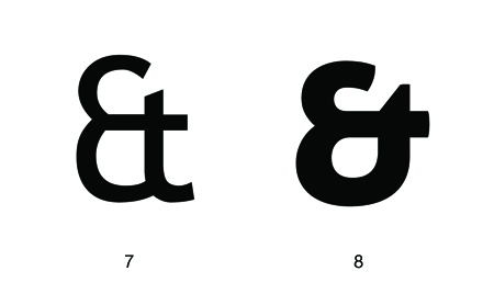
And per se And


I’m embarrassed to say I cannot draw an ampersand from memory; when I do it always looks like an unfortunate treble clef. Regardless I think the ampersand is easily the coolest symbol in any character set (or ever…). There are many reasons for this assessment.
First, it’s a complex symbol. Often times an ampersand would look more at home amidst a group of kanji characters rather than a cluster of geometric letters. This makes it very interesting to look at and you end up perceiving the overall shape, rather than the distinct path of the lines. Second, it can exist in many different forms and still be understood as an ampersand. I suppose this is the same for most letters, but the ampersand varies the most substantially between typefaces (thus allowing for the most potential random awesomeness). The creativity of the typographer is best (or at least more freely) expressed through the ampersand. Lastly, it stands for the word “and”, which if I were a symbol and I had to stand for something, would be a pretty damn good choice. Very optimistic and inclusive. I suppose the only sad thing about the ampersand is its relative absence from written English. (Though Wikipedia tells me it’s making a comeback via text messaging. I’ll have to get on that…)
I can’t write a post about ampersands and not mention the best blog ever: Ampersand. And another one! 300&65 Ampersands. Above I’ve collected just a few of my favorite ampersands; not a definitive list by any means. Links are below:
1. BernhardFasD
2. Caviar Dreams
3. Caslon Semi Bold Italic
4. Hoefler Text Italic
5. United Sans Condensed Bold
6. Sackers Gothic Medium
7. Trebuchet
8. Aller Display
And yes I know the Mother and Child logo is the coolest thing ever. I know there are more killer ampersands…list your favorite here.
