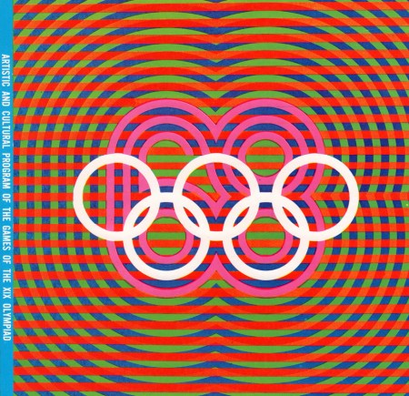
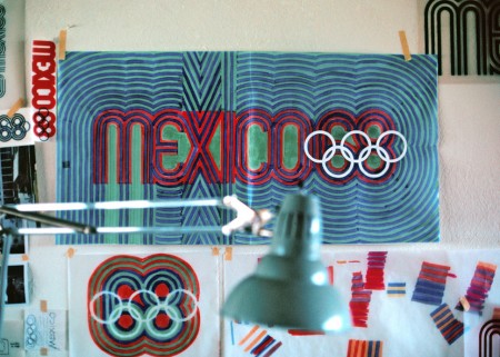
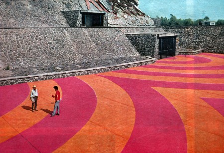
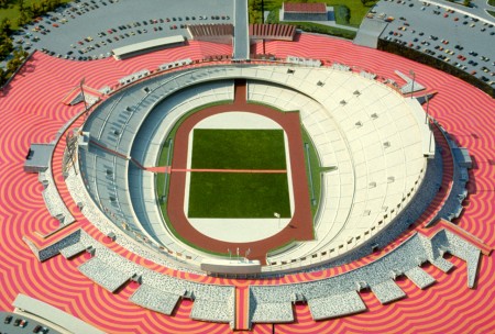
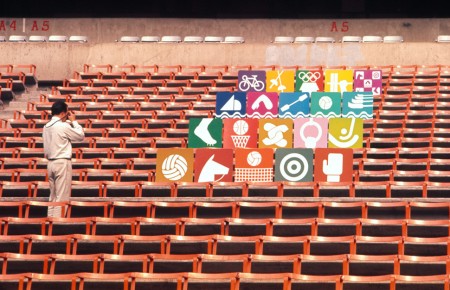
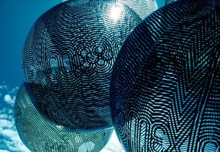
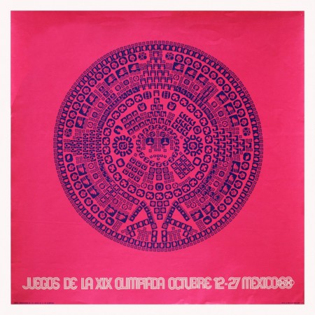
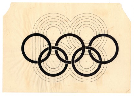
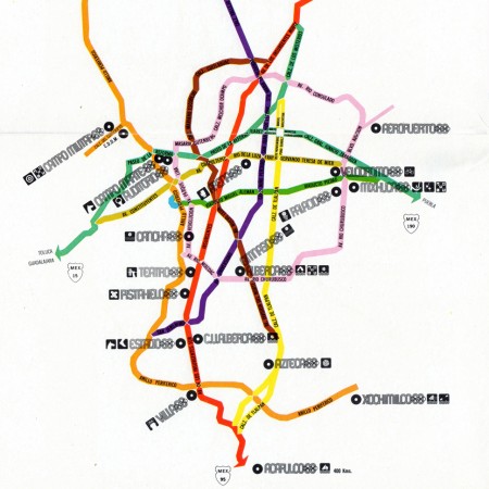
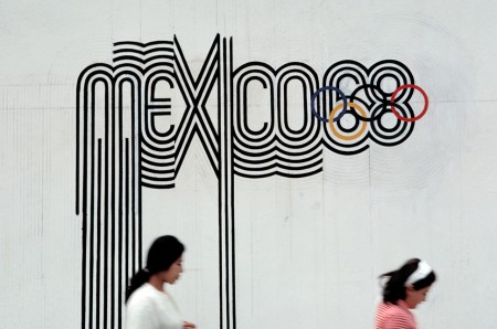
 With the London 2012 games (along with their controversial branding) in full swing I thought I’d revisit one of my favorite — Olympic or otherwise — branding campaigns ever: that which was created for the 1968 Mexico Olympics. Graphic Ambient has some beautiful images of the work in the real world, some of which I’d never seen before. I definitely have to say that I prefer Otl Aicher’s work for the 72 Munich games; but this has it’s own thing going on and after all it did come first! Related reading: Design Magazine #237 Via Graphic Ambient


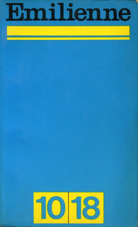
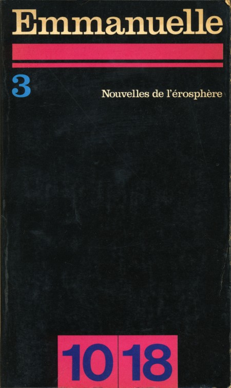
Here are a couple of great high res scans from Sarcoptiform’s excellent Flickr stream. Emilienne and Emmanuelle are apparently French books from 1968. I can’t find any more information on them.
The title face looks like Clarendon to me; one of the better uses I’ve seen, particularly on the Emmanuelle cover. And that black background would make a great texture for all sorts of applications. Sharpen > Desaturate, Levels > Select Color Range, or just use in blending mode.
Update: According to Blo in the comments: “Emmanuelle and Emilienne were erotic best sellers, and Emmanuelle was also a film. 10x18cm is the size of the pocket book. It was and still is a collection of novel paperback.”
Via Sarcoptiform


 With the London 2012 games (along with their controversial branding) in full swing I thought I’d revisit one of my favorite — Olympic or otherwise — branding campaigns ever: that which was created for the 1968 Mexico Olympics. Graphic Ambient has some beautiful images of the work in the real world, some of which I’d never seen before. I definitely have to say that I prefer Otl Aicher’s work for the 72 Munich games; but this has it’s own thing going on and after all it did come first! Related reading: Design Magazine #237 Via Graphic Ambient