Holland Festival 1969
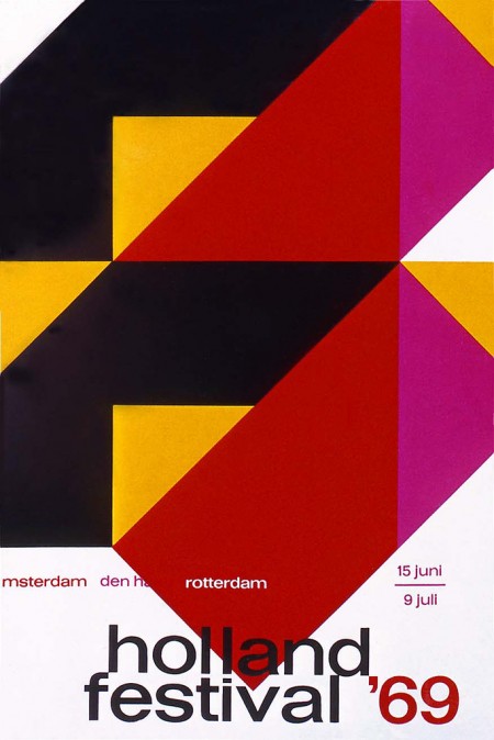
Holland Festival ’69 poster by Dick Elfers
Via Alki1

Holland Festival ’69 poster by Dick Elfers
Via Alki1

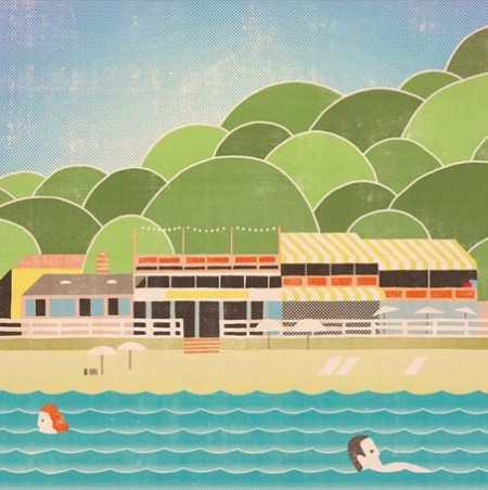
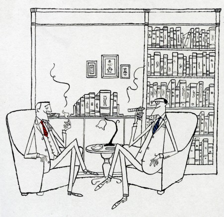
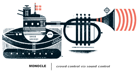
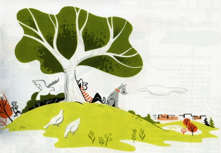


Monocle Magazine has an impressive roster of illustrators. Featured above is work by: Andrew Holder, Takashi Kuwahara, Raymond Biesinger, Satoshi Hashimoto, and Adrian Johnson. Each of them contributes to the magazine periodically.
Outside of the Monocle world, I am most familiar with Adrian Johnson. (Check out the Grain Edit interview). For whatever reason I come across his illustrations all the time. However, of the four listed above, Biesinger’s work resonates the most with me. I love his simple graphic approach and limited color palette. You can browse his work, Monocle and otherwise, on his website.
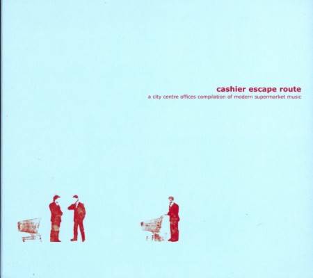
One of my favorite simple album covers has to be this cover for Cashier Escape Route above because of the subjects involved and that bold light blue with a tiny bit of red always worked. This Phonem track is pretty laid back and brings me back to the earlier days of IDM and how it always helped me on the imaginative end of thinking of new designs.
There are a ton of feel good tracks out there and Blackalicious might have one that hits the Top 50 of all time.
Most of you might already know but Grizzly Bear has a new album coming in in May, this is just one track from it that was taken from their performance on David Letterman.
Here’s a pretty simple edit done by Michael Mayer, sadly I don’t know the original track but I can’t wait to DJ again and play this for a couple minutes.
[audio:leuna.mp3] [audio:feelthatway.mp3] [audio:2weeks.mp3] [audio:amanda.mp3]
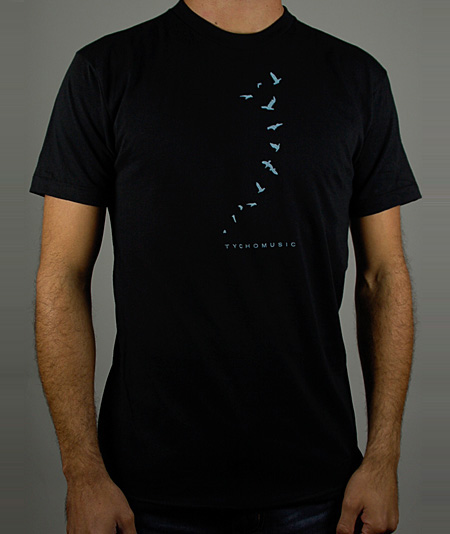
As you may already know, this Friday and Sunday Ghostly International will be celebrating their 10 year anniversary and have a select few artists (Tycho among them) playing in San Francisco and Los Angeles live. We’re giving away a set of two tickets for both shows which will include two t-shirts each (see above) for the winners. The first two people to correctly answer this question win:
Which Ghostly International catalog numbers are currently missing between their first release and their latest release? (Note: Catalog numbers are the numbers that are put on each release to show what number release this album is.)
Please email the answer to: jakub [at] iso50 [dot] com (please specify which show you will be going to). The winners must be able to go to the Los Angeles or San Francisco shows, sorry to the friends that just want the shirts, we will run a few more giveaways soon to make up for it.
More info on the shows is here and advanced tickets can be purchased here (SF) and here (LA).


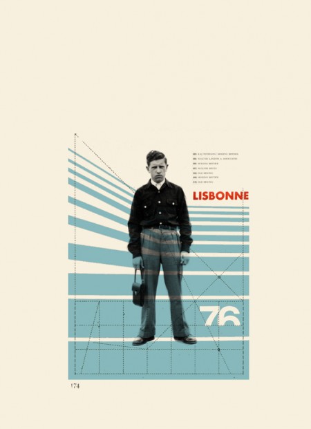
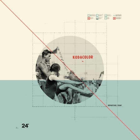
I had seen Cristina Couceiro’s work here and there before but this most recent series really blew me away. What classic style; I really like how she employs found imagery without crossing that fine line into kitsch that so many others seem to stumble over. The typography is spot on as well. You can see more of her design and photography here.
I don’t post many really upbeat poppy songs on here but its Friday and Phoenix have a new LP coming out and i’m super geeked to find out if its going to be great. It’s been almost 9 years since they released United which I first heard in the Ghostly International office as a intern and fell in love. I feel this track 1901 is going to be played really loud at every bar by June as a LAST CALL song which is good and also really really bad at the same time.
Mux Mool has a new EP coming out in March and has leaked a new song (that will stay unreleased) with the info on the “Just Saying Is All EP”. Nausican has this morning strut feel to it, you know that feeling when your having a good morning and saying hi to all the neighbors kind of like that Blackalicious track Make You Feel That Way.
Alright i’m not sold on this new Royksopp, its not what I like about the earlier material and it’s way too poppy for my taste. What do you guys think?
[audio:1901.mp3] [audio:tooyoung.mp3] [audio:nausican.mp3] [audio:happyup.mp3]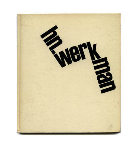
I’ve always been a huge fan of books on modernism, but unless you’re Dave from Grain Edit, it’s pretty hard to get your hands on the good stuff. And so it was with great pleasure that I stumbled onto Modernism 101 booksellers. the site, featuring a vast collection of rare and out of print books on modern design and architecture, serves up cover images and very detailed information on a wide array of classic design texts. Many of the books featured are have sold, but they archive the pages so it’s a great resource for images and information on many books that you’ll probably not find elsewhere. I’ll be running a (hopefully) weekly feature aptly titled “Modernism 101” highlighting the best examples from their collection.
Today’s selection is a collection of Dutch printmaker H.N. Werkman’s work edited by Fridolin Müller. Enjoy!

H. N. WERKMAN
Fridolin Müller
Fridolin Müller (editor), Peter Althaus (introduction): H. N. WERKMAN. NYC: Hastings House, 1967. First edition. Tri-lingual edition in English, German and French. A near-fine hardcover book in decorated glazed paper boards issued without a Dust Jacket: trace of wear overall. Interior textblock in fine condition. Volume Two in a projected four-volume set called Documents in the Visual Arts. A nice copy of a scarce book.
8.5 x 9.75 hardcover book with 104 pages with 79 plates (14 in color) of Werkman’s avant-garde Dutch typography. H. N. WERKMAN presents the most extensive published collection of Werkman’s typography to date. My highest recommendation.
Beautifully designed and printed by Verlag Arthur Niggli in Switzerland with the plate engraving and printing setting a new standard for the reproduction of the presented artwork. Spot colors are used throughout for maximum color fidelity.
Dutch designer and printmaker Hendrik Werkman (1882 1945) is best known for his innovative printing techniques and avant-garde typography. As publisher of De Blauwe Schuitt, a series of underground booklets produced by Jewish dissident poets and writers during the Nazi occupation of Holland, Werkman was imprisoned by German secret police in 1945 and executed without trial just three days before the country¹s liberation.
out of stock
Via Modernism 101
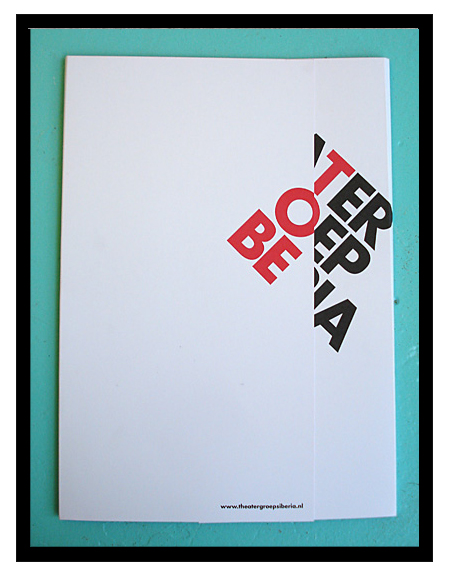
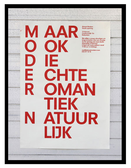
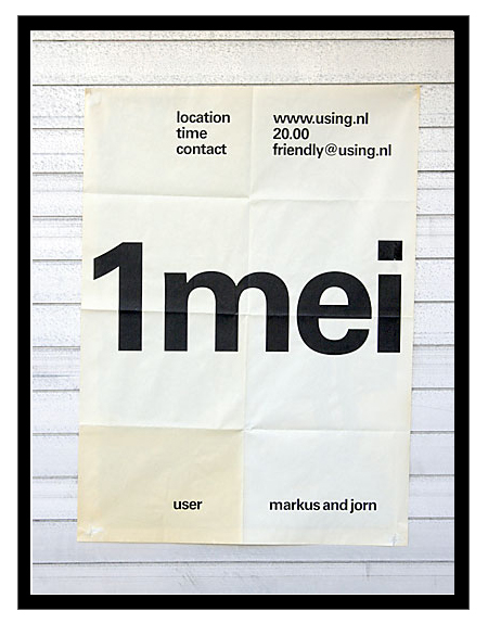
Just got turned onto Dutch studio Almost Modern this morning. I’m definitely a fan of their poster work; there are some misses here and there, but most of it is simple, minimal, and very effective design.