Well it looks as though Gapgate is over as quickly as it appeared. After all the speculation, they did indeed pull a Tropicana. And what started out as a fun little experiment for us, quickly swelled far beyond our expectations. We received hundreds of submissions, so many that we had trouble keeping up. So now it’s time to sort through all of them and choose the winners. But before we do, I wanted talk a little about the contest in general and what we’ve learned during the past week.
As we mentioned in the previous post, the contest is not affiliated with Gap in any way. We are not crowd sourcing a new logo for Gap. To think that we are is to misunderstand the concept of crowd sourcing as well as our intentions. This contest was designed to give people an opportunity to put themselves in the shoes of Laird + Partners; to see what they would do if tasked with the (apparently) impossible mission of rebranding Gap. These mega-rebrands are always hit with a wave of inevitable criticism, but rarely do you see designers offering viable alternatives in addition to their critiques. It’s harder than it looks. I wanted to challenge our readers to not just criticize the new logo, but provide an alternative solution. The contest was an exercise — like a school project — and had nothing to do with Gap’s ludicrous (thankfully temporary) decision to engage in crowd sourcing.
The entries were interesting to say the least. Submissions ran the gamut from tongue-in-cheek innuendo to well executed contenders to the original logo. What filled the space between was a raft of subtle variations and incremental evolutions that all seemed to rely heavily on the original brand. But I suppose that’s what’s at the core of this whole argument: people apparently love the blue square.
So now we leave it up to you again. Please refer to the submissions on the original post, noting the number of the submission (directly below the image on the left) and place your vote here. Voting will be open until 11:59 PM Wednesday October 13th. (Update: Voting is now closed, winners posted soon)
Thanks to everyone who submitted a logo, good luck!
The new Deerhunter is everywhere, you probably already listened to it but its well worth posting, when Bradford starts singing slower in Helicopter it grabs my ear, probably my favorite moment in the record.
Seams put up a free download recently, its beautiful, Four Tet-ish with whirlwind kind of feel, highly recommend you download.
I’m always excited for new Apparat, I expect him to always deliver epic speedy melodic material tastefully and he did just that, everything thats underlaying in the song gorgeous too, needs to be heard more than once, I could go with out the marching band breakdown though.
I don’t need to file Copy under any genre its not worth the hassle to place him somewhere because its not going to help explain how much I love this tune.
CDM is reporting on a new iOS based Moog product called Filtatron, “an iPhone Filtering, Effects, and Sampling App”, basically Moogerfoogers on your phone. This is looking pretty amazing interface-wise; very true to the signature Moog aesthetic with the Little Phatty style rotary encoders and soft buttons. From a strictly user experience perspective this must have been a lot of fun to design. It will be interesting to see how it actually sounds compared to the real thing though — I’m going to take a wild guess and say it sounds nothing like a MoogerFooger. Software analog modeling is an imperfect art (or perhaps too perfect); it’s best to think of it as it’s own beast entirely than a faithful representation of the sonic characteristics of a true analog circuit. At any rate it’s interesting to see music technology makers pushing the capabilities of mobile devices. Software like this can may never replace analog hardware, but it would be nice to have the portability and power when you’re away from the studio, even if it comes with a healthy dose of compromise. See also: iRig
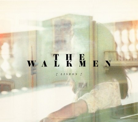
I’ve always liked how the singer of The Walkmen voice went along with the guitars and their conservative classic style has made it easy for them to be a big hit in the main stream. I listened to the album and thought it was really strong but I found this NPR Session of the song Woe Is Me to be what i’d love to put on if i’m going to listen to The Walkmen.
More Neon Indian remixes, this one comes from Anoraak from France, if you haven’t noticed yet i’m still a sucker for this gentle 80s sound.
Glasser takes a Fever Ray approach, nothing new here but its done really well. At times in this song I wish Ellen Allien took this approach I think by now she’d be doing big things. Also, one part that grabbed me in this Glasser track was the similarities in the intro with Matthew Dear’sDon’t Go This Way, which I loved, more of that sound please.
Hooray! style is all over the place, I can’t put my finger on it, crunchy kicks or sometimes even pianos, in I Guess… he flattens out simple noisy loops making them sound like the last new minutes of a No Age session that has died down.
Note: Skip to around 5 minutes in to bypass the outdated AIGA news
In addition to the Experimental Jetset Interview that Alex did a while back, this video should help reveal some more information about Experimental Jetset. The first time I watched the video I felt more of a connection to their work simply because I could see and hear their personality. Why?
More than once I’ve been informed of a new artists or designers but haven’t connected with them because I can’t see them talk about their work. Take David Carson as an example. During my first year at the Art Institute I heard his name once a day, five days a week and for the life of me, couldn’t see the value in his design. Now hold on here for a second, I know I’m not the only one (not trying to start a David Carson war here). Regardless my opinion has since changed. But not because I could finally comprehend his intentions. It was because when I watched a video of him speaking I started to see where he was coming from. It was almost as if seeing and hearing him talk let me see into his creative prism. Perhaps by his humor or perhaps because I could simply see him. Either way it helped me establish trust in what he was doing as a designer, or artist, whatever you might consider him to be.
Experimental Jetset didn’t need that trust or comprehension on my end. It was already there because I enjoyed their works and established an immediate connection to them. However, I still really enjoyed seeing Marieke and Danny share insight on their works. Part of it was realizing that these people that I look up to are human and part of it was that hearing those little insights into their creative process is very valuable and inspiring.
I’m posting this partly because there was one parked outside my house on Monday and partly because you can’t have grown up during the 80’s without lusting after these things (but I’m guessing all designers, regardless of age, have at least a passing interest in the aesthetics of this car). Gizmodo reports that an Italian team has converted a DeLorean DMC-12 to run on lithium-ion batteries. Sounds like fun but I think I’d rather just buy a new one.
Recently I’ve stumbled upon SR692—quite possibly the best collection of SwissAir collateral. It is definitely the biggest collection and had these gems stowed deep within. Most of these posters were came from the 50s to the 70s archives on the site. The few I’ve posted are very straight forward as you can see. Simply utilizing the generic airplane icon, a headline and the SwissAir logo—part of what makes these posters so unique.