Book & Periodical Covers
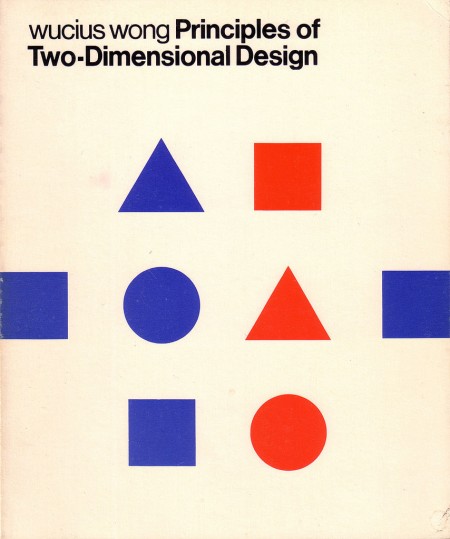
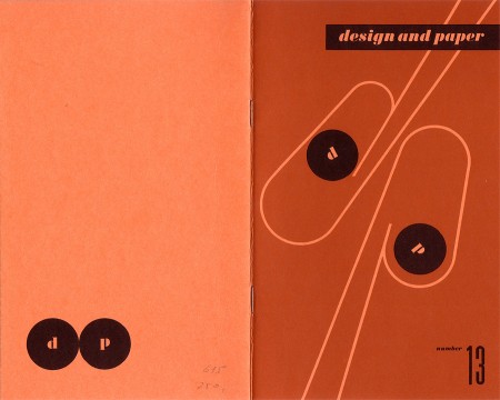
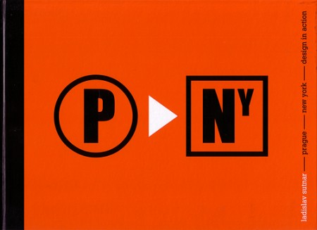
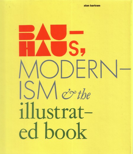

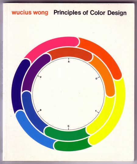
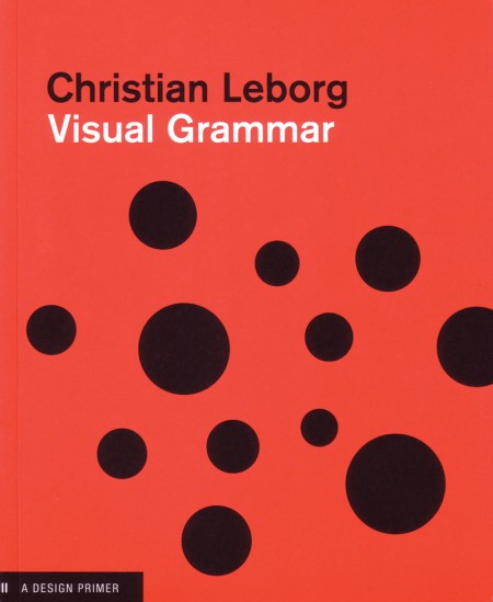
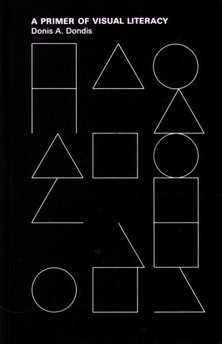
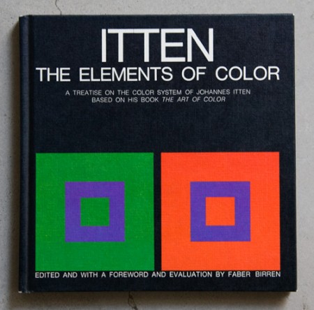
Some great covers archived by Oliver Thomas on his Flickr. Some are pretty high res scans so get your printers warmed up…
Source:
Book & Periodical Covers Set by Oliver.Thomas


Some great covers archived by Oliver Thomas on his Flickr. Some are pretty high res scans so get your printers warmed up…
Source:
Book & Periodical Covers Set by Oliver.Thomas
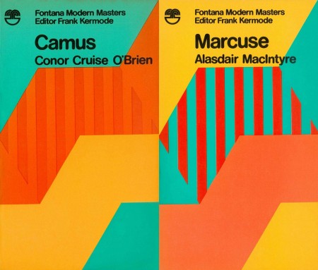
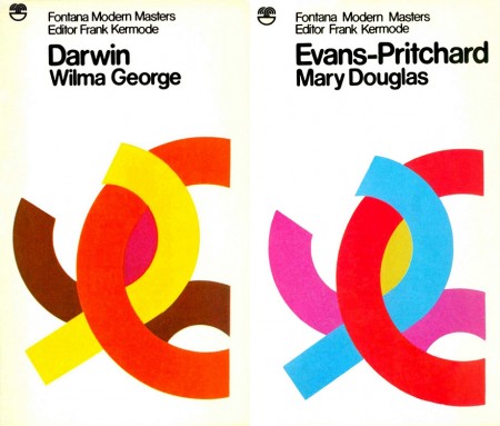
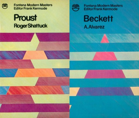
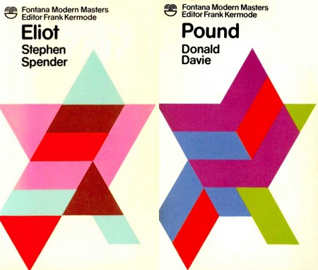
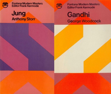
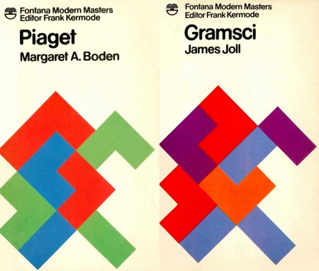
It’s a beautiful day outside but seeing these covers for Fontana Modern Masters makes me want to stay in and design. From Wikipedia:
The Fontana Modern Masters were a series of pocket guides on the writers, philosophers, and other thinkers and theorists whose ideas were shaping the intellectual landscape of the twentieth century… The books were very popular with students who, according to Kermode, ‘bought them by the handful’ and were instantly recognisable by their eye-catching front covers, which featured brightly-coloured geometric designs overlaid with modern sans-serif typography.
These covers are the work of artists Oliver Bevan and James Lowe, and originally they could be combined and arranged to create new works of art. When Lowe replaced Bevan in 1975 the covers dropped the full bleed pattens in favor of white backgrounds but retained the shifting geometric shapes.

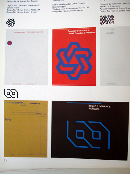
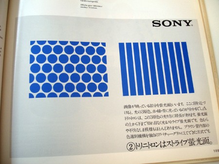
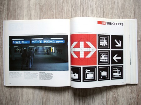
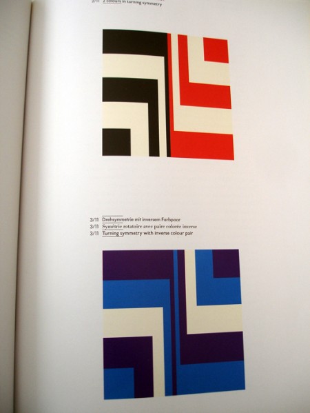
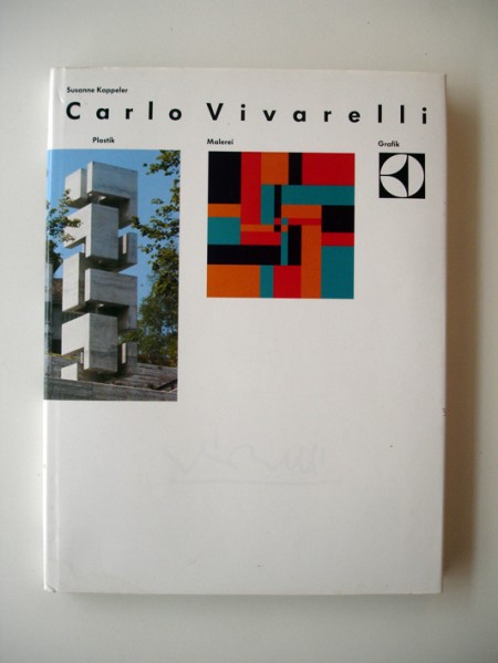
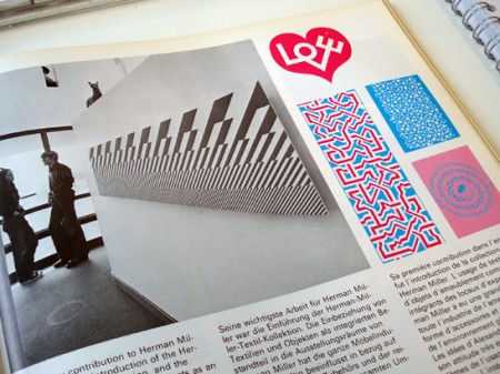
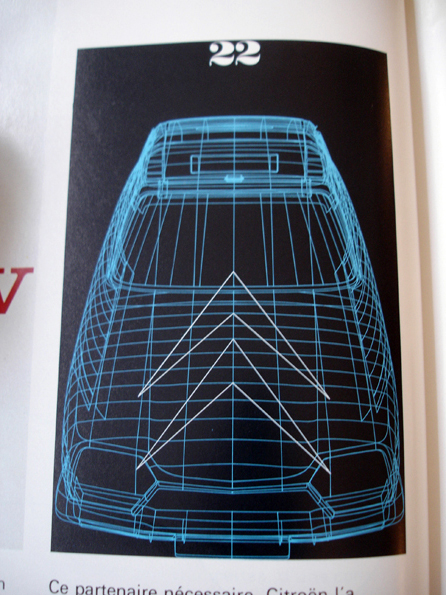
Unbelievably unbelievable Flickr set going on over here. Can’t get enough, that Sony stuff in particular is amazing. Want prints…
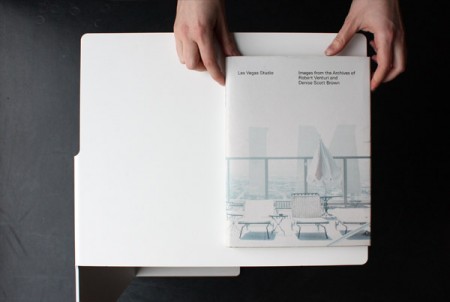
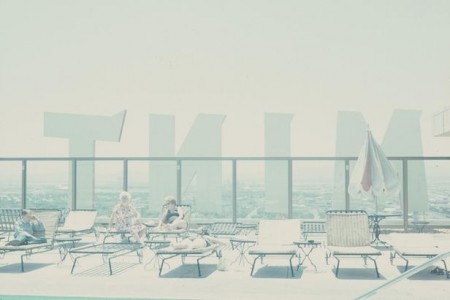
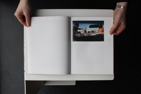
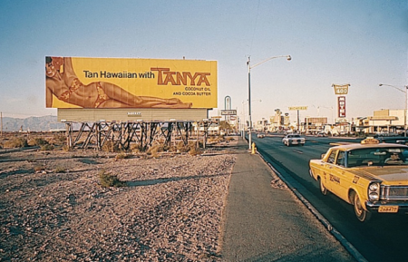
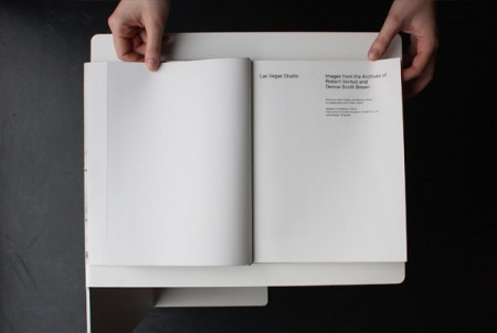

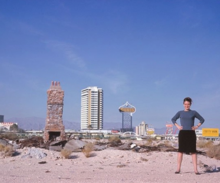
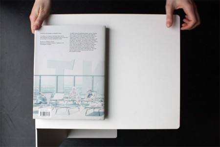
Las Vegas Studio: Images from the Archives of Robert Venturi and Denise Scott Brown, published by Scheidegger & Spiess, is a collection of images from architects Robert Venturi, Denise Scott Brown, and Steven Izenour’s field research in Las Vegas during the early 1970’s. The research was for their own book, the classic Learning from Las Vegas, which explored postmodernism in architecture and urban planning, using Las Vegas as an example.
Beautiful photography and an even better layout; amazing stuff. Stylepark has a great review of the book with some nice shots.
Images via Stylepark

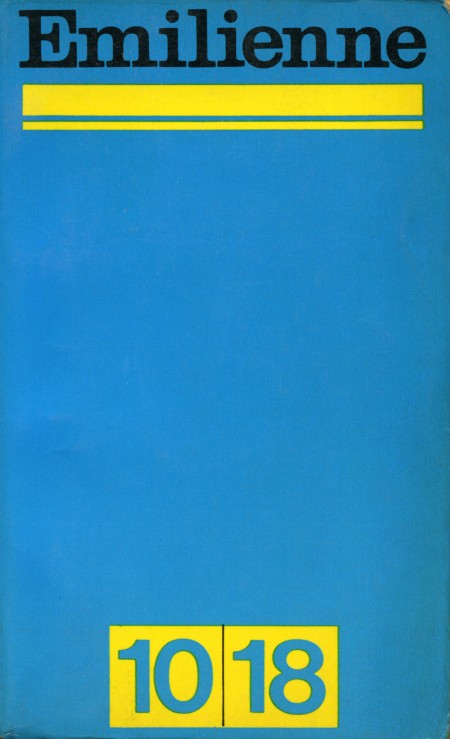
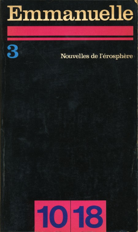
Here are a couple of great high res scans from Sarcoptiform’s excellent Flickr stream. Emilienne and Emmanuelle are apparently French books from 1968. I can’t find any more information on them.
The title face looks like Clarendon to me; one of the better uses I’ve seen, particularly on the Emmanuelle cover. And that black background would make a great texture for all sorts of applications. Sharpen > Desaturate, Levels > Select Color Range, or just use in blending mode.
Update: According to Blo in the comments: “Emmanuelle and Emilienne were erotic best sellers, and Emmanuelle was also a film. 10x18cm is the size of the pocket book. It was and still is a collection of novel paperback.”
Via Sarcoptiform
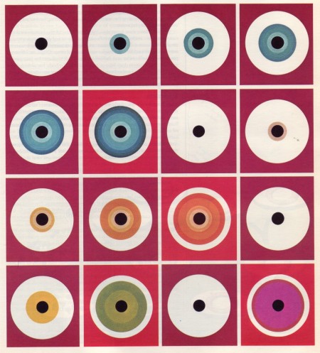
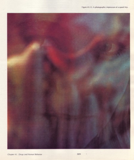
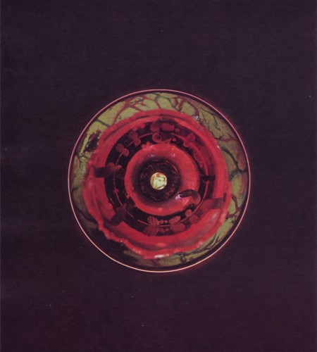
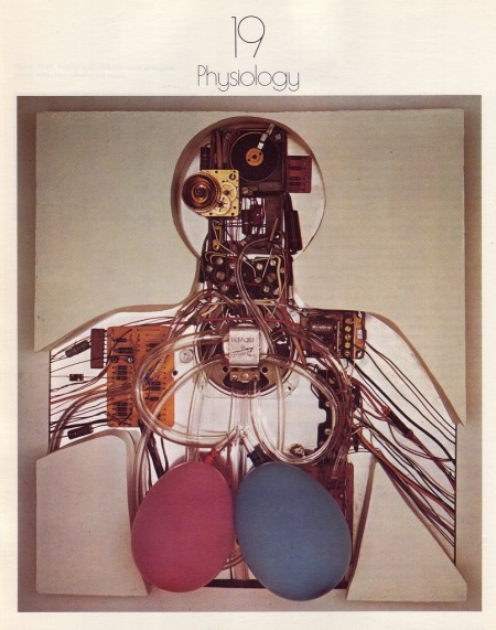
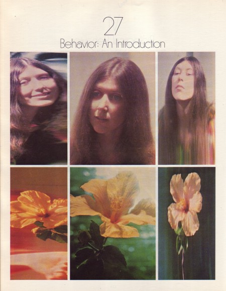
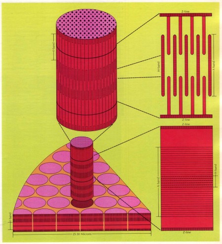
Biology Today was a college biology text book in the 70’s and early 80’s. A Journey Round My Skull has posted some high res scans from the 1972 edition. Beautiful stuff, suitable for textures or printing at these resolutions.
Biology Today via on A Journey Round My Skull
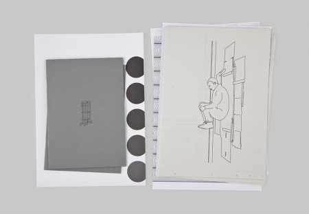
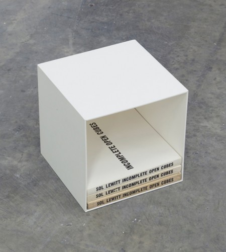
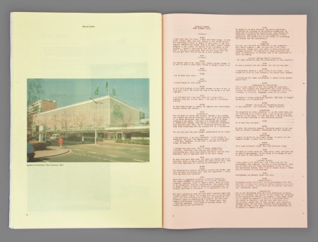
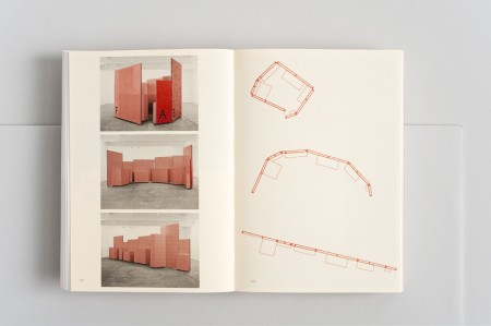
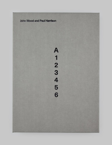
Book Show is an exhibition of artworks, objects and structures that address the physical form of the book thats curated by James Langdon and Gavin Wade.
I’ve always wanted to take a stab at curating the aesthetics of a book, everything from canvas covers to different color pages, so when I saw these books the gears in my head started turning, anyone need any help on that front?
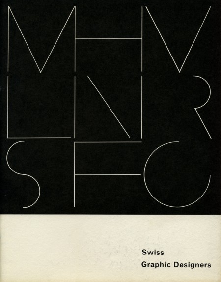

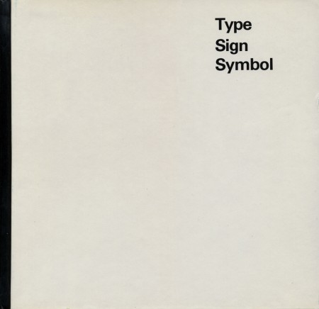
Three Covers 001 | Source: Joe Krall via Designspiration