John Simon’s Album – 1971
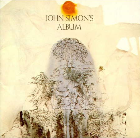
I wonder if the music is as good as the cover. Love the organic transitions and the seamless flow through each media. Particularly love that sun, amazing.

I wonder if the music is as good as the cover. Love the organic transitions and the seamless flow through each media. Particularly love that sun, amazing.
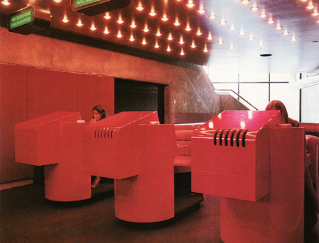
I don’t get how you could tear something like this out of a building!?!
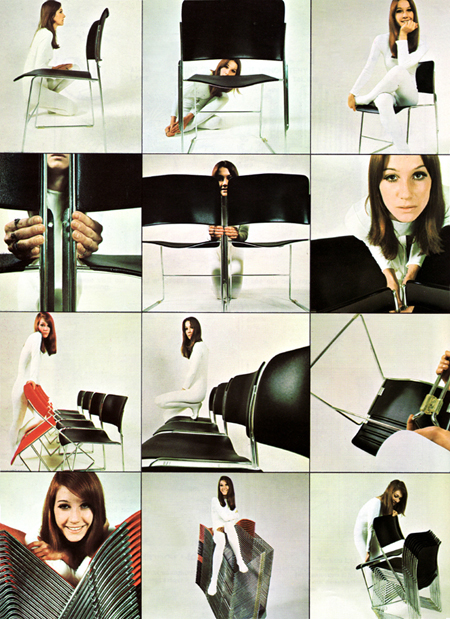
Nice ad layout and feel. I didn’t know you could have that much fun with stackable chairs, she’s all over it.
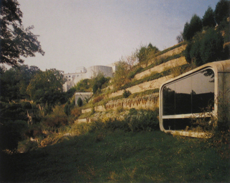
Dream home. Not sure how comfortable this would actually be, but when something looks this good, it really doesn’t matter how soft the couch is.


Probably close to perfect interior architecture in that place. Some more pics and info here.
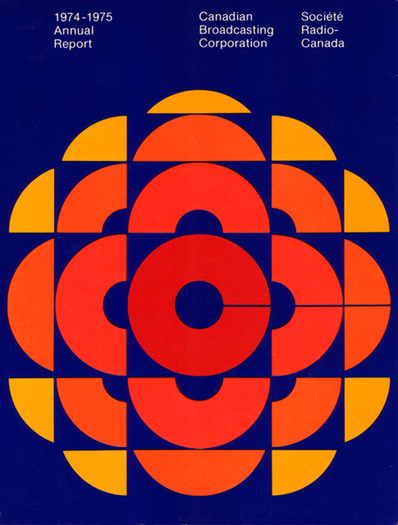
CBC Annual Report 74-75 graphic. The forms are incredible but the blue is a bit too royal-blue for my tastes. With a more muted color scheme and a shift of the blues into the aqua realm this would be on a whole other level. But I am assuming if you found a copy of this today, it would have faded just enough to look pretty amazing.

If you went to some of the Apple stores a few months back you were able to buy the updated versions of these.