Some excellent examples from Graphis Packaging 3. I can say without any doubt in my mind, that packaging design has declined significantly over the past 20 years. Take a look at the more recent Graphis Packaging 9. Nothing in there even remotely piques my interest. I would love to hear a reasonable explanation of this phenomenon. Is it that marketing departments have slowly wrested control from true designers? Or is it just that I personally appreciate the style of a specific era to the current one? Or maybe I’m just so used to the style of things today that I am intrigued by the rarefied forms of the past. I’d like to think I’m being objective about the whole thing and that the above examples really are superior, but perhaps I’m not.
Anyone in the know care to shed some light on this? Have studies been done? I need answers!! I’ll tell you one thing, you could fill those boxes with whatever you wanted; if I saw them on the shelf I would buy them. Check out some more examples here.
Images via Crabstick
In keeping with this week’s (completely unplanned) typographic theme, I thought I’d post these excellent covers by Emil Ruder. I’d love to see someone try to get away with type layout like this on a client project.
Some additional info (apparently translated) from 80 Magazine:
“in 1953, TM held a competition to design a cover series, inside layout and advertising pages. 12 people took part, including the basel typography teachers emil ruder and robert büchler. the TM jury report on ruder’s entry:
‘the designer if his competition work chose the square as design motif, wich also resonates again in the page layout. this cover series is designed with sparkling fantasy; bold and new, far way from tested solutions, in a darling refreshing attemp. […] a really new solution which could have an interesting change from the arrangement up to now’
five covers by emil ruder were applied to break the monotony of the winning entry of robert büchler”
extracto da revista-libro ‘ruder typography ruder philosophy’. idea magazine 333. vol. 57. marzo 2009. xapon. issn 0019-1299 +
Via 80 Magazine


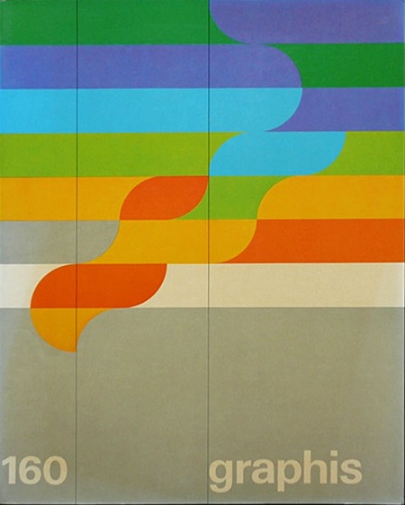
Sébastien Hayez was kind enough to send me this Graphis Flickr set where you’ll find a lot of nice shots of various Graphis books. Link
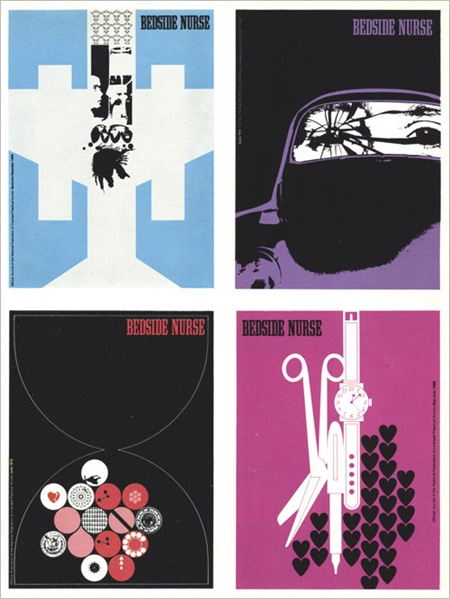

Some random beauty from Graphis 71/72 via The Nonist. These are from the same issue as that Dietmar Winkler piece I posted a while back (one of my all time faves). The Bedside Nurse stuff sort of reminds me of Air’s Virgin Suicides OST cover.
1. Charles Goslin / David Barnett. Covers for the magazinebedside Nurse. (Look very modern don’t they? But the bigger question “Bedside Nurse magazine?!")
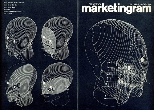
2. By: Kohei Sugiura. Front and back covers of Marketingram, the Shiseido house organ, here dealing with the morphology of the human head.
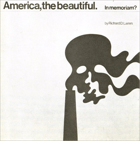
3. By: Ron Hughes. Cover for a record about ecology. (Gore could have used this for An Inconvenient Truth 35 years later.)
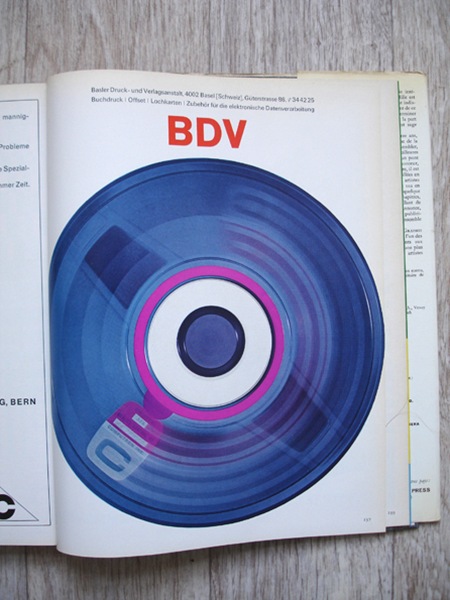
Some more pages from Graphis 190 (1977/78) via insect54
More greatness from Mr. Aicher Via rallovallo
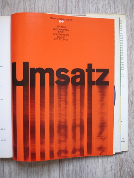
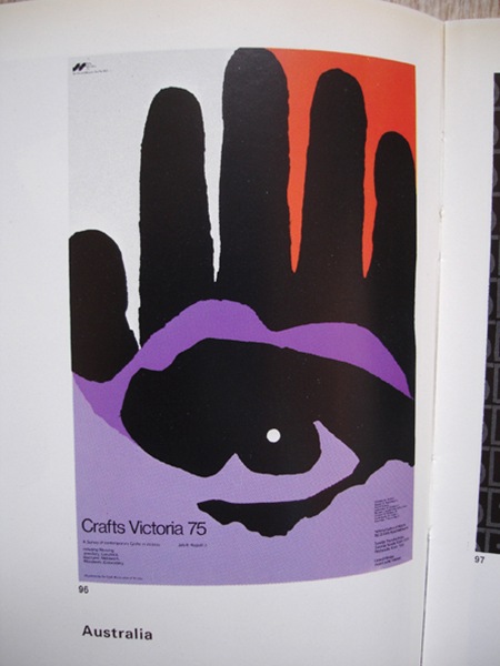
It’s all about the orange: Graphis Annual 1965/66. Via insect54.

Graphis Annual 1960: one more thing I wish was on my bookshelf.
Via insect54