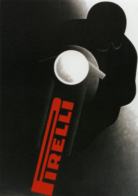
Gerhard Forster for Pirelli
Posted by Alex

I am not one for motorcycles, but it’s an ad like this that makes me reconsider my position. Sign me up to be one of the motorcycle bad guys in the Bourne films.
What about that logo! I like it — maybe a little unwieldy, but it does a good job conjuring their product. I guess it’s hard to evaluate at this point given its classic status. As far as I know, Pirelli was in the business of tires and not bikes. Either way, Gerhard Forster makes the thing look damn cool. I love the charcoal-like texture in the shadows; similar to some of the Robert Longo work I wrote about a few weeks ago.

3 Comments Leave A Comment
koneyn says:
July 31, 2009 at 12:52 amHmmm, I actually like everything about that illustration except the logo and the way it’s applied. It kind of sticks out too much being so intensively red.
What year does this come from? :]
alex says:
July 31, 2009 at 1:02 am1965. I agree about the way the logo is applied — personally I would prefer it smaller, and horizontally aligned. But I guess back then, a more playful and unusual solution like this was pretty hip.
Op says:
July 31, 2009 at 6:57 pmThe logo is the tyre though so it couldn’t really go anywhere else :) The bold bright red gives the impression of it racing out towards you and does a great job of saying ‘fast tyre’ and combined with the headlight makes a strong graphic impact even before you see the dark rider coming at you. Plus it gives the logo a dotted i which it would otherwise be missing ;)
Definately one of my fave posters of the time.