Leandro Castelao
Posted by Alex


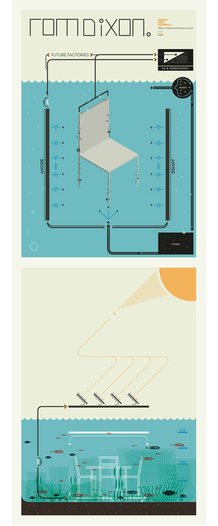
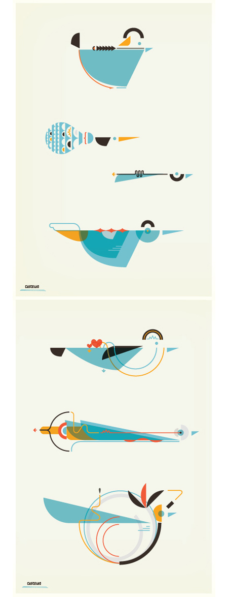
A few pieces by Argentinean illustrator Leandro Castelao. Terrific attention to detail and great color at work here. I feel like I’m looking at a retro instruction manual for some super bad ass birdhouse. Illustrations like this remind me of the work of Feric. Castelao’s are a little less intricate, but the playful/scientific aesthetic is reminiscent of some of the Fevolution renderings. Some impressive work from both artists.

9 Comments Leave A Comment
Patrick says:
July 3, 2009 at 5:08 amI saw that he was featured on TinyShowcase this week. Really terrific stuff.
lunik33 says:
July 3, 2009 at 6:22 amreally good work.
Rent says:
July 3, 2009 at 9:48 amI’m seriously fascinated by that second image down. I want a giant poster of that in my room.
Alex / HeadUp says:
July 3, 2009 at 11:31 amYeah, 2nd image is really spot-on, it communicates a little more than the others, really intriguing. Color choice really is excellent in each, love that goldenrod yellow and how it mixes with the deeper, redder orange.
Karl Peterson says:
July 3, 2009 at 11:52 amIsometric illustrations are great when done well. Reminds me of Felton, but with a Deco twist.
Brennan says:
July 5, 2009 at 9:19 amWould anyone happen to know what font that first “ROMDIXON” is? Or something close to it, anyway…
Cheers!
nick says:
July 6, 2009 at 3:42 pmit’s beautiful. makes you wonder at first what the design is for, until you come to the conclusion that the design is for itself.
everpress says:
July 8, 2009 at 6:56 amLooks more like Charley Harper to me than anything else.
http://www.charleyharperprints.com/
The website is garbage, but his work is amazing.
The color is rich and the lines are clean.