Graphic Design In Swiss Industry
Posted by Scott
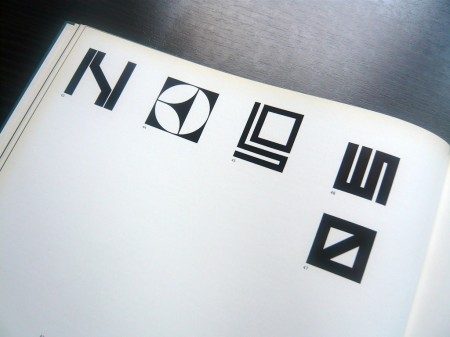

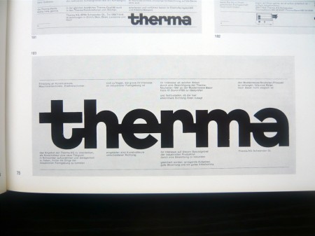
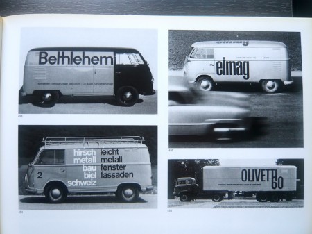
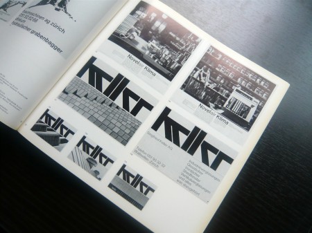
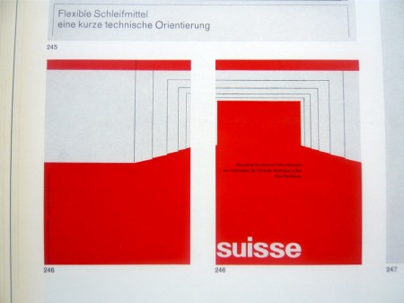
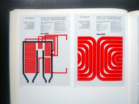
There’s a certain point at which you just have to give up on graphic design because the Swiss beat you to it like 30 years ago and you know it. AisleOne has managed to capture that exact point and wrap it up nicely into a flickr album. Enjoy: Graphic Design in Swiss Industry / Schweizer Industrie Grafik Pleasantly reminiscent of the World of Logotypes stuff.

8 Comments Leave A Comment
Ryan says:
April 20, 2009 at 11:49 pmWhew! Very nice stuff here!
The bottom left van ravaged with text.. Lovely! Would we ever see a rad van like this in america???
maria says:
April 20, 2009 at 11:50 pmSwiss always seem to have such a natural intuition for design and composition. Not only by walking by their streets, but when I met some Swiss students at my faculty (architecture in Barcelona), their plans were more well composed, with lovely typos and proportions… and the best is that they didn’t designed that specially, they just worked this way. I guess it’s something about visual education.
Scott says:
April 20, 2009 at 11:57 pm@ryan-
if any of those cars were brought here they would explode immediately. we can’t have nice things like that.
SebHayez says:
April 21, 2009 at 12:43 amSo, the e-mail I sent you yesterday is the perfect following.
Rent says:
April 21, 2009 at 6:32 amthe Swiss are seriously the all time masters of graphic design…I couldn’t have said it better really Scott, we just need to realize they have us beat and try and follow suit.
drooling over these shots though…amazing work
Jeff says:
April 21, 2009 at 6:39 amYesh, the Swiss definitely beat us to it! The design from that era is so simple yet so amazing. I’m a fan.
empty says:
April 21, 2009 at 5:04 pmgreat stuff, thanks!
wm says:
April 21, 2009 at 7:05 pmSwiss are amazing.
These works are modern, futuristic, relevant even to this day.
i wonder how did they arrived to such awesome state of work?