Almost Modern
Posted by Alex
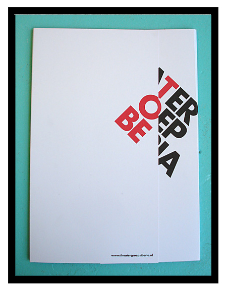
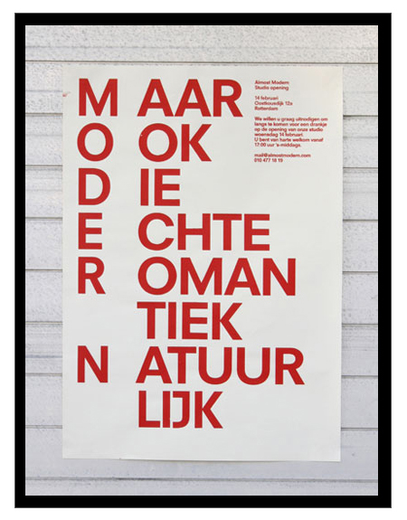
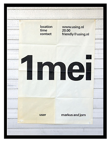
Just got turned onto Dutch studio Almost Modern this morning. I’m definitely a fan of their poster work; there are some misses here and there, but most of it is simple, minimal, and very effective design.


Just got turned onto Dutch studio Almost Modern this morning. I’m definitely a fan of their poster work; there are some misses here and there, but most of it is simple, minimal, and very effective design.

5 Comments Leave A Comment
Serviceburo says:
February 26, 2009 at 5:38 pmIt really reminds me of a much more subtle version of some of the old Designer’s Republic stuff, before their site made me start having seizures. I have to agree with you that there is some stuff that throws me a bit. The second poster is nice, but is probably pushed a bit too far. Very nice stuff all in all.
Jefta says:
February 26, 2009 at 8:21 pmLove it. Makes me proud to see another good dutch studio working on some minimalistic typography focused material.
Shelby White says:
February 26, 2009 at 11:25 pmAlex, Great post!
The first poster is interesting but doesn’t do a whole lot for me. I enjoy the third one the most followed by the second.
Joris Hoogendoorn says:
February 27, 2009 at 1:36 amHi,
Nice post. Im from holland.
The second poster says “But also the real romantic ofcourse”
Hardleers says:
February 27, 2009 at 6:33 amI love the first poster; How the name of the theatre group and the play are incorporated. The 2nd one is too much and the last one is a bit too boring for me.