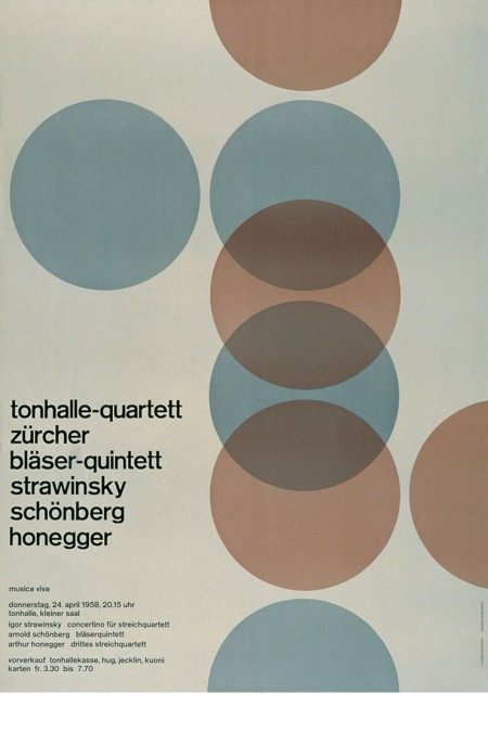
Classics: Schuricht / Tonhalle
Posted by Scott


Some classics via Helloairecords. It always amazes me to see such forward thinking design from this period. It’s 1955 and design this evolved already exists, it’s incredible. Of course, this is Europe. Unfortunately, most of us in the states were too concerned with Elvis and Marilyn Monroe to appreciate the finer points of the grid system or minimalist design theory. There is something very pleasing about such simple shapes and colors modulated by the quirks and imperfections of the analog printing process, it really brings life to the composition.

11 Comments Leave A Comment
Dan says:
January 26, 2009 at 4:06 amhow was dusty’s show?
Mario says:
January 26, 2009 at 6:45 amHey Scott, you forgot to mention the posters are from the swiss graphic designer Joseph Müller-Brockmann. Some more of his great work:
http://www.imagenow.ie/gallery/flash.htm
http://www.flickr.com/search/?q=muller-brockmann
By the way, inspiring blog! Keep up the good work.
Cheers!
Antonio says:
January 26, 2009 at 7:22 amScott, Brockmann was way ahead of his time. He created designs that are still relevant today.
greg says:
January 26, 2009 at 11:36 amThat goes without saying.
The sky is blue.
The grass is green.
Brockmann was a genius.
But we’ve all seen these posters before.
Serviceburo says:
January 26, 2009 at 12:30 pmThese pics are absolutely class. I would give anything to be able to work in a studio with all of the old pre-computer equipment. But as far as design in the states goes at the time, what about Paul Rand? His stuff from those days may not have have the same scientific purism of the Europeans, but there were definite parallels.
Brian says:
January 26, 2009 at 4:13 pmI
Love
Minimalistic
Design
Like
This
!
!
!
Rent says:
January 26, 2009 at 7:39 pmyeah this stuff is great…very simple and clean. especially like the top two.
Scott says:
January 26, 2009 at 9:14 pmgreg-
I hear where you’re coming from, and one look at your great portfolio makes it’s pretty clear you are very well versed on brockman and his peers. but if you can believe it, I first saw these last night. If you didn’t go to design school and haven’t spent much time researching these sorts of things, a lot can slip through the cracks. That’s been the best thing about writing the blog, it’s sort of been a crash course in design history for me. at any rate, I often try to post even very well known classics (such as the saul bass stuff), not because I think it’s new to everyone, but mostly to remind people and to hopefully open a dialogue. also, it’s good just to add it to the site’s database for searching and categories and all that…. not to mention the scores of younger designers coming here who may or may not have been exposed to this sort of work yet.
Adrian says:
January 27, 2009 at 7:24 amgreat posters. i’ve seen some of them before, too.
but the first yellow one was new to me.
just keep on posting what you like, scott.
greg says:
January 27, 2009 at 11:00 amNo offense meant Scott. I guess I just take it for granted that most graphic designers have seen this stuff before, especially one of your caliber.
Carry on! ;)