Wim Crouwell Archive
Posted by Scott
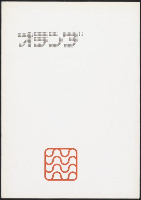
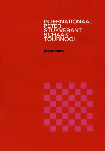
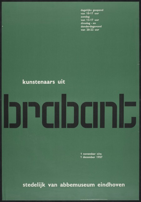
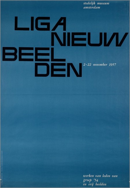
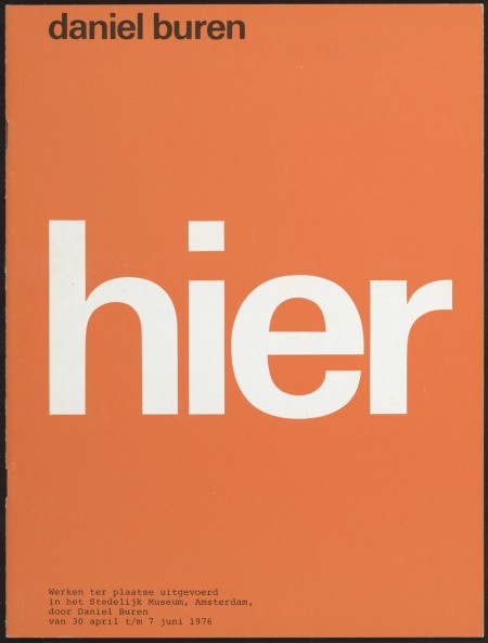
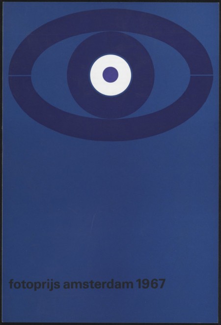
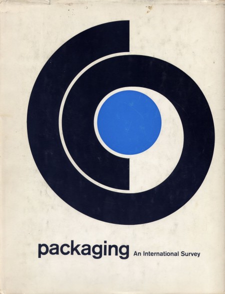
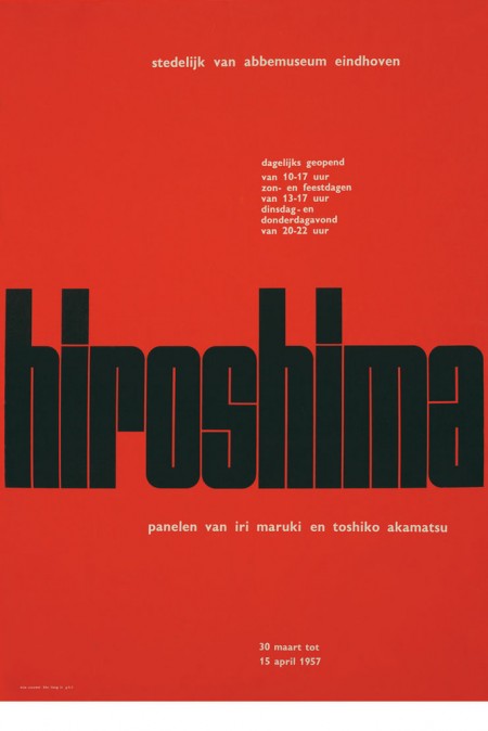
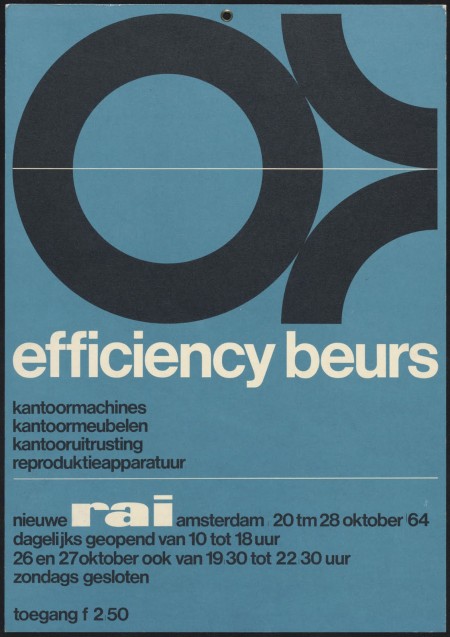
Fire up your Epsons, the Dutch site Memory of the Netherlands has an extensive high-res archive of Wim Crouwell’s work up for your downloading pleasure. All the recognizable classics are in there along with a lot of stuff I’d never seen before. I didn’t know it was possible but I now have even more respect for one of the true masters of graphic design.
That top one is incredible, I’m going to Genuine Fractal that immediately tomorrow and try to get a solid print out of it. On a side note, my friend tried to translate and said it spells out “olanda” so we’re thinking it says “Holland”. Can anyone confirm this?
Memory of the Netherlands Archive via Wanken and Flyer Goodness

14 Comments Leave A Comment
knon says:
April 1, 2011 at 12:44 amIt does indeed spell Holland. Super nice post.
Garrett Haas says:
April 1, 2011 at 7:08 amSo glad you found this. This is brilliant.
Scott says:
April 1, 2011 at 9:14 amThanks Knon, do you know why there isn’t an “H” sound in there?
NULCORE says:
April 1, 2011 at 10:04 amPositively masterful! Thanks for sharing.
Nick says:
April 1, 2011 at 12:23 pmThe Design Museum London just updated their store with a bunch of new merch from the upcoming Crouwel exhibition. Some great silkscreened posters from contributing designers.
http://designmuseumshop.com/exhibitions/current/wim-crouwel
Justin says:
April 1, 2011 at 12:33 pmScott – Maybe you can print these off for a contest? Don’t think there would be any ethical issues if you aren’t making a profit. As well, not everyone has a killer epson printer.
Nick – Thanks for the link – killer site!
Nashville Web Designer
Ian Paschal says:
April 1, 2011 at 1:08 pmHaven’t you posted this before Scott? I was assuming that’s where Shelby posted it from on his own blog recently.
Scott says:
April 1, 2011 at 1:19 pmJustin-
yeah not sure of the legal implications, but good idea. I’ll look into it.
Ian-
I’ve posted on Crouwell a number of times, but not on this particular archive and not with these resolutions. A couple images may overlap, but I think most of it is new, and I certainly didn’t have them high res like this. I posted this from Shelby’s post.
Ian Paschal says:
April 1, 2011 at 3:07 pmWell then my mistake, and thanks for the post! :D
Polyonymy says:
April 2, 2011 at 12:57 am@Scott: ホラント refers to Holland, and オランダ (like on the poster) refers to the Netherlands.
The first reads as holanto and the second as olanda.
Christian says:
April 2, 2011 at 10:21 amThis blog post combines my two favourite designers, thanks for sharing some higher res images of his work :)
Fairylight says:
April 3, 2011 at 4:49 amLot’s of goodness and talent from my country.
That man is almost a legend here.
Greetz from Amsterdam
Ash says:
April 3, 2011 at 4:53 pmOh my god….. Its pure greatness.
Him says:
July 28, 2011 at 11:12 amThe cold yet pleasing precision from an era when type was handmade/cut and done with instruments not a mouseclick.