Making of Designspiration.net
Nearly ten months ago, I (Shelby) had an idea that was inspired by the design community, one that I became very passionate about. The idea was to create some sort of platform to share what inspires you. We’ve seen it done before, but what I have for you is something I hope and believe you’ll really enjoy.
Designspiration is the outcome of my efforts to realize my idea, evolving into a site occupied by a diverse range of inspiration curated by its users. Designspiration or DSPN for short, focuses on the core principles of sharing inspiration and utilizes some great features; like a search function that works like a Swiss army knife, which I will discuss more in the post. Little did I know when starting this project that I would be clocking in more than 1,000 hours over the past ten months.
If you’re eager to check out the site, you can hit Designspiration.net or Ds.pn. With that said, I’m really excited to share this project and process with you…
This post is broken up into these sections:
Defining the Goals
Design & Typography
Development
Features & Invitations
Conclusion
Defining the Goals
Since the dawn of the project, I was constantly asking myself, why create another inspiration website?
The answer was simple: I wanted needed to find a way to help fellow students find inspiration. Through talking with other students in the past year at the Art Institute of Seattle, I found that over half of the graphic design students hadn’t heard of image bookmarking sites like FFFFOUND, and had potentially visited Behance no more than a handful of times. Granted, those aren’t the only sites out there, but they are two of the highest regarded. Perhaps even more alarmingly, I noted on multiple occasions that students were stopping by Google images as an inspiration outlet—rather frightening isn’t it?
It was quite clear that what needed to be done was provide a solution to the problem, and a concept was forming in my mind. The question was how do I make it happen? Answering that question isn’t easy. I had to realize that in order to complete this extremely daunting task, I needed to ask myself if I truly believed that I could make it happen. I believed I could do it even though I had no knowledge of how to, but not once did I allow myself to say, “I can’t do this.” Instead I asked myself, how could I do it.
Through the planning phase, done during the first week, I realized two things: one, I knew very little programming (html/css) and two; my budget was…well there wasn’t one. I spent some time talking with developers about what I was trying to do, and was pointed to Ruby on Rails. The following week was hell so I moved away from Ruby on Rails and started using an easier solution, PHP and MYSQL.
Research & Usability Testing
Usability was by far the most important aspect of creating this site, and I spent a great deal of time ensuring it was always usable and intuitive. To gather data for the initial build, I reached out to a number of designers and photographers to ask them a series of questions. The questions pertained to why they use specific sites and what they would like to see improved or added. The results were actually surprising: the majority wanted something very simple, but it had to have search capabilities and a range of high quality inspiration (without the junk). I completely immersed myself in using a lot of sites to understand how and why they are successful. Believe it or not, FFFFOUND is ugly for a reason, and has a unique system of relating images.
After 6 weeks I had a beta build up for DSPN and began doing small task testing. Some of the tasks included the difficulty of searching, ease of navigation, uploading to the site and how users tagged. The hardest part about the testing was who to include and who to exclude in the tests. One of the larger groups incorporated were those who answered yes to experiencing creative block. This group is more likely to use DSPN.
Design & Typography
The designing of the site was the second most difficult part to accomplish. Based on the research and desires of the people who will be using the site, they called for simplicity—I agreed. The design was to be ultimately dictated by the content, and it needed to be subtle, freeing each of the images from distraction as much as possible. I also believe this form of minimalism in the design added to a feeling of sophistication to the site in general.
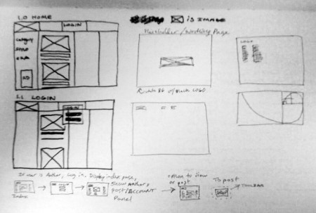
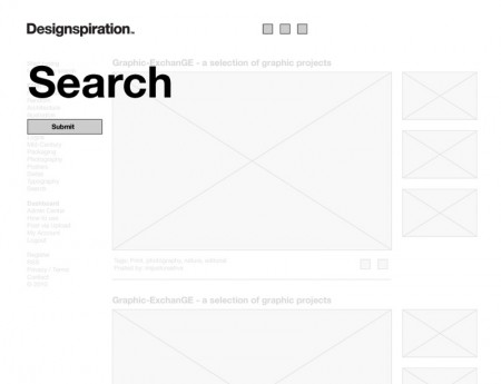

As with every project I do I start on paper regardless if its web or print. This project quickly transitioned into wireframes however. You can see from the rough sketch to wireframe, how the structure for the live search started developing.
Hand-in-hand with the layout was choosing the right typeface, especially when the site’s audience was planned to be so broad. It had to work well at small sizes and be a default on most machines. Initially, I had explored using gothic faces and serif faces such as Didot and reformed Baskerville for the logo, but most brought too much outside influence into the site’s neutral-leaning aesthetic. Designspiration needed a typeface that said, “I am unique, but I can sit back and watch the show”. Linotype’s version of Helvetica Neue did that.
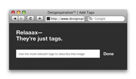
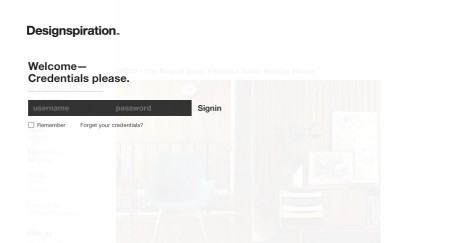
As with any large project, the smaller areas of design were initially overlooked. Those areas were the login form and each call-to-action above input forms site-wide. Being that tagging forms such a large part of the site, I wanted to calmly let people know that its really not that big of a hassle, and it will actually help you find what you’re looking for faster.
Development
Seventy-five percent of the time spent on this project was invested in the development. Coming into the project, I lacked almost all knowledge of any of the programming languages that I would be using. This may be surprising, but despite my knocking of Google images earlier in this post, the majority of my knowledge in JavaScript, JQuery, PHP and Mysql was found and learned via Google. Halfway through the project, a light bulb turned on in my head and I realized something that all accomplished developers have had to recognize at some point—that the majority of the coding was about thinking logically.
The nice thing about building a site from scratch is that it negates a lot of the unnecessary fluff that frameworks come with and it loads very quickly. Certainly the whole site would have been much easier to build if it were on a framework. Some of DSPN’s biggest original features such as the LiveType search function were built completely from scratch and took a lot of strategy to implement properly. I needed to figure out things like how I could allow the user to have as much control as possible when searching and still be able to use commands such as cut and copy, pasting and typing in other input fields. The only caveat to using JavaScript for all of this is that it may or may not work in Internet Explorer so you should make sure you’re in one of these browsers: Firefox, Safari or Chrome.
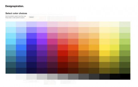
The search by color feature was actually easier to create than the tag search. Essentially getting each color from an image is the same as when in Photoshop and using the color picker. Just imagine zooming to 3200% and sampling an average of 2,000 pixels in .002 seconds and you’re hired.
All of those colors get stored and used in calculating what colors in the image. The visual part of this is where things begin to get tricky because our eyes lie. When we look at an image we see colors that have a higher luminance and calculating this is not easy. You may see in the search results that some images seem off and this happens when there is a lot of negative space occupied by whites or lighter colors. As the database grows, these results will slowly get filtered and put into groups with similar color palettes.
Features & Invitations
• LiveType search: To search for any image just begin typing. It’s a much faster solution than having to click in a box every time.
• Color Search: If you’re looking for images with certain colors, click the color search icon and you can select up to 5 colors from a 120-color palette.
• Keyboard Navigation: The Up and Down arrows scroll between posts and the Left and Right arrows take you to the next and previous page.
Hopefully by now, you’re asking, how do I get invited to the site?
Currently, membership is driven by those whom already been invited. Those members have the control over who gets invited; its a way to maintain the user base and the quality of uploads. By doing it this way it allows for me to keep up with the site, but don’t worry just yet because the site has to start somewhere:
Request an invitation by visiting http://ds.pn/register.
Conclusion
Spending the last 10 months working on this project has taxed, pushed, challenged, and ultimately, improved my skills as both a designer and a developer. Now that the project is live and in your hands, I’d like to ask that if you see my idea’s potential as a reliable source of well-curated inspiration, would you tell one friend about it by Tweeting or posting to Facebook.
As usual with projects as large as this, there will be updates and additions. Those will come and as I mentioned before, this site is all about you and your inspiration. Your suggestions and ideas to help make the site better are all valid and I would love to hear them.
Follow Designspiration and myself (Shelby White) & Facebook to get the status on updates and invites.
Check it out, Designspiration.net!

59 Comments Leave A Comment
Short Bloom says:
December 13, 2010 at 3:10 amThis is absolutely fantastic. Thank you for putting in so much time, energy and care into making the site a reality. Can’t wait to check this every morning for the rest of my life.
NEOkeitaro says:
December 13, 2010 at 3:18 amI’ve been browsing the site for a few minutes now and I like it. It has a feature that to me is absolutely essential (I’ve been begging for it for deviantART for years now, seems like they’re planning on releasing it), it’s the search by association of color. It’s very cleverly implemented, very simple, as is the site generally.
The choice for a very clean layout is good, it helps focus on the art. I however find the picture to be quite small, I get tired of these tumblr-like websites that think art should be displayed no larger than 500px. But then again, I think it’s not you fault, but rather the art that is posted that is originally at that size. Too bad, art is 99% better when it’s big.
Also, last critique: using chrome on windows 7, the sans-serif font used for titles does not look good. For example, in the about section, “Search by Color” displays a “e” in search with a full bowl. I believe the font displayed is “HelveticaNeueLTStdBold”, in my case.
Other than that, it’s a fav! I’ll be sharing it around me ;)
Artur says:
December 13, 2010 at 3:49 amBookmarked!
timkg says:
December 13, 2010 at 3:59 amHi,
congratulations for the new site/app. At first look I thought “hey, a ffffound clone”, but features like the big, bold, immediate search (which is beautiful!) and search for colour really make it stand out.
Once again, congratulations.
eydryan says:
December 13, 2010 at 5:22 amhi there :)
was expecting this process article and boy have you delivered! :) great stuff and although indeed ffffound does spring to mind immediately when seeing the site there’s enough good stuff and new stuff to make it worth it.
now if you could just get people involved in it that would be pretty awesome. I mean involved as in discussing each art piece, tagging like crazy or whatever else it is you real designers do :D
looking forward to the live thing tomorrow and I’ll start thinking whether I should apply for an invite or not. maybe it’s just the motivation I need to get back to my photography.
anyway, cheers and thanks a lot for writing this process article and for dedicating so much of your time to this project :)
eydryan says:
December 13, 2010 at 5:29 amThere are a couple of issues with the site though:
1. I can only select a maximum of 4 colours in some cases (apparently when they’re together). If I select a fifth I get the very annoying pop-up message (kill that thing, use a jquery pop-up or something) and cannot select a fith.
2. images are hard to click on as the selection box is only limited to the number of… what exactly? well the number mouseover.
That’s what I’ve found so far. Hope it helps
eydryan says:
December 13, 2010 at 5:34 amOne LAST thing: clicking the image takes you to source. That’s an all-right thing but I much prefer the ffffound way of giving me the actual image source which is hopefully bigger.
That’s something I dislike on most of these well designed websites: in order to maintain whitespace and so on the image itself gets shrunk to a tiny thumbnail of the original which is a shame since it should be as huge as possible, with an option to fit it to the users screen.
Tomislav says:
December 13, 2010 at 6:50 amExcellent site and post on making of. I was just looking for something like ffffound but with more features.
Damion says:
December 13, 2010 at 6:54 amGreat job Shelby. I definitely have bookmarked this site. I like the color search function and the simplicity of the site. I also like that I can just start typing and find what I’m looking for. Will spread the word.
JimmyViola says:
December 13, 2010 at 7:14 amThis is a great site! I didn’t realize it was you Shelby! I was checking it out last week when I was randomly searching for inspiration. I believe I found it through behance, but I don’t remember for sure. I really appreciate the ease of search and the simplicity of the design. Gorgeous work!
russell says:
December 13, 2010 at 7:14 amsite is niffty nice. however, i have one big problem with it: i cant use my standard key commands while your site is active.
most notably… [command] + [t] to open a new tab doesnt work, and [command] + [w] to close the tab. im using safari…
are all keypress event defaults being prevented?
eli says:
December 13, 2010 at 7:24 amlove it. it looks great and works wonderfully so far on my end. thanks for putting so much into it!
Pablo Lara H says:
December 13, 2010 at 7:30 amGreat site! Congratulations, but I think it needs something very tyoical of you…Music of course!
Clayton says:
December 13, 2010 at 8:28 amGreat job, Shelby. This site is looking very slick. I have no doubt in my mind that this will catch on and be a great source of inspiration for creatives for years to come.
However, I am having the same issue as Russell above, all of my keyboard shortcuts don’t seem to work when the ds.pn tab is active (most notably cmd+t and cmd+w). Not sure if there’s a work around for this, but it’s something to think about.
Overall, I applaud your vision and your effort to get this up and running. I’ll be visiting it frequently. Now, to get that invite… (I’ve sent an email)
Best of luck.
Bryant Eslava says:
December 13, 2010 at 9:00 amI love this website so far!
At first I was like this looks like “dropular” but that website never worked out again.
I’ve registered and I can’t wait to share inspirational images with others.
Great Job Shelby!
Ashraf Ali says:
December 13, 2010 at 9:12 amKind of reminds me of this:
http://www.typographicposters.com/
Storm Sentry says:
December 13, 2010 at 10:40 amGood job on this one. Although searching where to add RSS took me more then one or two looks :/. And I also have problem with logo of this site which is practically non-existent. Make something nice like FFFFound logo or Behance ;)
Kjell-Roger says:
December 13, 2010 at 10:44 amGreat reading about the process Shelby. I saw the site some days ago and I will definitely send a request for an invite.
I’m impressed by your efforts in the project too. Looking at the product I can see you’ve been quite dedicated. A mighty fine project to learn developing better, I must say! kudos.
Excited to see where this goes!
Alex / HeadUp says:
December 13, 2010 at 11:25 amI was fortunate enough to have been in contact with Shelby for the duration of the project and got to observe the process– I watched the idea grow and change and get more complicated.
What amazes me most, more than the great additions Shelby is offering to the inspiration-gathering experience, is the fact that he built it on his own, and when he didn’t know how to do something, he went out and learned it, he didn’t quit or try and get someone else to do it. I watched him make sacrifices too, that level of dedication requires nothing less.
Hope DSPN catches the wind because it really is my favorite new design site, friendship completely aside.
Jag says:
December 13, 2010 at 12:47 pmDefinitely bookmarking this. Great job, Shelby, and great behind-the-scenes info here
vlad says:
December 13, 2010 at 1:14 pmSo is this just like emberapp.com, but only very minimal? I hope it brings works from great minds.
MHagan says:
December 13, 2010 at 1:18 pmSuccess! thanks
Maxime says:
December 13, 2010 at 2:29 pmGreat to see the whole process. Just one remark about using Helvetica. Isn’t the “you don’t notice the typeface, just the brand” an outdated argument considering so much brands used Helvetica? Don’t get me wrong, I think the font looks great but I don’t buy the “watch the show” argument because I think once your mind thinks “oh this is helvetica”, the logo fails. Anyway, great project overall and super result :)
Tiemen says:
December 13, 2010 at 2:58 pmThe only thing I don’t like is the name. And ‘adieu’? ;)
Let’s use it and see if it works!
Philip Karpiak says:
December 13, 2010 at 3:10 pmCongrats on shipping something and picking up the necessary skills to do so in such a short time. This post hit the spot for me as I’ve been working on a webapp and had to decide between using Ruby or PHP also. In the end, like you, I just picked the tool that would let me shape a product to my vision the quickest.
Best of luck mate.
miriam says:
December 13, 2010 at 3:25 pmHave you seen Lookwork?
Jarred says:
December 13, 2010 at 4:06 pmKudos for taking on the challenge. Best of luck with it!
河源SEO says:
December 13, 2010 at 5:56 pm路过!顶一个
Eric Carl says:
December 13, 2010 at 7:34 pmCool! BUT I found a HUGE PROBLEM!
The “Search by Color” page says:
“Click submit to search when done.”
But the button is labeled as “Search”, not “submit”! OH. MY. GOD.
Ok, in all seriousness, very cool and congrats for launching after all your hard work. Personally I think sites likes these are better referred to as “reference” than “inspiration”, but I digress. ;)
Shelby says:
December 13, 2010 at 8:58 pmHey all, thank you for the great input and feedback! It’s very rewarding to see so many positive comments and hear of any issues you may be having with the site.
So far I’ve addressed a number of issues:
• The normal shortcuts (cmd + c, cmd + t, etc) should all be fixed.
• Text on color search said “Submit” not “Search”: fixed now.
@Ashraf Ali – I haven’t seen the new typographicposters or at least that version of the site before. There seems to be a strange pixellation that happened when viewing it earlier…
@Miriam — I actually came across Lookwork a couple weeks ago and it looked somewhat promising. But I’m convinced Designspiration is more unique.
Keep it coming guys and lets spread the word!
易赛 says:
December 13, 2010 at 9:31 pm很不错的BLOG。学到了很多。以后会常来。
Veena says:
December 13, 2010 at 9:37 pmExcellent site and post on making of.
This site is looking very slick.I took some time to find RSS feed button.
Somee of my key shortcuts are not working.
Keep upgrading the site .
Sucess is eventually for sure.
Bran says:
December 14, 2010 at 7:32 amCongrats on the site, it looks great. I do like the fact that unlike ffffound and many random tumblr sites, Designspiration actually credits the source of the image although I do think this could be done even better.
I guess my real question is why you think design students SHOULD be using things like fffound and behance and DSPN in the first place? I read the part of your post that mentioned that your students were using Google images, but I don’t see why that is a big problem. In my view sites like ffffound encourage mimicry and a homogeneous way of thinking about design. Shouldn’t student work be about exploring the possible, not just getting inspiration from established work and copying from it or updating it?
We’re seeing lots of design that is inspired by other design lately (retro this, minimalist that, star wars travel posters, art deco book covers, etc). But I think as an educator you should encourage students to seek better design solutions that derive from the needs of the project rather than in formal (previously created) solutions found with easily searchable tags that are currently in vogue.
Ashraf Ali says:
December 14, 2010 at 7:46 am@Shelby
“Strange pixellation.” That’s hilarious! I think your site is fantastic and look forward to going back to it over and over again.
Great work and if you can learn PHP from scratch, so can I! Now that’s motivating.
rafdevis says:
December 14, 2010 at 1:21 pmMore than excellent !
Chris says:
December 14, 2010 at 5:06 pmOne question: How do I sign up?
Chris says:
December 14, 2010 at 5:16 pmNevermind, I found it. I think I was looking for a clue on the How to use and sign in pages. Silly me.
Neeko says:
December 15, 2010 at 11:26 amBEATIFULL.. definetly a far more superior and improved and any other Inspiration site!
Aaron Mitchell says:
December 15, 2010 at 1:52 pmReally enjoying the website. Love the type search feature.
Luis Alves says:
December 15, 2010 at 7:07 pmgreat site!! really easy to use it!
Mpumelelo says:
December 16, 2010 at 4:04 amThis is fantastic. Thank you for sharing this. This just fired me up to redesign my site. I’ve always been afraid of jumping into development. I just have to give it time.
Thank you.
The site is incredible.
Asif Ahmed says:
December 16, 2010 at 9:37 amSuper duper job man! Especially thanks for sharing your objective and process with us!
thehalvo says:
December 16, 2010 at 1:50 pmepic
Shelby says:
December 16, 2010 at 11:16 pm@MPUMELELO I was afraid at first. Especially when I couldn’t seem to find the answer for the problems I was having. The moment I started finding the answers is when I realized that it wasn’t THAT hard.
Appreciate everyones comments so far and I’m looking forward to getting you all these new features that will improve curating the content and browsing the site.
Bryant Eslava says:
December 17, 2010 at 1:01 pmI wish there was a ‘like’ comment for the comment you made above Shelby :-p
I’ve been going on everyday and submitting fashion photos, I’ve seen that a few others have done the same.
I’m very excited to see this site grow!
Josh Sullivan says:
December 19, 2010 at 12:58 pmSuper happy with this site. Can’t wait to view it every day
laura says:
December 21, 2010 at 12:21 amoh my god.
Thank you SO MUCH for making this exist. In love with it.
Trevor Triano says:
December 23, 2010 at 9:31 amI really appreciate the space between the images and the simplicity. I think you did a really solid job of designing this site, i will definitely stop in regularly. Great job. Did you program the thing yourself?
Shelby says:
December 23, 2010 at 9:39 am@Trevor
Thank you. Yes I developed the whole site. Anything Designspiration you see, I was behind it. As you can imagine, it was overwhelming but has proved to be a great venture.
Logosafari says:
December 23, 2010 at 3:44 pmThank you for this valuable information. It is inspirational!
Francisco says:
December 27, 2010 at 10:38 pmAny good easy to use tutorials that you used to learn how to do this? Great job and site!
Shelby says:
December 27, 2010 at 10:46 pm@Francisco
At first I attempted learning Ruby on Rails tutorials but it was pretty difficult to follow (a lot of the tutorials I started, would end and have problems that the tutorial creators neglected). After that I started using PHP and learning from w3schools.com. The big “aha!” moment for me was when I found out about PHP the Docs (http://php.net/manual/en/index.php).
I invented the search while learning php and it definitely gave me the confidence to create the rest of the site/features.
Zach says:
December 28, 2010 at 1:47 pmI rarely post comments anywhere… mostly because people are over opinionated to begin with, but that is just my opinion.
This is another opinion of mine: This is pretty damn cool. Thanks Shelby.
DAVID says:
December 29, 2010 at 9:48 am“”Fake””” “”FAKE”” http://www.desigual.com/desigual/preHome.jsp
Francisco says:
December 29, 2010 at 11:30 amThanks for the reply Shelby, very informative. I’ll try and see if I can do this for my site.
Sarah says:
January 5, 2011 at 5:08 pmThis is great! Congrats on setting up a useful tool.
I’m taking some classes again for fun and the students in my sessions are using Google Images, too, at an alarming rate. The teachers don’t even seem to have very good resources sometimes so hopefully this will help both instructors and students step things up :)
Shelby says:
January 5, 2011 at 5:11 pmSarah,
If you can, let them know about the site.
Through my experience its not that the teachers don’t have the resources, rather its that they have resources that the students don’t find easy or convenient to use (eg. books, magazines etc.).
Hope you’re enjoying the site!
ken says:
January 8, 2011 at 9:38 amFantastic site and resource!
Just a few comments.
Can you add a furniture tag? The site is geared towards graphic design, but has a great potential to easily expand to furniture and product designers as well.
Is there a way to have images save with info from the image. Right now they save with random numbers and letters, it would be nice to know more about the images when I look back on them later. Yes, I could type it in myself, but Im lazy!