Chillout Sessions


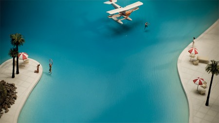
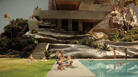
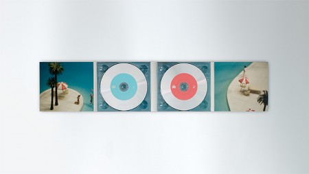
Both of these little worlds are part of the artwork created for the most recent Chillout Sessions: a compilation disc series put together by the Ministry of Sound Australia. The diorama-like concept was developed by Collider (design by Andrew van der Westhuyzen and cinematography by Brycen Horne). They decided to switch up the packaging after the first 10 discs:
The new Sessions concept involves miniature ‘worlds’ literally creating a package holiday that has both escapism and a sense of humour. [link]
I want to shrink down to size and move into one of these miniature worlds. As a concept I LOVE this. It was executed exceptionally well; from the world construction to the photography, this is a concept pulled off in every sense. Be sure to check out the video version of each: XII XI

12 Comments Leave A Comment
Jarson says:
August 25, 2010 at 10:24 ameveryone who knows me knows I have a HUGE obsession with miniatures. Haha I am a weirdo. The Thorne miniatures, Henry Selick’s minisets, all that jazz, for some reason I have a soft spot for that stuff…I would one day like to own something like this. So f#$@ing sweet!
Ryan says:
August 25, 2010 at 10:38 amExcellent… If the dioramas were just a bit (more?) twisted, they could be models of Josh Keyes paintings: http://www.joshkeyes.net/paintings.htm
Scott says:
August 25, 2010 at 11:05 amYES. Made endless dioramas when I was a kid. This is amazing.
Mark C. says:
August 25, 2010 at 11:14 amI used to be an architecture/engineering major, but never got far enough to have to do any elaborate models. These look fantastic!
Shelby says:
August 25, 2010 at 12:41 pmThe detail blows my mind. These two shots in particular: One & Two.
Anonymous says:
August 25, 2010 at 3:18 pmThe miniatures are awesome
Dan Matutina says:
August 26, 2010 at 1:45 amThis is nice. Thanks for sharing this. The miniatures are really nice. I hope I’ll be able to get a copy of the album.
Colin says:
August 26, 2010 at 2:26 amWonderful models, interior panels look decent, such a shame that the front covers are so unimaginatively executed.
seks izle says:
September 5, 2010 at 3:00 amwonderful. thank you admin
sibel kekilli says:
December 21, 2010 at 8:16 amThe detail blows my mind. These two shots in particular: